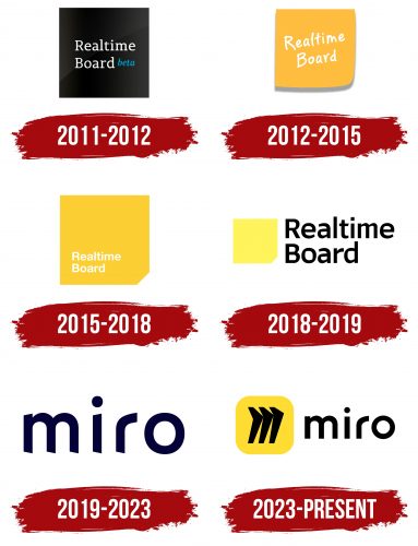
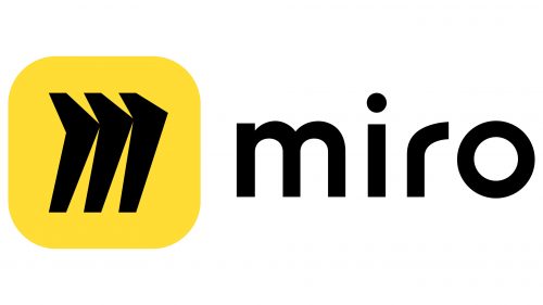
Miro logo presents a powerful vision designed by the agency Vruchtvlees, encompassing the essence of the digital collaboration platform it represents. The foundation of this emblem is a stylized “M,” poised as if ready for flight due to its three wing-like elements. The typography has also matured, from glyphs perceived as ‘standing on tiptoes’ to more assertive symbols. Meanwhile, a yellow background square punctuates the dark palette of the logo, offering a splash of brightness.
The change in typography signals a coming of age for the platform. The previous fonts, characterized by slanted, sharp cuts on the legs of characters, have given way to a more grown-up, self-assured representation. This transformation aligns well with the platform’s evolution, signifying its readiness to handle increasingly complex collaborations and serve a broader user base.
The stylized “M” is a centerpiece, revealing much about the platform’s ethos and aspirations. The three wing-like elements emanating from it not only form the letter but also signify limitless potential for soaring to new heights. This symbolism resonates strongly with a platform built for teamwork, brainstorming, and creativity. The wing-like elements express the freedom to explore, innovate, and grow, quintessential attributes for any collaborative workspace.
Introducing a yellow square in the emblem’s otherwise dark palette serves multiple purposes. First, it adds a vibrant contrast, making the logo more memorable and eye-catching. Second, yellow often symbolizes optimism, clarity, and warmth—crucial qualities in collaborative settings where clear communication and positive vibes are invaluable.
This logo redesign isn’t merely a cosmetic change; it speaks to the heart of Miro’s aims. The platform’s mission is encapsulated within these visual elements: the promise of seamless collaboration, the enthusiasm for limitless exploration, and the assurance of a mature and reliable tool. The colors, shapes, and typography are all carefully curated elements contributing to a comprehensive narrative. It’s a story of evolution and readiness, a narrative that aligns perfectly with the aspirations of a platform dedicated to fostering productive digital collaboration.
Miro: Brand overview
| Founded: | 2011 |
| Founder: | Andrey Khusid, Oleg Shardin |
| Website: | miro.com |
In 2011, the venture that would later be known as Miro came into existence under the name RealtimeBoard. Founded by Andrey Khusid and Oleg Shardin, it began as a digital whiteboard application with its origins in Russia. A significant turning point occurred in 2018 when the company successfully garnered $25 million in Series A financing. The following year saw a change in identity as the enterprise rebranded itself as Miro.
By the time 2020 rolled around, Miro had swelled its workforce to 300 people and secured another round of investment, bagging $50 million in Series B funding. This capital infusion elevated the company’s worth to an estimated $500 million. An even more momentous occasion came in 2022 when Miro attained an astonishing $17.5 billion valuation, bolstered by a robust $400 million Series C fundraising effort. This placed Miro among the most highly valued private software-as-a-service entities.
Nowadays, Miro operates dual headquarters in San Francisco and Amsterdam and boasts a global employee roster exceeding 1,500. With a customer base that surpasses 50 million users, the platform is a favored choice for nearly all Fortune 100 companies. What began as a simple digital whiteboard has evolved into a dominant platform specializing in visual cooperation and work optimization, particularly for dispersed teams. The seismic shift toward remote and hybrid working arrangements, especially triggered by the pandemic, has been a key driver in Miro’s accelerated expansion.
