


 Mixer Logo PNG
The emblem shows how the service connects two realities. Real and playful, it enables continuous communication and parallel existence within the game. The Mixer logo says, “It is up to the user to decide which component will be larger.”
Mixer began in 2014 as Beam, created by Matthew Salsamendi. The platform focused on near-zero-latency streaming via FTL technology, enabling viewers to interact with gameplay in real time, unlike Twitch’s passive format.
In 2015, Beam entered Y Combinator, gaining early funding and recognition. Growth remained limited, with a niche audience drawn to technical features rather than scale.
In August 2016, Microsoft acquired Beam to support its Xbox ecosystem. In January 2017, the service was renamed Mixer due to trademark issues. Microsoft later integrated it with Xbox One, allowing direct streaming from the console.
By 2018, Mixer ranked third behind YouTube Gaming and Twitch, with a wide gap in viewership. Organic growth stalled, and Microsoft shifted to paid creator acquisition.
In 2019, Mixer signed exclusive deals with Ninja and Shroud, reportedly worth about $30 million and $10 million. Concurrent viewership rose from roughly 27,000 to about 77,000, while Twitch exceeded 1.4 million.
Audience behavior limited the impact. Many users consumed content through YouTube clips rather than switching platforms, and community migration did not follow individual streamers.
In June 2020, Microsoft announced that Mixer would close on July 22, 2020, less than a year after signing major contracts. Users and partners were redirected to Facebook Gaming under an agreement with Meta.
Streamers were released from their contracts, compensated, and returned to Twitch within weeks, ending a four-year attempt to build a competing streaming platform.
Meaning and History
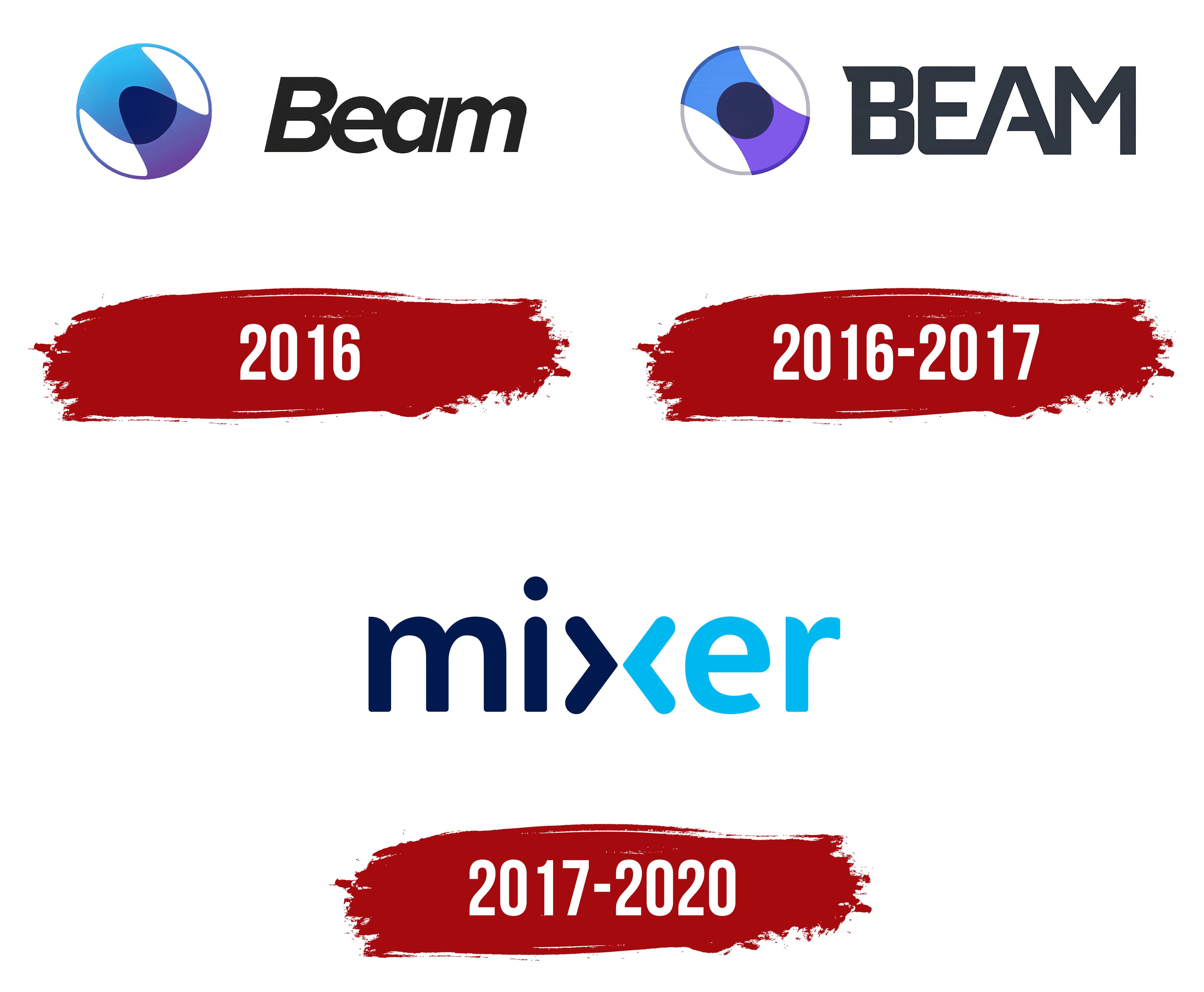
The streaming video service did not withstand serious competition, despite a recognizable, well-thought-out identity. The latest logo, with two-color “mixer” lettering, replaced the previous logo, which combined an abstract circle with the word “BEAM.” The rebranding improved the streaming platform’s image but did not prevent its closure.
What is Mixer?
Mixer is a gaming streaming platform. Its co-founders, Matthew Salsamendi and James Boehm, launched the service in 2016. Its key feature is maximum interactivity and minimal stream delay. Initially, the web platform was called Beam, but after transitioning to Microsoft in 2016, it was renamed. In 2020, the platform ceased operations due to competition.
2016

On January 5, 2016, James Boehm and Matthew Salsamendi launched a new video service aimed at gamers. It was called Beam, and the word appeared on the emblem. It was written in black italic sans-serif type. The designers followed the grammar by capitalizing the first letter and lowercasing the other three.
To the left of the inscription was an abstract sign consisting of two blue-violet figures resembling graphs of mathematical functions. They were arranged as mirror images, one opposite the other, and half-merged at the top. A ring connected them and ran along the border of the white circle.
2016 – 2017
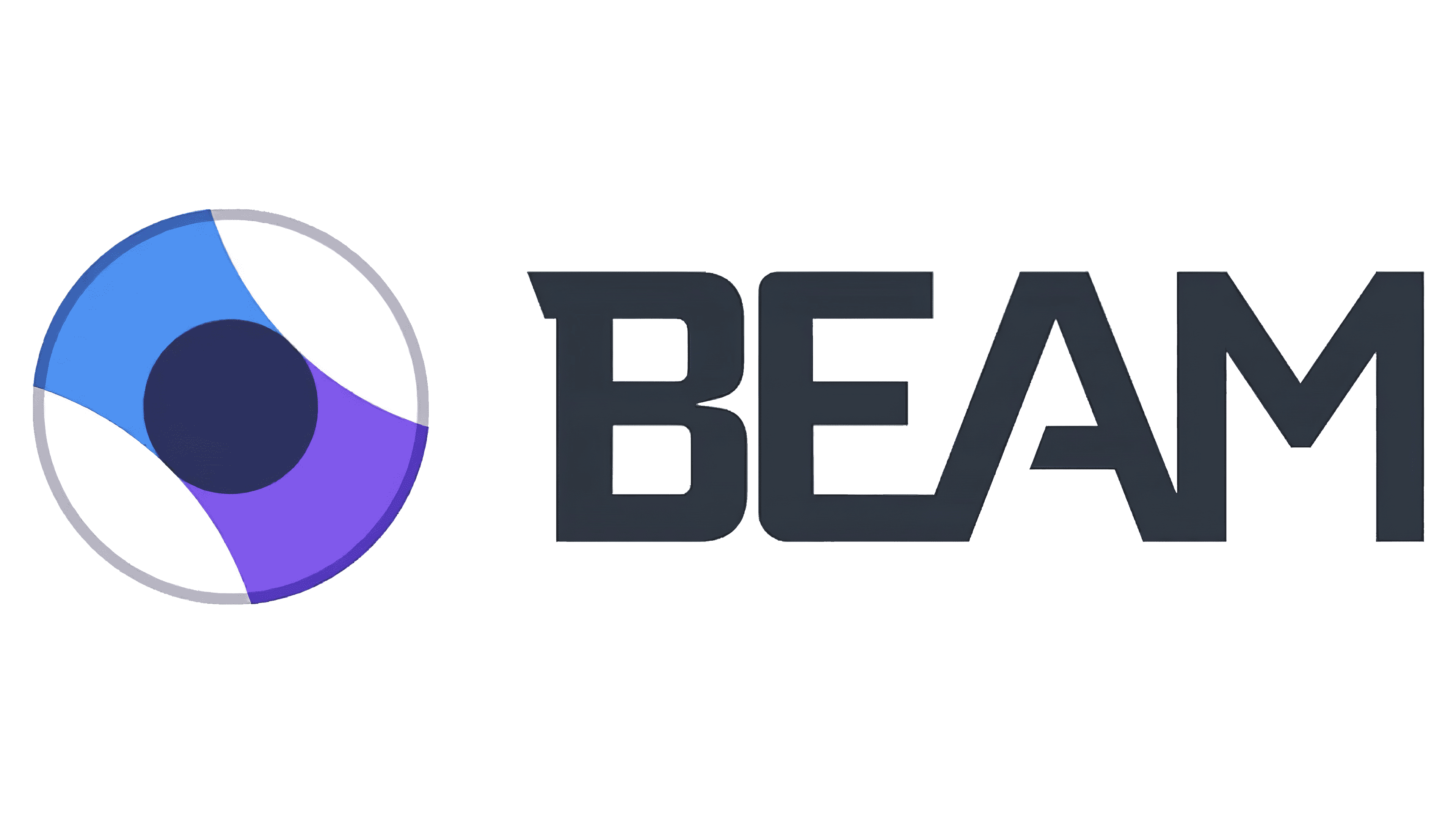
In August 2016, Microsoft acquired Beam. The multinational corporation made a small redesign, changing the lettering style. As a result, the service’s name turned dark gray and adopted a new font, where the upper serif could be recognized as a “B” and the shortened horizontal stroke as an “A.” All letters were in uppercase.
The graphic sign also went unnoticed. The designers changed the serifs so the dark connection point is circular.
2017 – 2020
Microsoft had renamed its video streaming platform, so it had to change its logo again. For the new name, she chose a stylized font that is completely different from previous versions. The word “mixer” is written in lowercase and divided into two parts: dark blue and light blue. The border sits exactly in the middle of the “x,” which changes the symbol’s appearance: it looks like two triangular brackets. This logo was used until July 22, 2020. Then the service stopped working, and all users were automatically transferred to Facebook Gaming.
Font and Colors

The Mixer platform’s wordmark is directly related to its name. It symbolizes the fusion of different parts into one whole and reflects the service’s main purpose: to unite people (in this case, gamers) from around the world.
The custom font used to create the logo is serif-free and has smoothly rounded strokes. Because of the characteristic “x,” the inscription seems divided into two parts. Each half is painted differently: the left side is completely blue, and the right side is blue. The background is traditionally white.