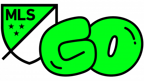
In a concerted effort with RCX Sports, Major League Soccer (MLS) has initiated MLS GO, a recreational soccer scheme tailored to expand the reach of the popular sport to boys and girls beyond the traditional soccer milieu. This all-embracing program targets children aged between 4 and 14 and seeks to provide an enjoyable, cost-effective, and community-oriented football experience. The creative force behind the visually appealing branding and logo of MLS GO is Athletics, a creative powerhouse based in Brooklyn.
MLS and Athletics have forged an appealing brand identity for MLS GO, brimming with vitality and light-heartedness to appeal to budding football enthusiasts. The brand moniker is personified through an endearing mascot named GO, symbolizing the program’s easy-going ethos. With a nod to iconic football mascots of times past, the GO mascot cheerfully manipulates the MLS GO symbol, beckoning aspiring young footballers to don their football boots and get in on the action.
Designing a secondary graphic that supports an existing logo can be a complex task, as it is essential to maintain the preeminence of the original logo while ensuring the supplementary feature is noticeable yet doesn’t outshine the main logo. The MLS GO logo artfully maintains this intricate balance. By cleverly filling the open space of the shield and embedding a sturdy, animated “GO” with a coordinated black outline, the new logo harmoniously enhances the established MLS shield. The flawless merging of the bold visual accentuation reaffirms the potency of the original MLS logo, a previous joint creation by Athletics and Berliner Benson from 2014.
The “GO” feature deserves recognition for its inventive design. The “G” is especially enthralling, with its uniqueness splendidly encapsulated sans any counter spaces. While a case could be made for a squarish outline for the “O,” the allure of the round design becomes apparent when “GO” metamorphoses into the mascot, and the “O” ingeniously assumes the form of a soccer ball. The mascot, though seemingly whimsical, is charmingly so. It portrays a formless, gender-neutral character with a humorous demeanor reflected in its dimensions and facial expressions, capable of performing any action merely by rotating the “G” and adjusting the limbs and eyes.
The kit designs, typified by Bhelt Vol 3, lend an eccentric yet fascinating aspect to the branding. However, its application seems somewhat restricted, invoking an urge for further extension and refinement of the system. The introductory video captures the brand’s essence to some extent but falls marginally short of realizing its full potential. Overall, the brand’s whimsical foundation effectively infuses the MLS brand with a “Nickelodeon” spirit, endowing it with a youthful charm likely to attract children to the sport and the virtues it propagates.


