


![]() Mobil Logo PNG
Mobil Logo PNG
Mobil’s logo stands out among Standard Oil’s successors for its dynamic and creative approach. Over the years, the company’s frequent mergers have led to multiple logo transformations, each time reinventing itself with a fresh perspective. The current design features a clean, professional blue-and-red text emblem paired with the Exxon logo, reflecting the collaboration and shared ambitions of the two energy giants.
Mobil’s history began in 1866, when Hiram Smith founded Vacuum Oil Company in Rochester, New York. The company produced lubricants and lamp kerosene, and its early development was tied to a new method of vacuum distillation. This process enabled Vacuum Oil to produce refined lubricants. It helped the company gain a foothold in the growing American petroleum market.
In 1879, Standard Oil, led by John D. Rockefeller, acquired a controlling stake in Vacuum Oil. The connection gave Vacuum Oil access to Standard Oil’s distribution network and supported expansion into Europe. After the U.S. Supreme Court dissolved the Standard Oil trust in 1911, Vacuum Oil became part of Standard Oil Company of New York, known as Socony. In the following years, Socony expanded its filling-station network and its range of petroleum products.
In 1931, Socony merged with Vacuum Oil, forming Socony-Vacuum Oil. The merger expanded retail distribution and reinforced the company’s lubricant business. In the 1930s, it adopted the flying red horse emblem, one of the most recognized signs in the oil industry. Rebranding continued in 1955, when the company became Socony Mobil Oil Company, and again in 1966, when it became Mobil Oil Corporation.
During the 1960s and 1970s, Mobil increased oil exploration and production, with activity in the Middle East and the North Sea. It expanded retail operations, petrochemicals, natural gas, and extraction technologies after the oil crisis of the 1970s. In the 1980s, Mobil introduced new lubricants and fuels and added convenience stores to filling stations. In 1998, Exxon and Mobil announced a merger that was completed in 1999, creating ExxonMobil.
Meaning and History
![]()
According to the agreement, Exxon bought Mobil but retained its identity, becoming, in effect, the parent corporation. With a rich history, ExxonMobil is now the largest player in the oil and gas industry. The brand has ten logos.
What is Mobil?
This is a well-known American brand in the oil and gas industry, tracing its origins to a company founded by Rockefeller. Today, it produces industrial oils and operates a network of gas stations. The brand’s original name, Socony, is an abbreviation of Standard Oil Company of New York.
1892 – 1904
![]()
The first logo of Standard Oil of New York, part of Rockefeller’s trust, incorporated numerous symbols emphasizing the quality of its products and the level of its service. At its center was the image of Aladdin’s lamp, referencing the idea of instantly granting wishes, much like the genie from the tale. This design linked the concept of top-quality oil to rapid delivery, made possible by Rockefeller’s railroad network.
The circular emblem symbolized a train wheel, highlighting its connection to railroad logistics and oil barrels. The design alluded to the company’s technological advancements in transportation. The word “security” was prominently displayed in the center, signifying the guaranteed safety of goods during transit.
Oil inspired the shape of Aladdin’s lamp, which is widely used as a lubricant for machinery. This visually associated the company with the technical oils it produced during its early market presence. Above the lamp, the word “Aladdin” was written in a cursive, hand-drawn style, adding an element of refinement to the design.
The lower part of the logo featured the company name “Standard Oil Company” in bold, sans-serif black font. The circle’s white background allowed all composition elements to stand out in contrast and appear visually appealing.
1904 – 1908
![]()
The 1904 emblem of the Standard Oil Company of New York (SOCONY) stood out with its recognizable shape and symbolism, reflecting the company’s activities. It was designed in a circular format, evoking the image of a car wheel, a direct reference to automobiles and their maintenance, specifically motor oil supply.
At the center of the emblem was a stylized shield divided into three sections. At the top, the company’s name, “SOCONY,” an abbreviation of Standard Oil Company of New York, was prominently displayed in bold font. This word emphasized the company’s regional identity, marking it as a market leader. The middle and lower sections of the shield contained the words “Motor” and “Oil,” highlighting the brand’s specialization in producing motor oils.
The color palette featured a deep red for the primary text and outer border and a rich blue for the background surrounding the central element.
Around the shield, large white letters “S,” “O,” “N,” and “Y” were arranged, representing key components of the company’s name. These bold letters stood out against the blue background. A thin red line separated the shield from the outer circle, creating a distinct boundary between the central and outer parts of the logo.
Additional smaller inscriptions were placed at the bottom of the circle to serve an informative purpose, emphasizing the products’ patented and original nature. This detail inspired customer trust and reinforced the company’s image as a reliable supplier of high-quality motor oil.
1904 – 1932
![]()
The logo featuring a gargoyle became one of the most recognizable symbols of the Standard Oil Company of New York (SOCONY) and later became part of Mobil’s identity. This mythical creature, depicted horizontally, became the emblem for the brand’s Gargoyle motor oils. The red body and black lines outlining the contours enhanced the visual impact, conveying a sense of energy and strength.
The gargoyle draws inspiration from architectural elements of medieval buildings, where such figures served as water spouts. This image was associated with reliability and protection, reflecting the emblem’s symbolic qualities, and the company attributed it to its motor oil. The red body color emphasized fiery energy and combustibility, while the black lines added dynamism and sharpness to the design.
The gargoyle’s downward-pointing head symbolized readiness for action, while its horizontally aligned body suggested swift movement, evoking associations with automobiles and transportation.
When this logo was introduced, SOCONY expanded its motor oil range, and the Gargoyle brand became a market leader. The emblem with the mythical creature highlighted the product’s uniqueness, setting it apart from competitors. This logo remained relevant for a long time until SOCONY merged with Vacuum Oil Company.
1931 – 1932
![]()
This logo combines the legacies of two companies: Vacuum Oil and Socony. The red gargoyle at the center is the key symbol inherited from the Gargoyle brand. This image has been in use since 1904, when the gargoyle symbolized the durability and reliability of motor oil.
The emblem features two inscriptions. At the top, the word “Gargoyle,” set in uppercase letters and rendered in a grotesque typeface, is arranged in a semicircle. A red stripe running through the letters adds dynamism and visually connects the text to the gargoyle. At the bottom, the “Mobiloil” brand is written in large black lettering with smooth forms, visually balanced with the rest of the composition.
Gargoyle-branded oils were used in industrial equipment, while Mobil oil products targeted automobiles. The logo unified the two lines and demonstrated the versatility and breadth of the product range.
1932 – 1966
![]()
After Standard Oil’s breakup, Vacuum Oil, previously part of the giant company, registered a white Pegasus as its trademark. This symbol represents high-quality gasoline marketed in Africa. According to mythology, Pegasus was born from the ocean and possessed incredible speed. Legends connected him with water sources that appeared wherever his hoof struck. Thus, the image of Pegasus symbolized the company’s connection to Earth’s resources, the quality of its gasoline, and the speed it provided to automobiles.
Designers from Jim Nash Associates chose the image of Pegasus to give the visual emblem a sense of harmony and to remove the aggression associated with the previous gargoyle symbol. Like its predecessor, Pegasus had wings, emphasizing speed and movement. However, it evoked only positive emotions. The horse’s pose was designed to convey the sensation of flight: its legs were extended, its head pointed leftward, and its wings were outstretched. The white color of Pegasus symbolizes purity, reliability, and the product’s technological quality.
1932 – 1959
![]()
The red Pegasus symbolized the new union after the Socony and Vacuum Oil merger. It was used for gasoline in the eastern United States, firmly establishing it as the brand’s primary symbol. The winged horse was depicted flying upward, symbolizing strength, growth, and the company’s ambitions and hinting at its commitment to developing jet fuel. Pegasus represented freedom, bringing petroleum products to people, enabling travel, driving, and flying.
The new visual symbol was more refined. Unlike in the previous depiction, artists made Pegasus more graceful by detailing its muscles, wings, and posture. It became more lifelike and sophisticated. The mythological creature was painted in vibrant red, while white outlines emphasized it against the rest of the logo, creating a striking contrast.
The name of the technical oil brand, Mobiloil, was placed at the bottom. The font was redesigned with simple and clear lettering without serifs, and the letters were elongated vertically. The minimalist text balanced the winged horse’s lightness and dynamism, adding stability and solidity to the overall composition.
1932 – 1947
![]()
The Mobilgas logo combined several symbols that became iconic for the brand. Its base featured a pentagonal shield with a blue outline, resembling either a gas pump or a steam cylinder from early automobiles.
The center of the shield features a red-winged Pegasus. This mythical creature, familiar from previous emblems, symbolizes speed, strength, and the freedom of movement that Mobilgas products provide. Pegasus is depicted in flight, with its front legs raised high as if ready to overcome any obstacle. Its wings are detailed, with every feather meticulously drawn.
Beneath the image of Pegasus was the brand name Mobilgas. The font was clear and simple, sans serif, in blue. This contrast with the red Pegasus made the text easily readable and visually distinct. At the bottom of the shield was the inscription “Socony Vacuum,” written in the same red color as the Pegasus.
1947 – 1957
![]()
The 1947 Mobilgas logo retained all the key elements of its predecessor but became visually more striking thanks to several enhancements. These included the frame thickness, font adjustments, and bolder lines, which made the logo clearer and more pronounced.
The red Pegasus, a symbol of speed, dynamism, and lightness, remained unchanged. The shield shape was preserved, but the blue frame became thicker, visually reinforcing the emblem’s structure.
Due to slight adjustments to line thickness, the “Mobilgas” text, rendered in bold blue, appeared more modern. At the bottom of the shield, the “Socony” Vacuum inscription, in red, remained unchanged.
1939 – 1957
![]()
In 1939, the Mobilgas logo was redesigned to make it easier to place on gas station signs and to give it a more modern appearance. The main change involved transitioning from a shield shape to a simple circle, creating a more balanced, cohesive look.
The red Pegasus, symbolizing speed, power, and movement, remained the central element. It was still depicted in a dynamic pose with detailed wings and body. However, Pegasus’s figure is now outlined in blue, making it stand out more prominently.
The font became more refined. The word “Mobilgas” was reduced in size but retained its impact through a bold blue color. Placing the text directly below Pegasus achieved harmony between text and image, ensuring a balanced composition.
The inscription “Socony – Vacuum,” which previously appeared below the brand name, was removed from the logo.
1957 – 1966
![]()
In 1955, the company updated its name to Socony Mobil Oil, necessitating changes to its visual identity. Peter Schladermundt, Inc. designed the new logo, maintaining the traditional red and blue colors but giving them a modern interpretation.
The emblem featured a combination of symbols representing the company’s two main divisions. The upper blue frame, thickened in the central part, referenced Socony. The lower section was replaced with an elongated red “V,” symbolizing Vacuum Oil. The sharp curve of the “V” added dynamism and visual stability.
Inside, a smaller Pegasus, the brand’s enduring symbol, was placed above two triangles resembling wings, reinforcing associations with flight and progress.
The company name “Mobil” was written in bold blue, with rounded and flat letters. This version marked an important step in Mobil’s visual identity, connecting the company’s past with its modern aspirations.
1966 – today
![]()
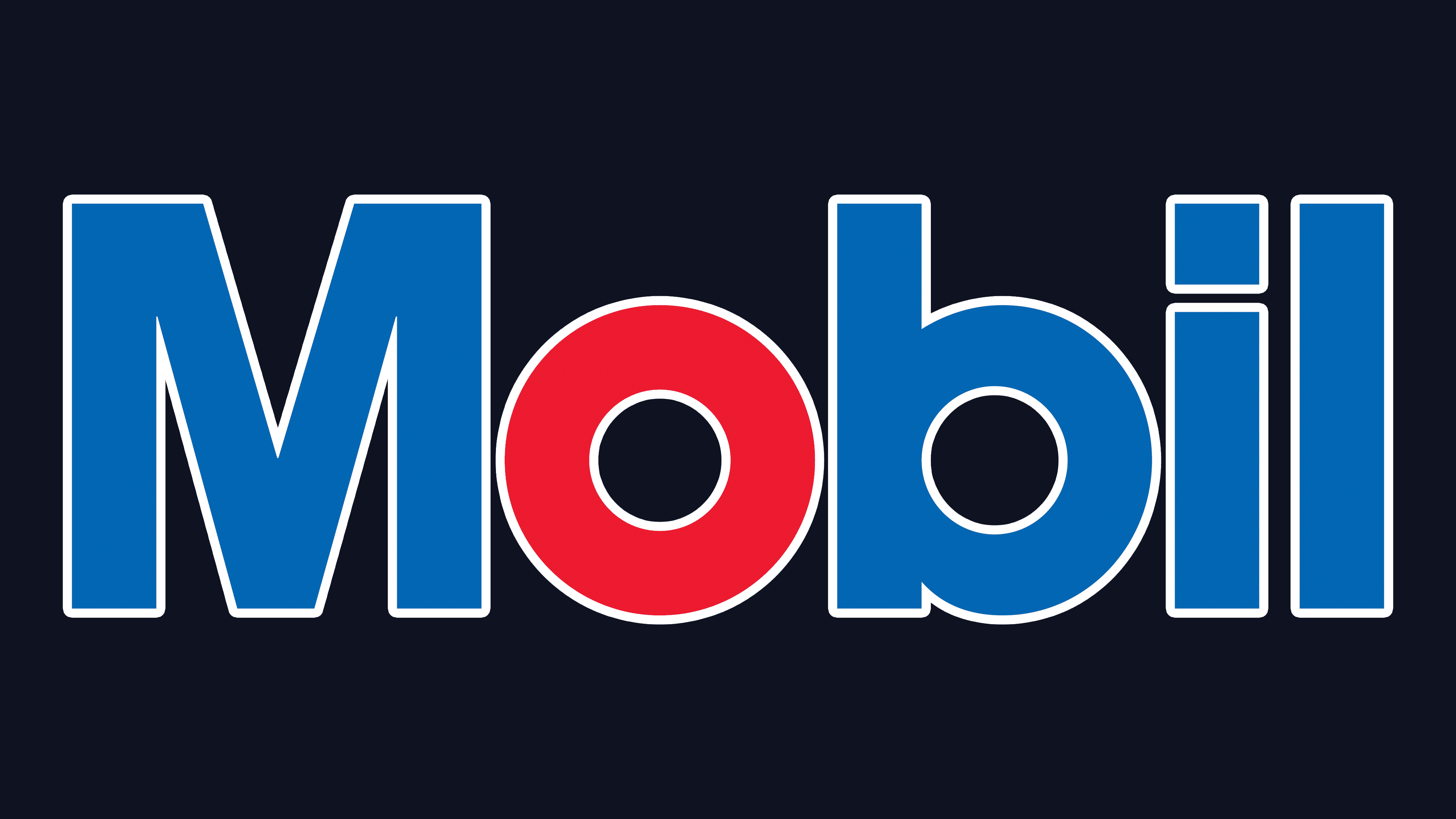
In 1963, the company name was shortened to Socony Mobil, and in 1966, it was further simplified to just Mobil. The brand adopted a simpler, more modern identity by removing the word “oil” from its name. A new logo was created to mark this change, and it remains in use today. The American graphic design firm Chermayeff & Geismar designed the logo.
The resulting logo was minimalist and precise, reflecting the streamlined name. It is a wordmark consisting solely of the word “Mobil.” The letter “O” is rendered in red, retaining the connection to the oil industry. The rest of the name is rendered in blue, symbolizing reliability and stability.
The font features geometrically even forms. However, the red “O” adds dynamism and makes the visual identity more memorable. This design element also symbolizes speed and convenience, aligning with Mobil’s innovation in introducing payment terminals at gas stations and developing a dedicated app for customers.
The name “Mobil” is phonetically linked to “mobile,” emphasizing the company’s mission to provide freedom of movement. The emblem no longer includes borders, shields, or other graphic elements. Its simplicity underscores that the core value lies in the product itself, without embellishments.
Font and Colors
The parent corporation owns the Mobil brand and has not abandoned the red Pegasus. It is still present, as before, on the company’s cars, equipment, and buildings. However, the official version uses only a verbal symbol, which looks simple but elegant.
The Mobil logo’s lettering is in avant-garde Gothic Bold. The letters are simple, geometric, and sans-serif. The font was created by Herb Lubalin and Tom Carnase and published by International Typeface Corporation. The company’s corporate palette combines red and blue. The logo appeared in 1904 and hasn’t been changed since.