


![]() Modern Warfare Logo PNG
Modern Warfare Logo PNG
The designers have created a militaristic emblem for the Modern Warfare game series. It consists of a massive inscription made in different fonts. The massive design adds dynamics and energy to the Modern Warfare logo, making it appear as an active subject and conveying the right information, creating a military mood in users.
Modern Warfare became a separate line inside Call of Duty in 2007, when Infinity Ward moved the series away from World War II and into contemporary military conflict. Led by Vince Zampella and Jason West, the studio built the first game around terrorism, covert operations, and a fictional fight against far-right Russian nationalists trying to restore Soviet power through coups and annexations.
The first Modern Warfare was praised for its tense campaign, modern setting, multiplayer progression, and missions that quickly became part of gaming culture. Its success led to Modern Warfare 2, known for record sales and the controversial “No Russian” mission. Modern Warfare 3 was followed by Sledgehammer Games’ involvement, even as internal conflict within the original studio shaped the production’s background.
After several other releases in the wider franchise, the subseries returned in 2019 with a reboot. The new Modern Warfare kept the military-thriller tone, updated the visual style, and introduced a revised storyline for a newer audience. Its biggest expansion came through Warzone, a battle royale mode that turned the brand into a live-service platform with constant updates and a much wider multiplayer audience.
Modern Warfare II arrived in 2022, followed by Modern Warfare III in 2023. Both games received mixed critical responses, but the line remained commercially powerful through online modes, familiar characters, and nostalgia for the original trilogy. After Microsoft’s acquisition of Activision Blizzard, Modern Warfare remained one of the franchise’s core branches.
Meaning and History
![]()
The events of the first three games in the Modern Warfare sub-series are interconnected and unfold over several years. At first, users can play as six characters to prevent Russian ultra-nationalists from coming to power in the Russian Federation. In the second part, you need to perform special operations amid the Russian invasion of the United States. The next video game is dedicated to the end of the Third World War.
However, the fourth part, released in 2019 as part of Call of Duty: Modern Warfare, has an independent plot. Its history is also connected with armed conflicts. Still, now, real events are taken as the basis: the wars in Iraq and Syria, and military operations on the territory of the Ukrainian Donbas. The actual organizations and agencies served as prototypes for the factions. The action begins with Russia finding an excuse to attack another country by declaring its intention to fight terrorists. Later, it turns out that the military of the Russian Federation is organizing mass executions of residents. Meanwhile, a CIA agent tries to trace the origin of the gas weapon.
Each Modern Warfare game has its logo. These are verbal signs in which the name of a particular part is presented. The font varies across styles, but you can also notice common features, such as bold glyphs, asymmetry, and the lack of serifs. The colors also differ: while the designers used green in the first three cases, the fourth emblem uses only two shades of gray.
What is Modern Warfare?
Modern Warfare is a series of games in the Call of Duty franchise. The first of these appeared in 2007, and the fourth came out in 2019. Like all other CoD video games, these are first-person shooters. The publisher of the series is the American company Activision; the main developer is the studio Infinity Ward.
2007
![]()
In 2007, the fourth installment of the Call of Duty series, a military shooter developed by Infinity Ward, was released. It spawned the Modern Warfare sub-series and was initially only available on three platforms: Xbox 360, PlayStation 3, and Windows. Users could see the video game’s logo even before its official release. It was a visually heavy inscription, divided into two levels and decorated with a gradient.
On the top line was the phrase “CALL OF DUTY 4”. It is noteworthy that the designers made only the words “CALL” and “DUTY” large, and reduced the preposition “OF” between them, placing it in the center. The quad at the end was similarly raised and slightly reduced. Each glyph had unevenly colored outlines, making the text appear voluminous. The color of the letters and numbers was also heterogeneous: the dark silver top gave way to a light gray, almost white, middle, and a slight green tint appeared below.
The second line contained the phrase “MODERN WARFARE.” These two words were almost half as long as the previous inscription. The logo’s designers painted each letter light green and surrounded it with a brighter green halo. The title of the sub-series was streaked with thin horizontal lines, like static on a screen.
2009
![]()
In 2009, the first part of Modern Warfare was followed by Call of Duty: Modern Warfare 2. The plot connected the two games, but their logos differed significantly. For the new project, the designers created a wordmark with a different design. The main title of the series has been significantly reduced and moved to the upper left corner. Its font has not changed. The preposition “OF” remained disproportionately small and elevated.
All attention was focused on the inscription “MODERN WARFARE.” This phrase took up much more space than before because the logo’s authors enlarged the letters and widened the spacing between them. In this case, the typeface has not changed either: a geometric grotesque built based on square shapes remains.
Interestingly, the designers played on the number “2,” positioning it so that it was partially hidden behind the last three letters of the word “WARFARE.” This sign looked non-standard because of the stencil type; the deuce was not solid but consisted of four separate fragments spaced apart.
Each glyph was white, with thin, light green outlines. Additionally, the inscription was surrounded by blurry gray shadows clustered around the letters. Moreover, the shadows around the phrase “MODERN WARFARE” were streaked horizontally.
2011
![]()
In 2011, the sequel to the acclaimed war game Call of Duty: Modern Warfare 3 was released. Its logo turned out more compact than previous versions because the designers did not use the shooter’s full name. They limited themselves to the inscription “CALL OF DUTY” and the monogram “MW,” which was supplemented by the number “3”.
The main title of the series was at the top and consisted of visually massive glyphs with a black gradient. The neighboring “T” and “Y” are merged with protruding edges. At the bottom was a combination of three characters: “M,” “W,” and “3”. The developers used a stencil font for the triple, and connected the letters to create a mirrored monogram. At the same time, their common part was divided in half by a diagonal line. The “MW3” lettering was green, transitioning several shades. It was lined with thin horizontal stripes.
2019
![]()
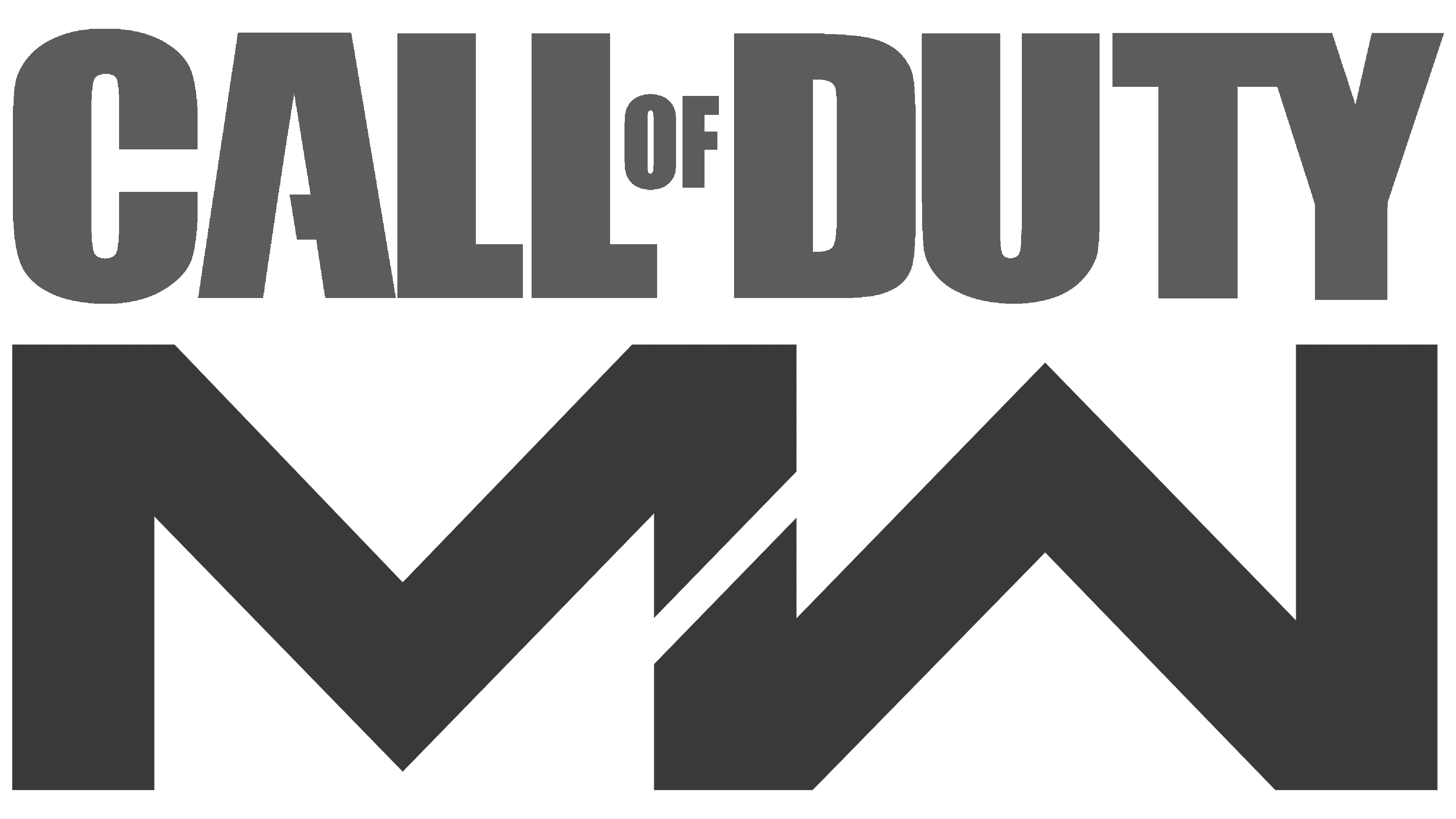
The fourth game in the sub-series appeared in 2019. The designers presented their title, “Call of Duty: Modern Warfare,” as a minimalist inscription spanning three terms. At the top, according to tradition, the phrase “CALL OF DUTY” was located. It looked the same as the 2011 shooter logo, except that the jumper inside the “A” was missing a piece on the left side. Below was the word “MODERN” with an unusual “E” in which the middle horizontal stroke was angled.
The third line was occupied by the word “WARFARE.” It is noteworthy that the first letters “M” and “W” were, in fact, mirror images of each other, and the negative space between them resembled two arrows. Dark gray was used for the series title and light gray for the subseries.
Font and Colors

Modern Warfare has a short version of the logo: a black “MW” monogram. The glyphs look the same, just rotated in different directions. They have a common vertical line in the middle, divided by a short white diagonal into two. The emblem contains many corners and no rounded elements, which hints at the “militant” nature of the game series.
The words “CALL OF DUTY” are made up of massive, bold sans-serif letters. Call of Duty: Ghosts Regular, released in 2014, can be used to create the same lettering style. The designers chose a sans-serif similar to MicroSquare Bold Extended by FontSite Inc. for the second half of the name. The logo’s color scheme, introduced in 2019, is as simple as possible: it uses two shades of gray on a white background.