Created to facilitate and facilitate the search for offers in the domestic service market in 2004 in San Francisco, the interactive platform felt the need to make changes to its own visual identity. Russell Simmons and Jeremy Stoppelman were prompted to create it by the imperfection of the market for the provision of home services by individual artisans, in which people, when independently searching for a contractor for a particular type of service, very often encountered poor-quality and unprofessional service, non-compliance with the terms of the contract.
Over the years of its existence, Yelp has constantly evolved, making additions, adding tools to improve the quality and ensure customers’ safety with an honest and responsible approach of the performers to their obligations. The measures taken to improve interaction in almost 60 business categories made it possible to assist enterprises in finding potential customers and artisans to find work in their area.
Together with the update of the service applications, the new logo became a demonstration of the modernization carried out. The brand sign has undergone not very significant changes, retaining the main idea but at the same time acquiring a modern look. By becoming more cheerful and open, he demonstrates sociability and a pronounced personality, reflecting the meaning of all the achievements that have become available to users. For an effective way of demonstrating the logo, drawing attention to it, an original decision was made to use a fun animation.
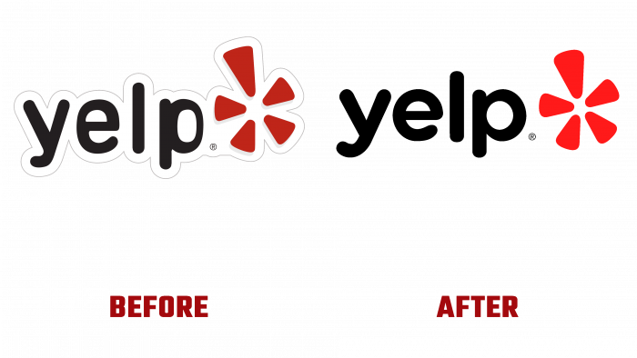
The black font in the logo was completely redrawn, retaining the roundness of the original, but with an increase in the radius of the corners of its bends. The red star following the name was also slightly thicker. Its corners have become more rounded. To accentuate it, a brighter red shade was used. Small changes in it made it possible to look differently at the meaning of this sign. He became the personification of the moment when this user discovers himself, finds what is especially needed. And the star symbolizes the very explosion of emotions and satisfaction that the user feels from a positive effect.
The main difference between the logo was the rejection of the gray border surrounding the logo, smooth transitions, and proportionality of each element. This version will be tied to each sign, button, and service on the site, thereby providing a single visual language connecting the logo and all application designations. All badges are made in compliance with the uniformity of dimensions and geometry. A red background has been chosen for the main icon to increase its recognizability; for icons, white.


