The Monarch Airlines logo embodies royal service – safe, comfortable, impeccable, and splendid. This means the airline is ready to provide all the above to its passengers, ensuring they reach their destinations conveniently.
Monarch Airlines: Brand overview
Monarch Airlines, the brainchild of Bill Hodgson and Don Peacock and backed by Sergio Mantegazza’s Swiss family, has left an indelible mark on the aviation industry. Initially focused on charter flights, Monarch took a bold leap in 2004, becoming a budget airline and moving away from charter operations.
Since its inception in 1967, Monarch Airlines has become the trusted choice for UK travelers. It offers reliable charter flights from Luton, Birmingham, Leeds/Bradford, Gatwick, and Manchester bases.
In 2004, Monarch seized the opportunity to change the aviation landscape by repositioning itself as a low-cost carrier. Monarch attracted new customers and became a formidable competitor by expanding its route network to popular European destinations.
Monarch Airlines faced serious financial problems in its final years due to rising fuel prices and intense competition. Despite focused efforts to restructure and improve efficiency, the company succumbed to increasingly difficult market conditions and went into administration in 2017.
Meaning and History
What is Monarch Airlines?
Monarch Airlines, known simply as Monarch, has entered the annals of British aviation history. The airline was the brainchild of founders Bill Hodgson and Don Peacock and received significant financial backing from the Swiss Mantegazza family. Over time, it evolved from a charter and scheduled airline into a low-cost model, and in 2004, it abandoned charter operations.
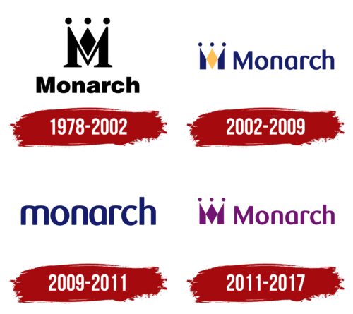
1978 – 2002
The foundation of the Monarch Airlines logo is a single letter “M” designed in an elegant style. The large glyph is not a printed character – it is hand-drawn. The graphic representation serves multiple functions:
- Represents the brand;
- Unveils the concept;
- Showcases the level of service;
- Demonstrates the company’s status;
- Attracts high-class clients;
- Emphasizes the level of comfort;
- Embodies authenticity.
The last point means that the airline has become the premium choice for British travelers. The “crowned” glyph expresses its connection to the UK and highlights its exclusivity. Thus, it conveys its cultural context, emphasizing sophistication, elegance, and exclusivity.
At the same time, the sign’s structure is very simple: it consists of one capital letter and several geometric shapes. Specifically, the “M” comprises three miniature circles, and a diamond is placed in the middle. This arrangement gives the emblem three peaks, to which bold dots were added, making the composition resemble a royal crown.
Beneath it is the brand name, written in an extra-bold font, which signifies the company’s stability, reliability, and vast prospects for continuing to ensure passenger safety. This approach showcases the airline as a caring and attentive host that treats its clients with the utmost care. The rounded letters signify the airline’s trustworthiness, openness, and commitment to avoiding delicate situations.
2002 – 2009
The Monarch Airlines logo has undergone significant stylistic changes from serious and strict to pleasant and inviting. The company approved a new font and chose a different color scheme to achieve this effect. Some elements were rearranged, resulting in a brighter and more charismatic symbol that conveys the airline’s worldview and quickly attracts customers’ attention.
- The letter “M” is now entirely graphic: it is composed of one diamond (in the center) and two irregular trapezoids (on the sides). The geometric shapes perfectly fit into the glyph’s structure and softened the seriousness of the old emblem to show closeness to travelers, a friendly atmosphere, and comfortable service.
- As before, the crown is made from the “M,” perfectly replicating its shape. To make the resemblance even more apparent, designers placed one identical circle at each sharp end—miniature, filled solidly with dark blue, matching the rest of the logo’s elements. The result is an imposing crown that underscores the company’s “royal” status and represents the country it serves.
- The name occupies one line and is placed next to the brand symbol. The semi-bold, lowercase font looks elegant and airy due to the large inner letter space. The freely placed characters create this impression: despite their proximity, they do not touch each other.
The color palette was changed: now, instead of uniform black, a refined combination of light yellow and dark blue is used. Notably, the blue color, in this case, closely resembles Royal Blue (HEX 002366), traditionally considered the color of the British royal court. This reflects the brand’s continued leadership concept in the aviation market and its aspiration for primacy, exclusivity, and distinction.
Thus, through its identity, the airline expresses its view on the level of passenger service, its self-imposed standards, and its uniqueness. Although the emblem lacks national motifs in the form of ornaments, cultural heritage is clearly expressed in the colors and in the most recognizable attribute of imperial status – the crown, which cleverly incorporates the first letter of the name.
2009 – 2011
The airline removed the crown from the Monarch Airlines logo to demonstrate its approachability to clients of all social statuses. It opted for a simple and concise design, expressing royal passenger conditions through Royal Blue. The lowercase font style contributes to this impression: the rounded letters closely resemble the sloping backs of airplane seats. They have smooth lines and soft features, creating a sense of pleasant comfort.
Even the single uppercase letter “M” – the first in the brand name – was converted to lowercase. This change led to removing the crown, which is difficult to combine with a lowercase “m,” which lacks sharp peaks. As a result, the identity of the British carrier now focuses on a homely atmosphere – calm, serene, and trustworthy.
The company expanded the emblem’s meaning by adding a welcoming aura of coziness to the “royal” status that signifies premium services and leadership. The soft, grotesque font with rounded glyphs reinforces this impression. All the letters are bold, large, monolithic, and elegant, evoking a sense of maximum trust.
2011 – 2017
The designers of Monarch Airlines stylized the letter “M” as a crown, cleverly reflecting the company’s name. This crown design looks like a diamond flanked by two mirrored trapezoids, each topped with a small circle. The branding agency Communiqué developed this concept. They also chose a rounded font that appears both delicate and confident. Since 2011, the emblem has featured purple, associated with royalty, leadership, and power.
The crown-shaped “M” and purple highlight the royal theme, giving the logo an elegant and luxurious feel. The geometric shapes and small circles add sophistication, while the rounded font adds a modern and friendly touch. This combination effectively captures the essence of Monarch Airlines, emphasizing the quality and prestige of their services.
The crown motif for the “M” reinforces the brand’s identity, creating a strong and memorable symbol. The diamond shape and mirrored trapezoids give the logo balance and symmetry, suggesting reliability and stability.
The small circles atop each crown point add a whimsical touch, representing attention to detail and commitment to excellence. This element enhances the overall look, making the logo more visually engaging.
Purple conveys luxury and sophistication, helping the brand stand out and project an image of high quality and premium service.
The rounded font complements the geometric crown symbol, adding a contemporary and approachable feel. This balance between tradition and modernity ensures the brand appeals to a broad audience, from those seeking luxury to those appreciating a friendly and welcoming airline.
