


![]() Monsters Inc Logo PNG
Monsters Inc Logo PNG
The Monsters Inc. logo looks wary at the viewer from a world hidden from people. The emblem says that the monsters are watching us. But instead of horror and fear, the sign conveys kindness and hints at a search for friendship and understanding.
Monsters, Inc. began in 1994, when John Lasseter’s Pixar team met over lunch to discuss possible future films. One idea focused on a hidden world of monsters whose job was to scare children for energy. Pete Docter, who had worked on Toy Story, began leading the project in 1996, using childhood fears, office culture, and friendship as the base for the story.
The film was made by Pixar Animation Studios, with Docter directing and co-writing. Production became technically difficult because of Sulley’s fur. Pixar developed specialized software to animate millions of individual hairs, making animating a single character a major technical challenge. Disney approved full production in 1998, and the team spent the next few years refining the script, the monster world, and the visual effects.
The voice cast gave the film much of its rhythm. Billy Crystal voiced Mike Wazowski, while John Goodman voiced Sulley, creating the contrast between nervous comic energy and warm physical presence. Monsters, Inc. was released on November 2, 2001. It became a major box office success, earning more than $577 million worldwide, and won an Oscar for the original song “If I Didn’t Have You.”
The film later expanded into toys, books, video games, and Disney theme park attractions. In 2013, Monsters University showed Mike and Sulley’s college years and extended the franchise. In 2020, Disney+ launched Monsters at Work, a series about the company’s shift from scream power to laugh power after the events of the original film.
Meaning and History
![]()
Monsters Inc. isn’t just a cartoon nominated for several Academy Awards. It’s the exact name of a fictional corporation owned by the Waternoose family for many years. It is located in Monstropolis, where creatures with tentacles, fangs, horns, and varying numbers of eyes live. When creating the city, Pixar assumed that all materials had to be strong enough to withstand the weight of the monsters. The buildings are made of steel, stone, and bricks. In turn, phones and doors are made universal because dwarfs use them with suction cups on their paws, and giants use them with claws.
The monsters look completely different because the Pixar research team had no references to draw on. If the experts had visited real toy stores while developing the characters for Toy Story, the cartoon Monsters, Inc. would have put them at a standstill. They could not study the monsters in any way, and even a trip to the library did not give the expected results. Surveys of children showed no single scary image; everyone is afraid of something different. As a result, illustrators were given the “green light” to create without limits.
The factory was designed with American baby-boom architecture in mind. The cartoon’s authors considered it a golden period in Monsters Inc.’s history, so the main construction was completed during that era. Then, according to their plan, scary movies and violent video games appeared in the human world, prompting the corporation to stop developing. This explains its vintage look and outdated equipment.
What is Monsters Inc?
The animated film was produced by Pixar Animation Studios and released by Walt Disney Pictures. The story is set in the monster-filled city of Monstropolis, home to Monsters, Inc., the world’s largest scream-processing factory. The plot follows two monsters who work at the factory as “scarers”: Mike Wazowski and James P. Sullivan, known as Sulley. Their job is to collect the screams of human children, which power their city. The narrative takes a turn when a human child accidentally enters their world, challenging their beliefs and leading to adventures exploring themes of friendship, morality, and fear.
2001
![]()
2012
![]()
Symbol
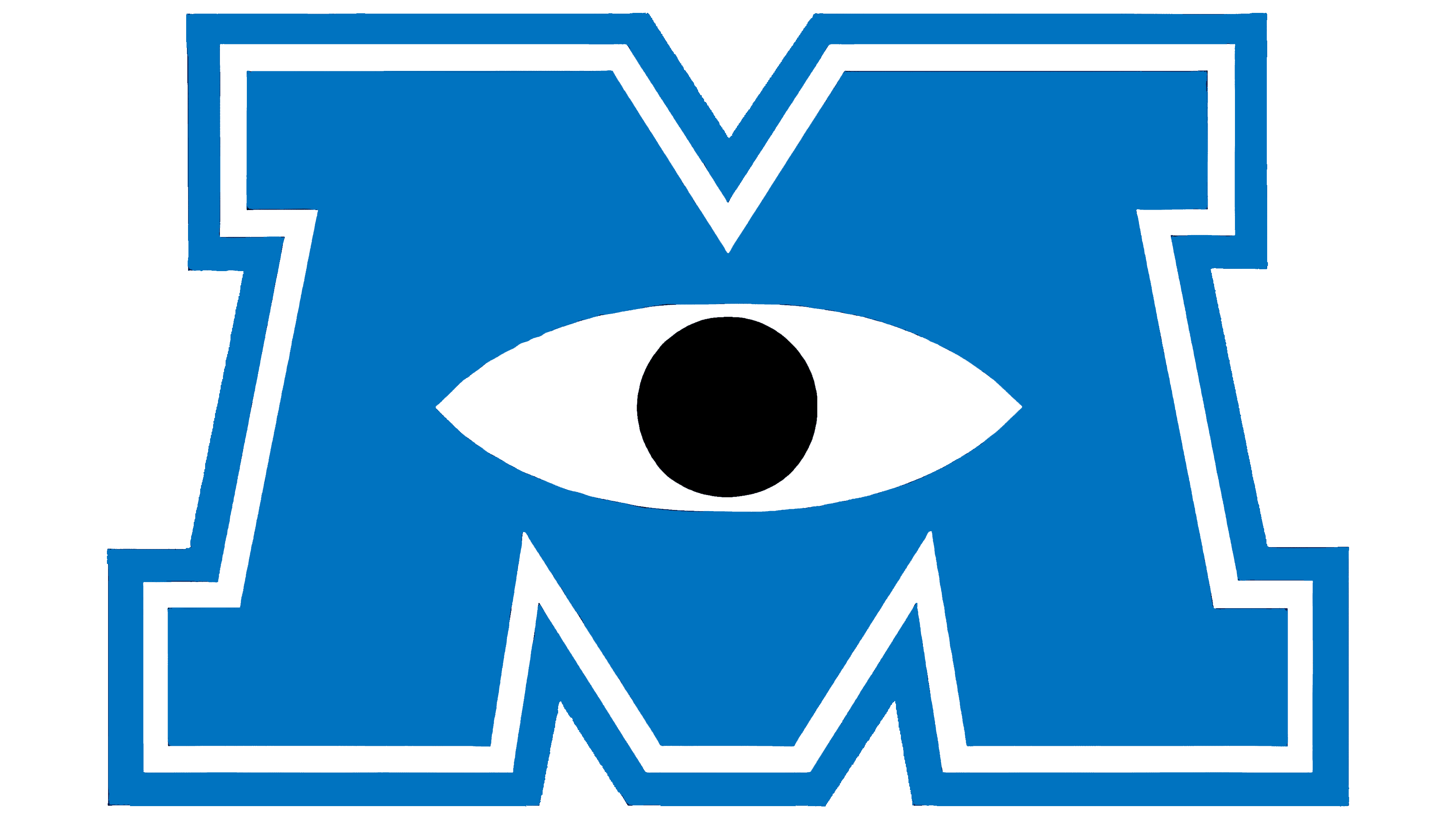
The only thing in the cartoon that looks modern is the factory sign, a big blue “M” in a ring. Inside it is a white eye with a black pupil. This symbol inspired the development team behind the cartoon logo. It bears the blue inscription “MONSTERS INC.” the name of the movie, and represents the fictional organization from the Pixar universe. Even though all the letters are capitalized, the “M” is noticeably raised above the line, disrupting visual symmetry.
The “M” symbol reminds cartoon fans of the main character, Mike Wazowski, because he also has only one eye. However, many other one-eyed creatures live in Monstropolis, so this image is more collective and not tied specifically to Mike. It refers to a hypothetical monster and reflects the atmosphere of an adventure comedy.
Font and Colors
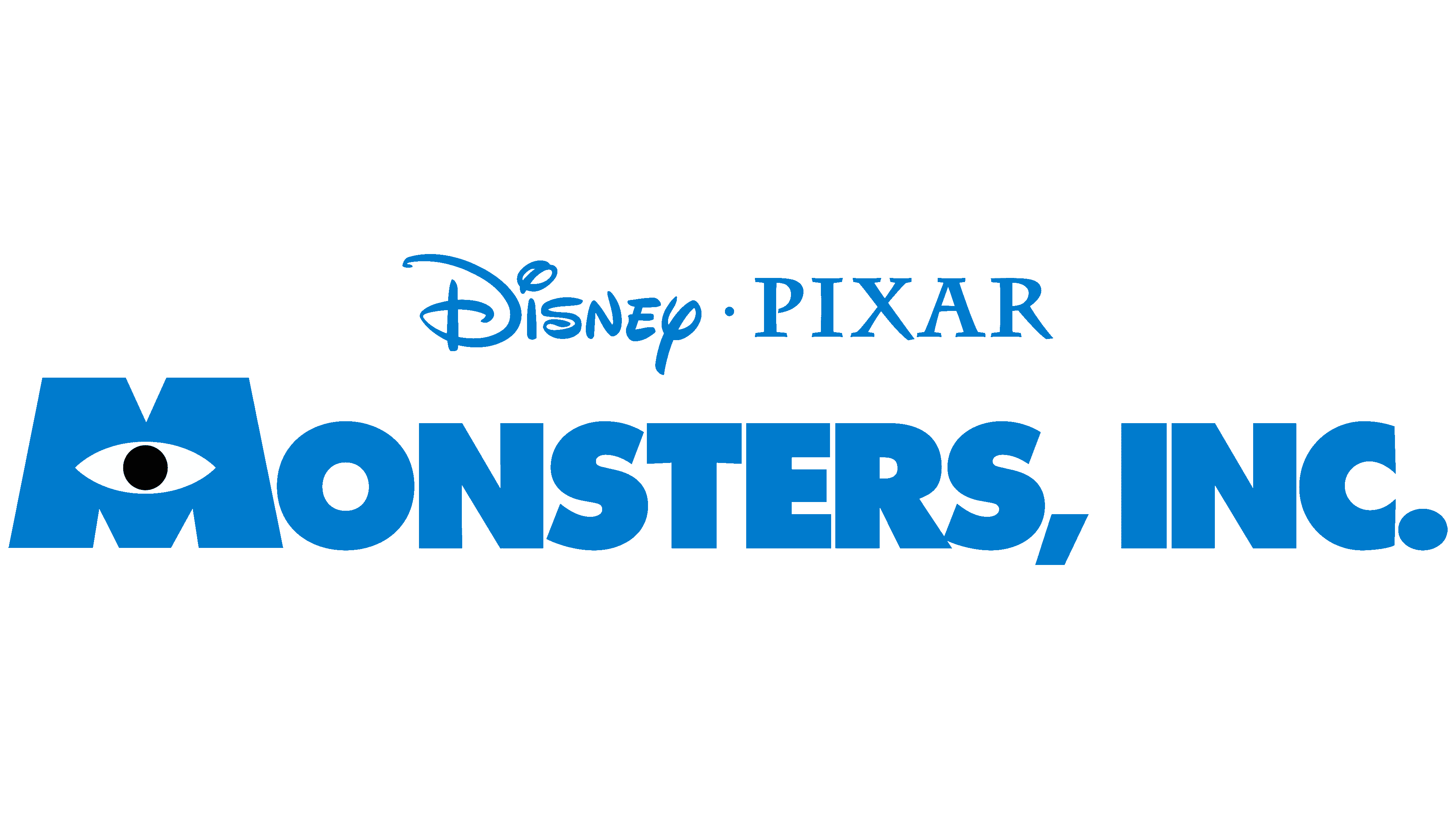
The inscription “MONSTERS INC.” was coined by the cartoon’s creators. Then, Jens R. Ziehn created the free, non-commercial font Monster AG. He focused on bold, angular letters without serifs.
All logo elements are blue except for the white eye with a black pupil. The bright color of the name matches the monsters’ coloring in Monstropolis. The design team made the monsters colorful to visually contrast with the industrial city’s grayness. The experts chose candy-colored shades that children like, including blue.