


![]()
The state of Morelos has introduced a new logo and visual identity created by KOMMUN, a studio specializing in cultural design and urban symbolism. The updated graphics highlight the region’s connection to heritage and unity among residents. Morelos is known as an area rich in history, natural resources, and unique cultural traditions, all of which are embodied in the presented identity.
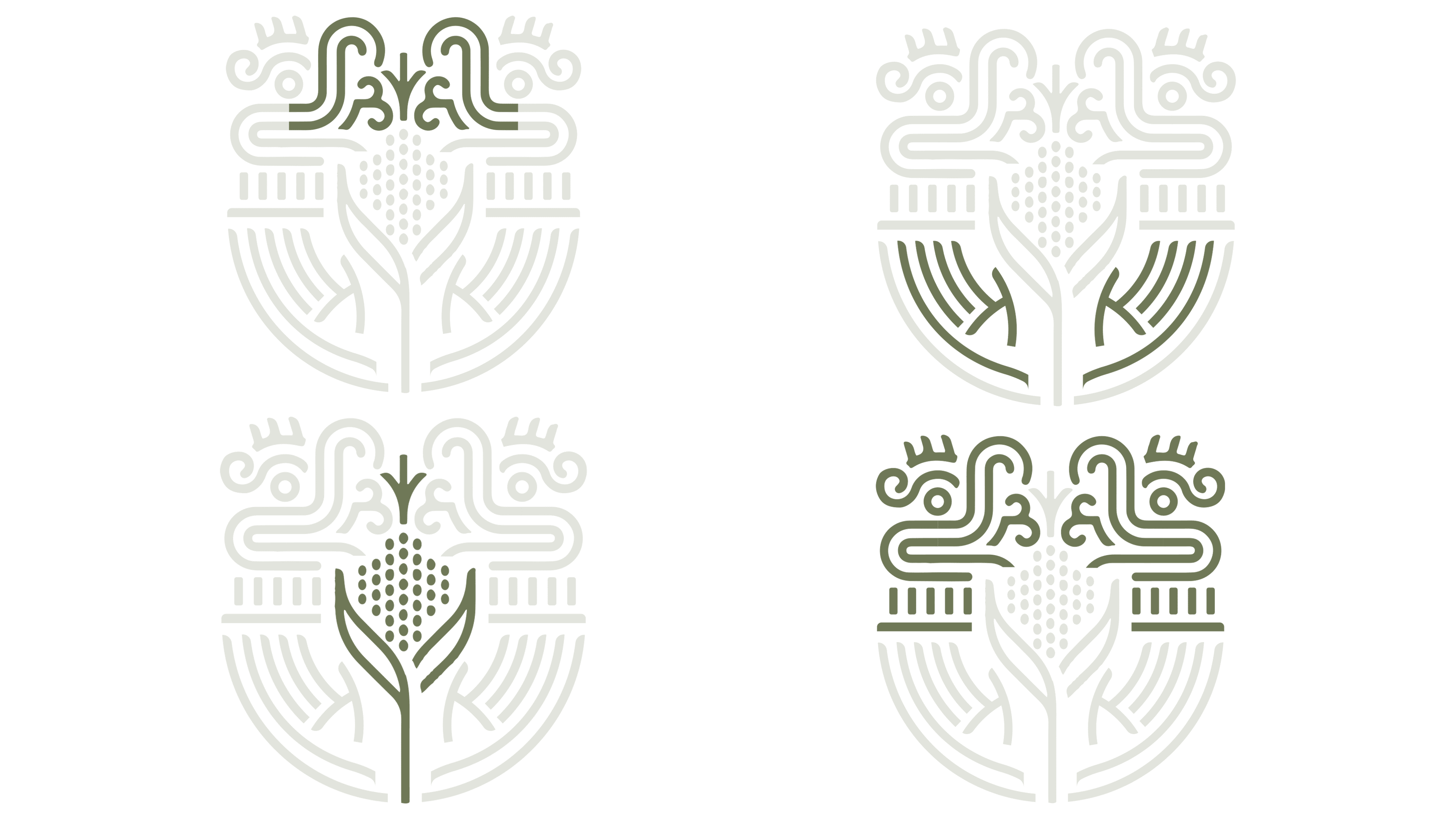
The official emblem has been entirely reimagined. The previous formal shape has given way to a more modern symbol filled with deeper meanings. At the center of the composition is now the letter “M,” the initial of the state’s name, specifically stylized and integrated with other symbols. This letter unifies the entire graphic and serves as a starting point for interpreting the remaining details.
![]()
Corn occupies a prominent place as an ancient symbol of prosperity and abundance. It represents both the agricultural strength of the region and the number 36, which corresponds to the number of municipalities in Morelos. The image also includes hands, symbolizing respect for labor, careful stewardship of the land, and concern for future generations.
A particular emphasis is placed on the figure of Quetzalcoatl, the ancient Aztec deity, whose presence in the symbolism underscores the region’s connection to ancestral wisdom and heritage. Quetzalcoatl is presented graphically and stylized without explicit ethnic detailing, preserving universal appeal while conveying cultural identity.
An important addition is the slogan “La tierra que nos une” (“The land that unites us”), emphasizing the idea of unity among all the state’s inhabitants. This phrase highlights the shared path, common goals, and the aspiration for justice, peace, and progress. Designers chose an official typeface with contemporary proportions, combining readability with respect for the historical context of Morelos.
The soft green hue symbolizes the richness of nature and the ecological well-being of the region. At the same time, the golden ochre references the fertility of the land and the richness of historical heritage. The selected palette helps the new style feel lively and welcoming.
![]()
The previous emblem, although historically significant, was less comprehensible and perceived by the population as overly formal and detached from everyday life. KOMMUN’s new design makes the graphics open, friendly, and accessible to a broad audience.
The identity communicates the state’s core ideas: unity among its people, respect for traditions, and a clear vision for a shared future. The resulting style feels like a vivid reflection of the region, seamlessly blending history, culture, and modernity into a harmonious visual image.