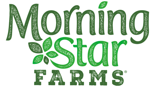
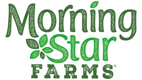
MorningStar Farms logo serves as a fitting representation of its mission to provide meat substitutes for vegetarians and vegans. The emblem features plant-based motifs, and the brand name is presented in three centered lines with varying shades of green. Green leaves appear beside the letter “S,” transforming it into a winding branch, while another leaf replaces the dot over the “i.” The elements of the logo are not fully colored in but feature numerous small white spots.
Green, the dominant color in the design, is directly associated with nature and eco-friendliness. Different shades of this hue evoke growth, health, and sustainability, perfectly encapsulating the brand’s focus on plant-based nutrition. This choice of color ensures that the logo resonates with the target consumer base, making a strong statement about commitment to natural and sustainable food options.
The brand name is divided into three centered lines, contributing to a sense of balance and symmetry. This adds a visual appeal while emphasizing the brand’s core values of harmony and well-being. The typography’s varying sizes and shades of green indicate diversity, suggesting a wide range of plant-based food products that cater to different tastes and dietary needs.
The leaves are essential to the design, transforming ordinary alphabets into nature-inspired characters. By turning the “S” into a winding branch and placing a leaf over the “i,” the emblem visually narrates the brand’s story. It conveys the conversion process of plants into nourishing, flavorful meat substitutes. MorningStar Farms makes this transformation seamless, and the logo effectively encapsulates this metamorphosis.
The small white spots scattered across the logo elements are intriguing. These spots break the monotony of the green, creating an impression of light filtering through a canopy of leaves. This signifies the brand’s transparent approach to food production, reinforcing the idea of purity and natural ingredients.
The logo is a harmonious blend of color, typography, and symbolism. Its thoughtful design elements perfectly align with the brand’s core values and mission. It succeeds in communicating a message of health, sustainability, and plant-based nutrition, underlining the brand’s status as a dependable choice for those pursuing a vegetarian or vegan lifestyle.
MorningStar Farms: Brand overview
| Founded: | 1974 |
| Founder: | Kellogg’s |
| Headquarters: | United States |
| Website: | morningstarfarms.com |
MorningStar Farms came into existence in 1974, initially operating as a subsidiary of Worthington Foods, which itself was an offshoot of Miles Laboratories. A year after its inception, the company ventured into the meat substitute market by launching a range of frozen, soy-derived meatless products. These were made available in American grocery stores, exposing U.S. consumers to soy as an alternative to animal-based meats.
In a significant business move in 1999, Kellogg’s acquired Worthington Foods and the MorningStar Farms brand. Under the aegis of Kellogg’s, the brand sustained its momentum in developing plant-based foods. New additions to the product line included items such as meat-free chicken nuggets, sausages, and various burger alternatives.
A notable shift in MorningStar Farms’ approach came in 2019 when the company proclaimed its intent to make all products entirely vegan by 2021. This was to be achieved by eliminating egg whites from the existing recipes. Despite this ambitious pledge, the complete vegan transition had not been accomplished as of the end of 2022.
Today, MorningStar Farms maintains its prominence in the realm of plant-based meats. Although it faces a growing pool of rivals, it remains the highest-grossing meatless burger brand in the United States.
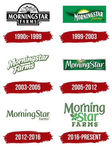
Meaning and History
1990s – 1999
1999 – 2003
2003 – 2005
2005 – 2012
2012 – 2016
2016 – today
MorningStar Farms color codes
| Fern Green | Hex color: | #3f6b35 |
|---|---|---|
| RGB: | 63 107 53 | |
| CMYK: | 41 0 50 58 | |
| Pantone: | PMS 349 C |
| Pigment Green | Hex color: | #14a937 |
|---|---|---|
| RGB: | 20 169 55 | |
| CMYK: | 88 0 67 34 | |
| Pantone: | PMS 354 C |
