The Mortal Kombat logo introduces the participant to the world of martial arts and hand-to-hand combat through amazing creatures that hold power and the secret of ancient techniques. The emblem looks mysterious and magical, with elements of formidable grandeur.
Mortal Kombat: Brand overview
| Founded: | 1992 |
| Founder: | Midway Games |
| Headquarters: | U.S. |
The Mortal Kombat franchise is based on a series of video games of the same name, the essence of simulating hand-to-hand combat. The first multiplatform game from this line appeared in 1992. It was created based on a retro arcade game developed specifically for the coin-op and later served as an inspiration for comics, TV series, cartoons, films, and other media products.
Those who have never played Mortal Kombat have probably seen its logo at least once – the head of a black dragon inside a circle. The original symbol appears in some battle arenas and is used in several MK movies. But dragons themselves are rarely mentioned. These mysterious characters appear before gamers as wild predators from Outworld. They can control different elements, although this is not known for certain because users for the entire game have the opportunity to meet only three representatives of the legendary race.
Meaning and History
It is believed that the Elder Gods from Mortal Kombat can transform into dragons when they transform into their true form. Such imagery occurs periodically throughout the video game series. This means that the logo partially overlaps with the plot, although it does not reveal it, leaving room for imagination. The formidable mythical creature is used as the main symbol of MK because of its mysteriousness and because of the qualities that it represents: courage, fury, strength, fighting spirit, and desire to win.
What is Mortal Kombat?
The Mortal Kombat series of video games in the action-adventure genre and the fighting game became the basis for the franchise of the same name. Numerous films and cartoons have been shot based on it, novels and comics have been written, theatrical performances, and online gambling have been created.
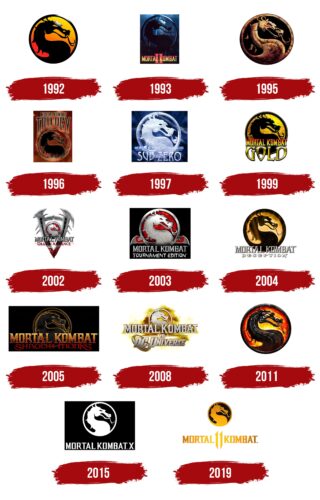
1992
The legendary black dragon on a fiery background appeared exactly this year and has always remained on the franchise logo since then. Only his environment changed, but not himself. A round medallion with a wide frame depicts a mythical creature with a forked tongue and empty eye sockets. The top of the circle is yellow, the bottom is red, and they mix to form an orange glow in the middle. The gradient is smooth and soft, without sharp transitions. The dragon’s silhouette is graceful – curved, with wavy strokes, which, however, does not prevent it from instilling a threat.
1993
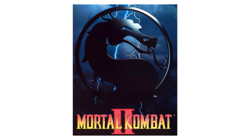
This year’s logo variant retained the previous contours and received new ones. A round sign with a curved dragon is placed in the center of a vertical rectangle. Moreover, it became dark to convey the oppressive atmosphere of the game’s plot. The elements of intimidation are flashes of lightning, thunderclouds, gray smoke, and dark blue, which are widely present in the emblem. Hope for good is given by a shining reflection in the forehead and eyes of a mythical creature. Below it is the inscription “Mortal Kombat” and the background number “II.” They have colored yellow-red with a gradient.
1995
The 1995 logo has a completely different style. It has a 3D design with a rocky texture that makes the sign look like it was carved out of marble. Even the roughness of the relief with dark spots is visible. The black background and the precise distribution of the shadows make it so. The dragon is the same: large, intimidating, with a protruding tongue, spikes protruding along the back, and with curved lines. The feeling of fear adds to the realism of the mythical animal and its burning red eye.
1996
The next modification brought a black silhouette of a dragon on a red brick background with flames rising up. Above the circle appeared the inscription “Trilogy,” which directly says: this is the logo of the third part of the game. The name is located at the top and is typed in capital letters with small serifs. The whole composition is in a vertical rectangle.
1997
A year later, the icy visual identity of the video game was born because the story takes place in extremely frosty conditions. This is evidenced by the addition to the title of the fourth part – “Sub Zero.” The inscription is designed accordingly: it is white with a bluish gradient and sharp serifs. The emblem, as before, is voluminous. It exactly matches the style of cold and looks like a figure made of ice. The background of the dragon is a black and blue square with a white trace of a blizzard.
1999
The name of the series, “Mortal Kombat Gold,” of course, is sustained in golden color. A black dragon on a yellow background looks very impressive and conceptual. The inscription is superimposed over a circle with a mythical creature. It is textured, bright, and convex.
2002
A few years later, a computer game dedicated to the Alliance appeared, as indicated in its title. The disc with the dragon is scaled down and placed inside a large V stylized as a melee weapon with spikes. Blood is dripping from the tip of the letter (at the bottom). The background of the mythological creature is painted in the same red color, and it is depicted in a metallic texture.
2003
In this episode of the game, the cold metal in the emblem has been preserved. It still decorates the dragon, making it an impregnable element. Not only is it metalized, the frame surrounding it and the side elements resemble a cutting tool. The background is the same everywhere – blood red. There are two inscriptions in the logo: they are located on two levels and are located under the round sign. The top line is typed in block type with a three-dimensional effect and backlit on the left. The word combination in the bottom row is made in careless letters with a cut edge – each character looks like it was cut with a sharp object. All components are placed in a black square.
2004
The 2004 logo again took on a round shape. The dragon seems to be illuminated from below, as evidenced by the rays directed upwards. He himself is black, as is the frame surrounding him. The background is yellow with a gradient. The lettering is white. The top line is completely taken over from the previous emblem. The lower one is typed in a font with wide and pointed letters.
2005
A year later, the drawing style of the Mortal Kombat logo changed: a vertical black rectangle appeared, a large yellow inscription, and under it, a small red one. The name is so large that it overlaps the lower part of the dragon. By the way, the background on which it is placed is now darker than before. The yellow color is preserved in the form of a smoky stroke around the perimeter of the black silhouette.
2008
The video game Mortal Kombat grew into something grandiose, which was immediately reflected in the identity. As a result, the emblem became light, but with a large-scale smoke screen in the background. Thin lightnings penetrate the yellow, olive, and brown colors concentrated in it. They are on the dragon, as well as on the top inscription. The bottom line has an additional graphic element – an oval with a star. In fact, this is a circle, but due to the diagonal arrangement, it is visually displaced, so it seems to be an oval.
2011
The 2011 logo has an updated design that, at first glance, has nothing in common with the previous one. However, the commonality is still preserved – in the dragon, which is again used to refer to the popular franchise. The designers enlarged the medallion with the mythological animal, added a shell-like texture to it, and moved it away from the edge to lengthen the spikes and make them into sharp curls slightly. The forked tongue also became thinner and more elegant. The eye glows with golden light reflected from a yellow-red background. The edge is wide, voluminous, and black. There are no inscriptions on the emblem.
2015
After the release of the next part of Mortal Kombat, the logo became monochrome and restrained. The white silhouette of a dragon in the same white circle is in a black rectangle, along with the franchise’s name. The inscription is strict, lowercase, with needle serifs at the ends of the letters. Next to it is the issue number – X.
2019
The latest part of the landmark video game is back with a golden logo representing passion, fire, confrontation, and high voltage. At the same time, not only the dragon in the frame is painted yellow, but also the inscription located under it. However, the color is not solid – it is a gradient. On the icon, the lightest part is the bottom, and in the title, it is the central one. The dimming goes to the right and to the left from the number “11” to the extreme letters.
Mortal Kombat: Interesting Facts
“Mortal Kombat” is a famous video game series since 1992. Ed Boon and John Tobias made it.
- How It Started: The game first came out in 1992 and was made by Midway Games. After Midway had financial troubles, a new company called NetherRealm Studios took over, with Warner Bros. looking after the game now.
- Fatalities: The game is known for its Fatalities, which are powerful moves to finish off opponents. These moves made the game very popular but also caused some debates because they were very graphic.
- Ratings for Games: Because “Mortal Kombat” had a lot of violence, it helped create a group in 1994 that decides age ratings for video games. This was to make sure games had warnings about their content.
- Characters: The game features many characters, such as Scorpion, Sub-Zero, and Liu Kang, each with a story and special moves.
- More Than a Game: “Mortal Kombat” isn’t just a game anymore. It’s also movies, TV shows, comics, and even live shows. There’s a movie from 1995 that fans like.
- Secrets in the Game: The first Mortal Kombat game had hidden characters and secret fights, like one with a character named Reptile, which made players want to explore the game more.
- Different Kinds of Games: In addition to fighting, there are adventure games that tell more about the characters’ backgrounds, like “Mortal Kombat: Mythologies: Sub-Zero.”
- Realistic Graphics: “Mortal Kombat” was one of the first to use real actors to make the characters look more realistic, unlike other games at the time.
- Story Matters: The 2011 game Mortal Kombat started focusing heavily on the story, making it more like a movie with detailed plots and character growth.
- A Big Deal: “Mortal Kombat” is a big part of gaming and pop culture. Sayings like “Finish Him!” and the dragon logo are well-known.
Overall, “Mortal Kombat” has made a big mark on video games with its cool characters, story, and unique finishing moves.
Font and Colors
The original graphic sign of Mortal Kombat is made in a red-yellow-black palette. The dragon here looks like a shadow, which indicates its elusiveness. The artists depicted the head on an elongated neck, making the only visible eye transparent. The curved lines give the picture a dynamic feel.
Because of the dragon’s curved neck, the emblem is associated with Taijitu, an ancient Chinese diagram that consists of two interlocking spirals. This divided circle has been popularized in Western culture as a “yin-yang symbol.” It represents a combination of two opposites, harmoniously complementing each other.
However, in the Mortal Kombat logo, the right side of the circle is empty. The black dragon is contrasted with the bright red and yellow space. The designers used such a contrast to make the character visible. And the colors can also symbolize its fiery element, so that a simple white background would be inappropriate.
There are several variations of the logo with additional elements. The main version contains only a dragon without inscriptions, so there is no talk of fonts. The color palette is more varied: the dragon and the edging ring are colored black, and the space inside the circle is colored red and yellow. Moreover, the last two colors are presented in several shades that smoothly flow into one another. The gradient symbolizes fire and passion. By the way, the dragon’s long tongue also looks like a flame, and this coincidence is no coincidence.
FAQ
What does the Mortal Kombat symbol mean?
The symbol, featuring a dragon, represents the Elder Gods in their purest forms. This imagery adds depth and mystique to the brand’s universe.
The dragon symbol appears throughout the series in various game arenas. This emblem is instantly recognizable to fans and players, symbolizing strength, power, and the ancient, mystical elements in the storylines.
The dragon symbol is in the movie adaptations, reinforcing its iconic status and creating an immersive experience for fans. This emblem unifies the franchise, connecting different versions of Mortal Kombat.
What is the Mortal Kombat font?
The 1992 arcade hit Mortal Kombat used the Comix font. This font appears in many parts of the game, such as the main title screen, before and after each round, and during character bios and endings. Comix’s bold and dynamic style fits well with the game’s intense atmosphere.
Using the Comix font helped create a consistent look across different game elements. It added to the nostalgia for players who remember the original arcade version. The design of Comix complements the action-packed nature of Mortal Kombat, enhancing the experience for players. The brand established a unique visual style that resonated with fans by choosing Comix.
Who created the MK logo?
John Tobias, one of the creators of Mortal Kombat, designed the brand’s dragon logo. He shared the development process on Twitter, where he worked with Ed Boon.
Tobias posted his first sketch of the design. His sister thought it looked like a seahorse, and he almost discarded the sketch. The dragon design became a powerful and iconic symbol recognized by fans everywhere.
The dragon logo now embodies the mystical and powerful elements of the game’s universe.
What does the Mortal Kombat logo mean?
The dragon on the Mortal Kombat emblem represents the Elder Gods from the game’s mythology. The dragon’s head sits inside a circle divided into two parts, similar to the Yin and Yang symbol. This design highlights balance and duality.
The emblem signifies strength and power, reflecting the mystical and ancient themes in the game’s story. The dragon icon is a defining feature of the brand, easily recognized by fans and players. It captures the essence of Mortal Kombat, blending mythology and martial arts.
Who is the blue guy in Mortal Kombat?
In Mortal Kombat, the most famous character in a blue suit is Sub-Zero. He leads the Lin Kuei assassin clan and is known for his ability to control ice, which is called cryomancy.
Sub-Zero appears in many games in the series and plays a key role in the story. In the original game, his name is Bi-Han. Later, his younger brother Kuai Liang becomes Sub-Zero after Bi-Han becomes Noob Saibot. Sub-Zero’s icy powers and rivalry with Scorpion are central themes in the series.
As a member of the Lin Kuei, Sub-Zero is skilled in martial arts and assassination techniques. His blue suit and mask are iconic, making him easy to recognize. Although the character’s design and abilities have changed, he remains a powerful ice warrior. Sub-Zero is one of the most popular and enduring characters in the franchise.
Are there dragons in Mortal Kombat?
There are dragons in Mortal Kombat, but they are very rare. Only three known dragons are in the series. These dragons play important roles in the brand’s lore.
One notable dragon is Onaga, known as the Dragon King. He once ruled the Outworld before Shao Kahn overthrew him. Onaga is powerful and aims to reclaim his throne, serving as the main antagonist in the series.
Blaze is another dragon-like character in Mortal Kombat. While not a traditional dragon, Blaze has draconic traits and fire-based abilities. He is an elemental warrior and plays a key role in the events leading to Armageddon.
The final dragon is the iconic symbol itself, representing the Elder Gods. This dragon appears in various forms throughout the games and media adaptations. It is central to the brand’s visual identity, symbolizing the ancient and mystical elements of the game’s universe.
These rare dragons add depth to Mortal Kombat’s mythology, giving fans intriguing characters and stories.
What is the dragon mark in Mortal Kombat?
The dragon mark in Mortal Kombat is a symbol representing the Elder Gods. This mark is central to the brand’s mythology, signifying ancient and powerful beings that influence the events in the Mortal Kombat universe.
The dragon mark appears as a tattoo-like emblem on chosen warriors, indicating their selection to participate in the Mortal Kombat tournament. This mark is a key element in the storyline, as a sign of destiny and power. It connects the characters to the larger narrative involving the Elder Gods.
The design of the dragon mark, featuring a dragon head within a circle, echoes the iconic logo. This connection reinforces the mark’s importance and ties to the brand’s identity. The presence of the dragon mark on characters creates a sense of unity and purpose, linking them to the themes of strength, honor, and combat.
