


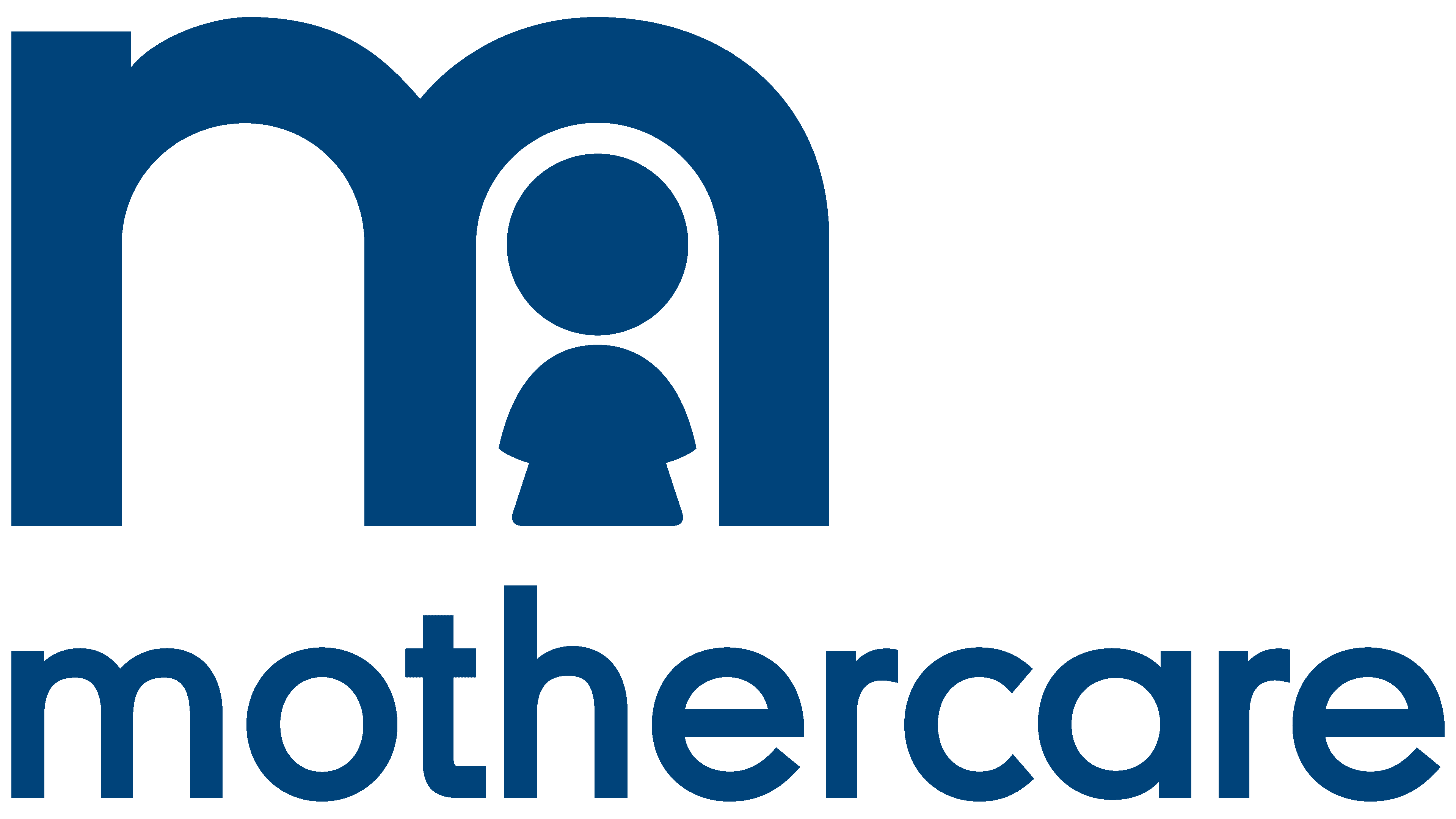
![]() Mothercare Logo PNG
Mothercare Logo PNG
The simplicity and conciseness of the emblem show that there is nothing superfluous in stores, only things that are indispensable for caring for a child. The symbols with which the Mothercare logo is filled, like warm motherly hands, radiate care and love.
Mothercare grew from an idea Selim Zilkha found in France. In the late 1950s, he visited Prénatal, a chain for pregnant women and young mothers, and saw a format Britain lacked. His first attempt, through Lewis and Burrows, lost £180,000 in two years. In 1960, he sold it and bought W.J. Harris, a 50-store chain for prams and nursery furniture.
Zilkha closed half the stores, renamed the rest Mothercare, and reshaped the offer around mothers and children up to age five. The first Mothercare store opened in Kingston, Surrey, in 1961. It sold maternity wear, children’s clothing, furniture, prams, and baby food under one roof.
The early years were difficult, but the arrival of Barney Goodman in 1963 changed the business. In 1964, Mothercare introduced a computerized ordering and distribution system, which was rare in retail at the time. International growth began in Denmark in 1968, followed by Switzerland, Norway, Germany, Austria, the Netherlands, and Belgium. In 1972, the company floated on the London Stock Exchange with 139 stores and £3 million in pre-tax profit.
In 1981, Zilkha and Goodman sold 423 stores to Habitat plc for £50 million. Later came Habitat Mothercare plc, Storehouse plc, and the closure of the loss-making U.S. business in the 1990s. Mothercare became independent again in 2000, bought “Early Learning Centre” in 2002, and had 1,060 stores worldwide by 2009. The U.K. business then weakened under pressure from Next and other rivals. “Early Learning Centre” was sold to The Entertainer in 2019, all U.K. Mothercare stores closed, and from mid-2020, Boots began selling Mothercare products in stores and online.
Meaning and History
![]()
Emigrant Selim Zilkhe, having arrived in England in 1960, immediately saw a niche in the market for selling goods for pregnant women. And in 1961, with financing from billionaire James Goldsmith, he opened the first store. Great demand allowed for seven years to develop a network of up to 100 outlets. After merging with Hobitat in 1982, Zilkhe sold his stake and left England. But this did not affect the company’s fate. The brand underwent several important mergers and, by 2000, had taken a leading position among its partners, prompting the holding company’s renaming to Mothercare Plc.
The brand logo has been updated three times, each time retaining blue hues and the chain’s name. Major upgrades have been associated with mergers and company expansions.
What is Mothercare?
Mother and child stores have existed in the UK since 1961. Franchised in 40 countries and managed by Boots since 2019.
1945 – 1985
![]()
The idea for the first logo proved very successful and immediately attracted customers’ attention. However, the business was not typical for England; it was the first such store.
The name with the stylized letter M is used as an emblem. The name of the company itself informs about the sale of goods for children and expectant mothers. The translation of Mothercare is “care for the mother,” and when written separately, “maternal care.” Therefore, the logo has no other signatures indicating the direction of activity.
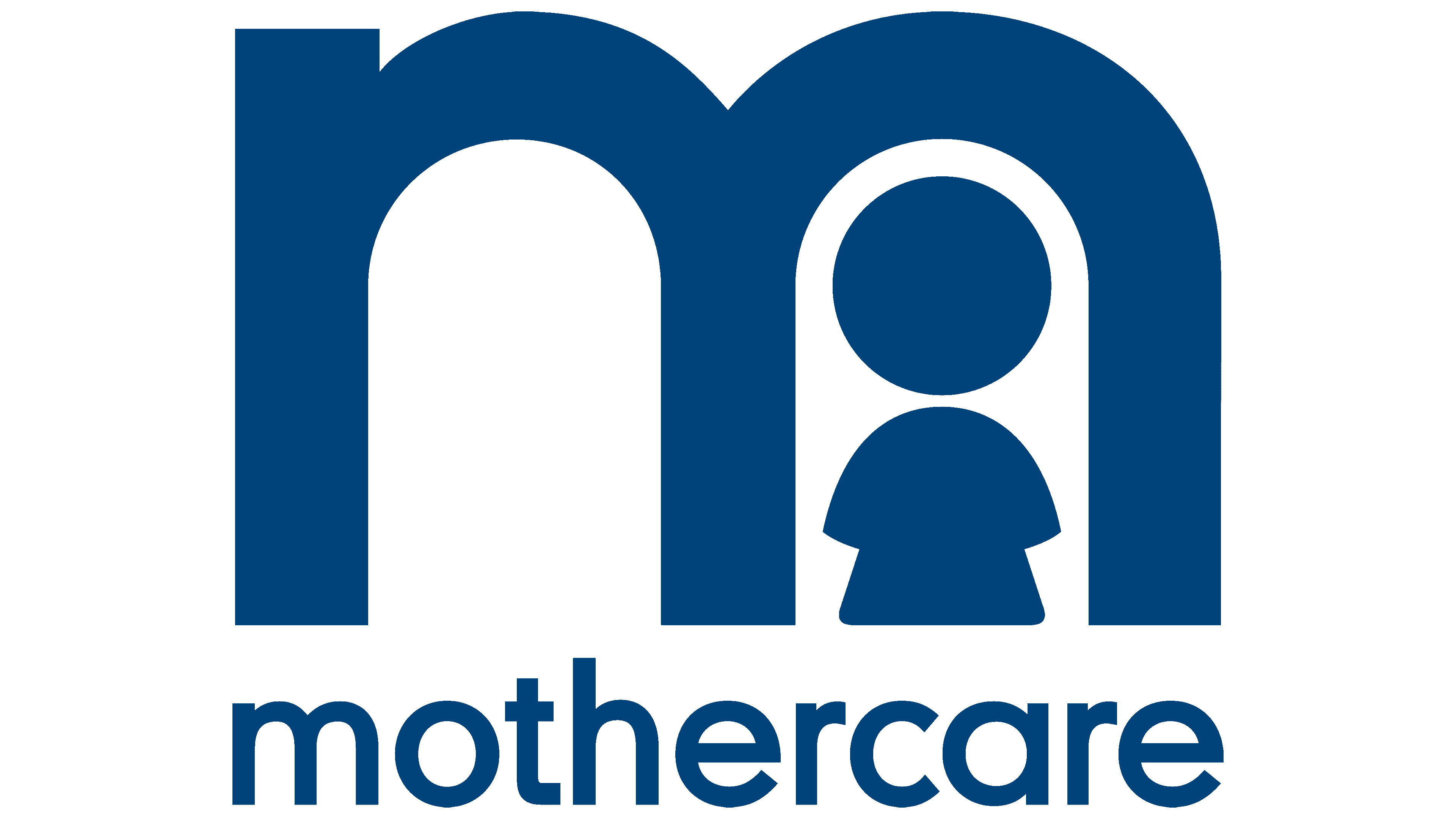
The idea of care and protection is also reflected in the first capital letter of Mazekey, stylized as a capital “m,” with a small man inside one of its arches. The image simultaneously symbolizes the baby in the womb and the newborn in the mother’s arms. The child is hidden from all adversity, covered with a dome of maternal love.
As a sign of its particular concern for mothers, the company began mailing merchandise the year after the store opened to help women who had trouble getting out to shop.
1985 – 1994
![]()
In 1982, the management company merged with the large furniture chain Habitat (Habitat Mothercare plc). This expanded Mazekey’s capabilities, and from 1984 the retailer began opening branches abroad as franchises.
The brand logo was simplified, allowing franchisees to design stores to their liking. The new visual badge consisted of a simple inscription in dark blue: Mothercare. The name’s translation told consumers what kind of goods the store offered. The lack of images and features made the visual mark poor and uninteresting. The only nice touch is the smooth rounding of the letter ends. They added softness and friendliness.
1994 – 2009
![]()
Storehouse, a company formed by the merger of Habitat Mothercare plc and British Home Stores plc, has been reorganized into three divisions led by David Dworkin. He sold some of the brands, including Hobitat. And for Mazekeya, which has become the central brand of its Specialty Retailing division, he carried out a rebranding.
The new logo looked rich and reflected the company’s international expansion. For the first time in history, the emblem received a background: an oval with tapered edges. It symbolized the globe. The softly rounded shape complemented the name, reminiscent of a caring hug.
Unlike the usual blue tone, the updated emblem is presented in Viridian Green (a green with blue undertones). The color of the sea wave evoked a sense of calm and symbolized the birth of new life.
The letters of the name and the edging, placed some distance from the edge, were painted white. Its purity is the personification of innocence, newborn, good thoughts, the beginning of a journey, and a hint of an updated company strategy.
2009 – today
![]()
In 2009, the company acquired the Internet network for expectant mothers, Gurgle, with 100,000 users. The brand needed an image of an expert who could provide competent advice and respond to the needs of young parents. Therefore, the modern logo returned to its roots and borrowed a security element from the first emblem, a baby in the arch of the letter “m.” This provided the company with a friendlier visual image. It focused on the experience’s long history and ensured the brand’s memorability. The small pictogram in the modern logo is not part of the name; it appears as a separate image beneath the Mothercare inscription. It helps to mark brand publications on the Internet, providing recognition.
Starting in 2017, the number of stores in England declined, and in 2019, the company went bankrupt and was taken over by Boots for 10 years. All shops have closed. Goods are sold through Boots points. However, the sale of Mothercare franchises to other countries continues.
Font and Colors
Various shades of blue are used for all company logos:
- Delicate “childish” blue appeared in the first version of the emblem. This is the color of childhood, dreaminess.
- Dark blue communicates the company’s experience and inspires confidence.
- The color of the sea wave reflects the depth and tranquility. The sea is the birthplace of life. The combination of blue (dreams) and green (life) embodies desires and aspirations.
- Astronomical blue, the color of the modern emblem, conveys calmness, order, a sense of global scale, and balance.
The logo font corresponds to DIN Neuzeit Grotesk Pro.