A gust of fresh air has swept through the outdoor apparel industry as Mountain Hardwear has unveiled an updated brand identity. Founded in 1993 in Austin, Texas, this powerful brand began as a dream of passionate outdoor enthusiasts and quickly achieved global reach. Mountaineering icon Ed Viesturs played an important role in the brand’s formation. Through his unrivaled expertise and collaboration, Mountain Hardwear gained an edge by emphasizing its superior quality and connection to the mountaineering elite.
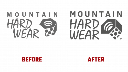
Three decades later, in 2023, the evolution of the brand continues. In collaboration with prestigious Brooklyn-based design house Gretel, Mountain Hardwear has unveiled a new face for the brand. The new Mountain Hardwear logo elegantly blends distinguished heritage and modernity. The emblematic geometric logo, which has been an integral part of the brand since its early days, is now in the form of a symmetrical, adaptable square.
A crucial aspect of the brand’s visual transformation is its subtle typography. Through a collaboration with the SuperContinente foundry, the Hardwear typeface has undergone a metamorphosis. Drawing on Roger Excoffon’s iconic “Mistral,” the team distilled its essence while enhancing its modern appeal. The term “Mountain” that complements the font is custom-made, reinforcing the logo’s synchronicity.
Gretel’s skill was evident in the creation of the “Hardwear” typeface, reflecting Mountain Hardwear’s commitment to resilience and precision. The typeface, reminiscent of 19th-century wooden typography, harmonizes rugged exterior elements with delicate interior elements. With SuperContinente’s input, every nuance of the typeface has been honed to reflect the spirit of the Mountain Hardwear brand.
The complementary fonts Quadrant Text and Mono subtly echo cartographic prints and topographical annotations. These subtle nuances complement the dominant Hardwear font, creating a rich tapestry of rugged elegance. The synergy of these elements creates a compelling image of strength and sophistication.
Central to this epic rebranding is a carefully crafted family of custom fonts. Each symbol, chiseled with precision, evokes the brand’s iconic nut-shaped emblem, imbuing it with industrial energy and emphasizing the promise of longevity. The versatility of the font collection promises adaptability, delivering a cohesive brand voice across channels.
The bright yellow palette becomes a beacon in the brand’s visual narrative. This bold choice sets Mountain Hardwear apart in the marketplace, symbolizing its craving for adventure. The brand utilizes dynamic typographic configurations to drive momentum, providing a pulsating modern feel.


