


 Mountain Hardwear Logo PNG
The Mountain Hardwear logo is a unique corporate identity that stands out for its style and depth of meaning. It reflects the brand’s core values and key aspects. The logo conveys the confidence of people who prefer outdoor activities. Symbols, signs, and text elements harmonize, creating an image of uniqueness and fearlessness. A glance at the logo evokes images of mountains, rushing river streams, and outdoor adventures. These associations lead the mind toward high-quality recreation, which is not always associated with calmness and tranquility. The focus is on gear, the most crucial element that determines the quality and safety of the journey. This is exactly what the logo communicates.
Mountain Hardwear has always guaranteed comfort and safety, even in extreme conditions. The manufacturer ensured that travelers conquering snowy peaks would stay warm and cozy in Mountain Hardwear gear. In addition, great attention was paid to the products’ appearance; the clothing was easily recognizable by its distinctive design and style, characteristic of this brand.
Today, Mountain Hardwear continues to follow traditions and stay loyal to its customers. The brand supports the desire for adventure, and the logo reflects all the main aspects of its activity. The modern identity embodies a rebellious spirit, fearlessness, readiness for any challenges, and, of course, the originality of the products. The logo declares: “Your adventure will be incredible and unforgettable!” The brand does everything to ensure this promise is fulfilled with every purchase.
Mountain Hardwear was founded in 1993 in Richmond, California, by Paul Krumholz, Jack Gilbert, Mike Wallenfels, Hap Klopp, and Ty Whitbeck. The founders had previously worked at The North Face. They drew on their experience in outdoor retail to create a company focused on technical equipment for climbers, mountaineers, and other demanding outdoor users.
The first product range consisted of three sleeping bags and four tents. Early attention came from professional climbers, who valued the gear’s construction and functional details. In 1994, Mountain Hardwear released its first apparel collection, which included technical jackets designed for severe weather and alpine conditions. In 1995, the company patented Conduit, a breathable waterproof membrane designed to protect against moisture during active use.
In 1997, the Trango tent became one of the brand’s best-known expedition products. It gained a place in high-altitude climbing and appeared in trips to some of the world’s highest peaks. In 2001, Columbia Sportswear acquired Mountain Hardwear for $36 million. The acquisition gave the company wider market access and stronger resources, while product development and marketing remained autonomous.
During the 2000s and 2010s, the brand expanded its technical catalog. OutDry waterproof technology appeared in 2004, followed by Q.Shield Down in 2009, the Ueli Steck Signature Series in 2011, and the 20th anniversary in 2013. Ghost Whisperer insulation arrived in 2015, followed by a logo redesign in 2018. In 2019, the company developed the Ghost Whisperer project and introduced the lighter Trango 2 tent. Later updates included climbing apparel in 2020, Stratus insulation and new backpacks in 2021, Gore-Tex Pro outerwear in 2022, and lighter Ghost Whisperer down jackets in 2023.
Meaning and History
What is Mountain Hardwear?
This Richmond, California-based company manufactures high-performance outdoor clothing and gear. It is known for its technical clothing, tents, sleeping bags, and backpacks, and specializes in outdoor sports gear, including rock climbing, mountaineering, and trekking. The brand’s products are popular with outdoor enthusiasts, mountaineers, and explorers because they are designed to withstand harsh conditions. The company uses the latest materials and technologies to create durable, portable, and useful gear.
1993 – 2023

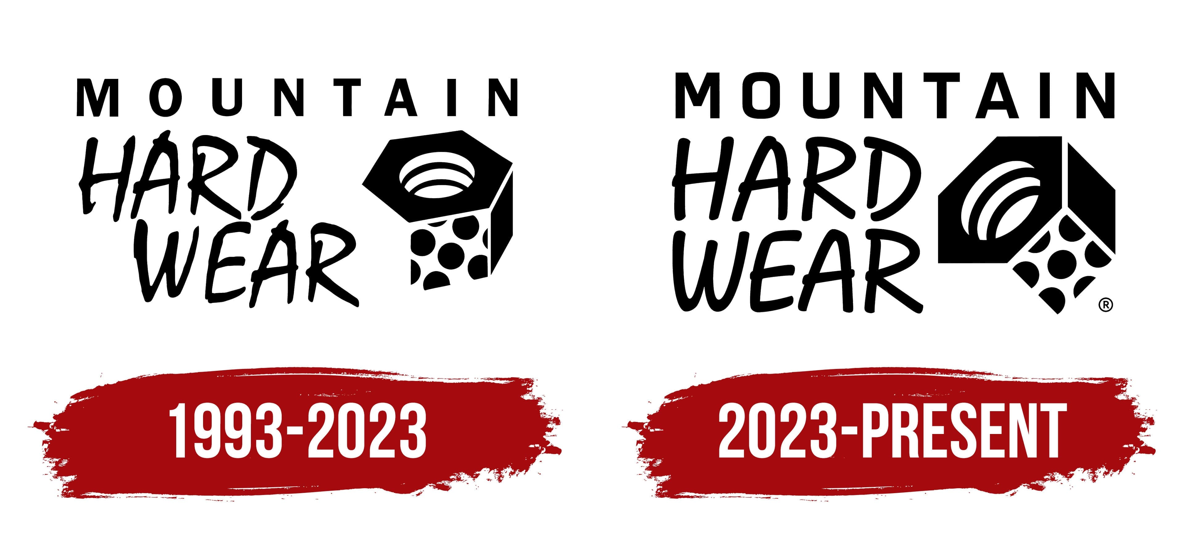
The first Mountain Hardwear logo was presentational and carried high expectations. It was meant to highlight the unique features of the innovative products and convey fresh motives and the brand’s originality. In this identity, no element stands out as the main one; each drawing, text, and symbol plays an important role.
The word “Mountain” evokes admiration and associations with absolute freedom. All the letters are capitalized, elegant, and possess a touch of aristocracy. Double spaces between the letters make the word highly readable, giving it grandeur and scale, and aligning with the brand of the new outdoor-gear segment. Mountain Hardwear’s products were unique, provided protection and comfort, and became a key to a great experience.
On the left, the phrase “Hardwear” stands out in a separate part of the logo. This word is written in two rows, with all letters in superscript, giving it identity, dynamism, and a subtle sense of grandeur. The font is distinctive, and because of this, the eight letters bring remarkable liveliness to the logo.
The graphic element deserves special attention, as it is meticulously detailed and parallel to the word “Hardwear” at the same level. This element symbolizes the strength of metal, absolute reliability, and high product quality. The design conveys the brand’s core values and priority directions, emphasizing that Mountain Hardwear is not just gear but a guarantee of confidence in the most extreme conditions.
2023 – today
The logo was rebranded in 2023 to enhance its presentability and highlight the unique features of Mountain Hardwear’s products. The updated identity looks expressive and modern, though the changes were minimal. The main elements, such as the design and text, were retained.
Three key differences can be noted. First, the words are closer together, and all text elements are larger and more expressive. Although the fonts were changed, all the words remained original. The spacing between the capital letters of the first word, which is at the top of the logo, was reduced, giving it a smoother, clearer look.
The serifs in the letters were replaced with rounded edges, which gives the logo a softer appearance. The word “Hardwear” is now perceived as a symbol of confidence, lighting the path to success. The sharpness of this word is emphasized by the use of classic black on a contrasting white background, making it bold and significant.
The graphic element in the new identity became more prominent, with added shading and tonality, and its angle was adjusted. These updates were intended to emphasize the brand’s stability in the market, which successfully achieved trust from the target audience, and sales grew.
Today, the logo is authentic, clearly reflecting two priority aspects: the high quality of the products, which makes outdoor activities enjoyable, and the brand’s attention to product variety, allowing everyone to find the perfect gear and equipment.