


 Lanvin Logo PNG
The Lanvin logo undoubtedly stands out for its stylish, modern appearance, reflecting the elegance and refined beauty of every piece from this legendary fashion house. The charm of women’s attire played an important role in shaping the brand, and every element reflects this history, highlighting its uniqueness. Every woman’s look is unique, and the company’s products, whether bags, perfumes, or clothing, are also distinguished by their individuality. The visual symbol, created in a minimalist style, conveys classic accents, but behind this outward simplicity lies a deep authenticity. A
Lanvin began in Paris in 1889, when 22-year-old Jeanne Lanvin opened a small millinery shop on Rue du Faubourg Saint-Honoré. After the birth of her daughter Marguerite in 1897, she began making children’s clothes that attracted wealthy clients. The shift from hats to clothing led the house into haute couture, and in 1909 it joined the Chambre Syndicale.
The 1920s became a major period of expansion. Lanvin was known for pastel tones, detailed embroidery, lowered waists, and long-skirted robes de style. Its first fragrance line appeared in 1924, followed by My Sin and Arpège in 1927, created for Marguerite’s 30th birthday. Menswear, lingerie, fur and home decoration were added during the 1930s.
After Jeanne died in 1946, Marguerite took control. The company passed through several owners after she died in 1958 but continued producing couture and perfume. Its centenary was marked in 1989. Alber Elbaz became creative director in 2001 and updated the collections for a younger market while retaining draped dresses and eveningwear. A 2010 collaboration with H&M broadened public exposure, before Elbaz left in 2015.
Fosun International acquired a controlling stake in 2018. Bruno Sialelli became creative director in 2019, combining archive references with newer silhouettes. During 2021 and 2022, the house expanded e-commerce, social-media marketing, accessories, and fragrances. By early 2023, ready-to-wear, perfume, and leather goods remained the main categories.
Meaning and History
What is Lanvin?
This is the oldest French designer label still in operation, serving as a prime example of Parisian elegance and refinement in luxury fashion. Known for its craftsmanship and attention to detail, it has developed a unique style that blends modernity with classic sophistication. The brand’s collections feature elegant yet strong silhouettes adorned with intricate details and made from luxurious fabrics. In addition to haute couture and ready-to-wear clothing, the brand offers accessories, fragrances, and even children’s clothing, all maintaining the brand’s distinctive aesthetic. Fans appreciate its evening gowns and iconic ballet flats, symbolizing French style and refined luxury.
1924 – today

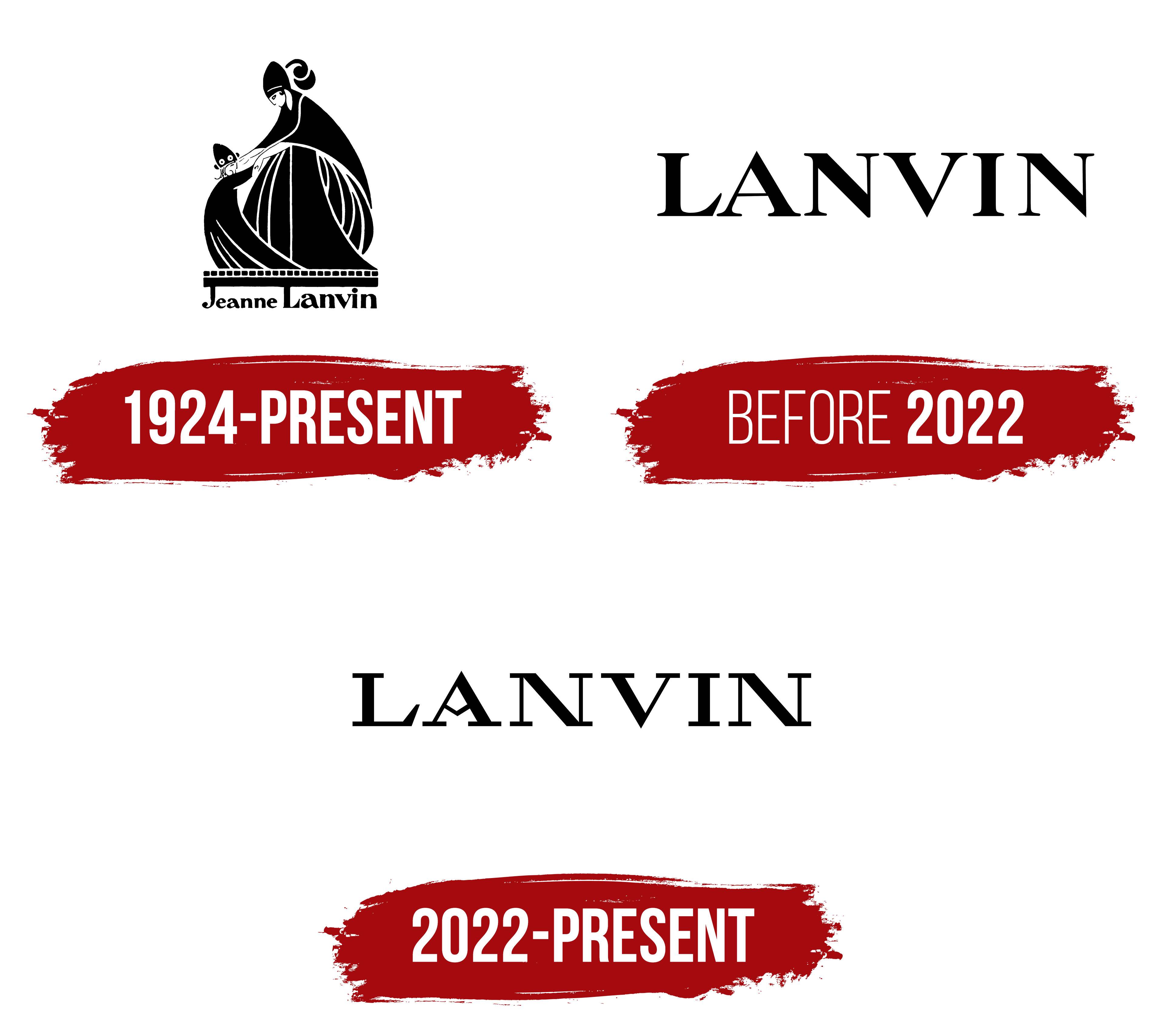
A mother and daughter facing each other and holding hands became Lanvin’s emblem. The image draws on Jeanne Lanvin’s family history. The clothes she made for her daughter, Marguerite, took her Paris millinery business in a new direction, and a photograph of the two later inspired the logo. The illustration commemorated a relationship that shaped the fashion house and associated its founder’s name with maternal love.
Lanvin’s surname had served as the business name since its early years. In 1889, the 22-year-old milliner Jeanne Lanvin opened a workshop on Rue Boissy d’Anglas in Paris. Four years later, the business moved to 22 Rue du Faubourg Saint-Honoré. The sign read “Lanvin (Mademoiselle Jeanne) Modes,” identifying the owner by name and indicating her trade with the word “Modes.” The house later used two versions of its name, “Jeanne Lanvin” and “LANVIN.” The shift from the full name to the surname accompanied an expanding product range. After starting with hats, the business gradually branched out into clothing.
Marguerite was born in 1897. Jeanne made clothes for her, then began receiving orders from the mothers of her daughter’s friends, who wanted similar outfits for their children. Lanvin opened a children’s department in 1908, followed a year later by departments for young women and women. The clothes Jeanne made for her daughter laid the groundwork for the house’s collections, directly connecting the mother-and-child image to its origins.
The emblem was based on a photograph taken at a costume ball in 1907. In the picture, Jeanne and Marguerite face each other and hold hands, wearing coordinated costumes. Illustrator Paul Iribe turned the scene into a drawing, preserving their poses and positions relative to one another. Beginning in 1924, the image appeared on Lanvin stationery, boxes, and labels. The family scene introduced customers to the origins of the collections. At the same time, packaging and garment labels carried the tribute to the founder’s daughter.
Iribe combined black silhouettes, outlines, and white lines. Jeanne’s taller figure bends toward Marguerite as her daughter reaches up to her, their joined hands connecting the two halves of the drawing. Their full skirts form a rounded base. Within the dark areas, light strokes distinguish the sleeves, suggest folds in the fabric, and define sections of the costumes. The faces are rendered with just a few strokes, leaving gestures and clothing to convey the family scene. In adapting the photograph, Iribe retained the silhouettes and details that captured the interaction between mother and daughter.
In the full version of the emblem, the figures stand above a row of small rectangles and a thick horizontal bar. The name “Jeanne Lanvin” appears below. The elongated capitals “J” and “L” reach up to the base of the illustration, connecting the name to the image. The lowercase letters combine rounded forms with varying stroke weights. The surname takes up most of the lettering and is larger than the first name. The vertical arrangement resembles a vignette in a book, with the illustration and lettering forming a unified composition. In the later “LANVIN” wordmark, the surname stands alone; in the full-name version, it remains part of the family scene.
The drawing was adapted to the curved surface of a perfume bottle designed by Armand-Albert Rateau. Gold silhouettes of the mother and daughter adorned a black glass sphere. The materials and colors preserved the figures’ outlines, while their faces and costumes were rendered in simplified form. In 1927, the bottle became associated with Arpège, a fragrance created for Marguerite’s 30th birthday. By then, she was known as Marie-Blanche de Polignac. The fragrance’s name referred to arpeggios and her musical pursuits. Both the image and the musical reference continued the tribute to the founder’s daughter.
Blue had a separate history at Lanvin. Jeanne admired the paintings of Fra Angelico, and the shades of blue in his Florentine frescoes inspired her experiments with fabric dyes. The resulting color became known as Lanvin Blue. Another name, “bleu Quattrocento,” linked it to 15th-century Italian art. Blue appeared in the house’s clothing, packaging, and fabric labels. On a surviving woven label from the Sybille suit for summer 1935, the emblem appears in blue against a white background.

Letter-based marks continued to accompany the family scene throughout Lanvin’s history. The house used a “JL” monogram drawn from Jeanne Lanvin’s initials, and Jules-François Crahay developed a version in the 1970s. The angular connections between the letters allowed the monogram to form a repeating pattern. The mother-and-daughter image remained in use alongside the monogram and surname. On the label of a dress from the fall/winter 1970-1971 season, the figures appear above “LANVIN.” The black illustration is woven into ivory satin. Decades after the emblem’s introduction, the family scene remained on the house’s labels.
before 2022
Lanvin’s 2001 update shifted the focus to the founder’s surname. By then, the house was known for clothing, shoes, accessories, and fragrances, and customers associated the name with luxury, high quality, and individual style. The founder’s surname formed the brand’s wordmark. The name maintained a link to its heritage, while the restrained lettering suited the brand’s established image.
Until the 2022 update, the logo consisted of six uppercase serif letters. Heavy vertical and diagonal strokes alternated with thin connecting lines. Gentle curves joined the serifs to the main strokes, softening the letters’ formal outlines. The letters were evenly spaced, with stroke weights ranging from fine to heavy. The primary version featured black lettering on a white background. Some versions included a smaller line reading “PARIS” below, with generous spacing between the letters. Traditional serifs and ample space around the name gave the logo an elegant appearance.
Lanvin continued to use its historic emblem for anniversary celebrations. In 2014, for the house’s 125th anniversary, Iribe’s drawing was combined with the number 125 and the brand name in uppercase letters. The mother and daughter appeared at the top, followed by the anniversary number and “LANVIN.” A line at the bottom included the dates 1889 and 2014 and the word “PARIS.” The number and dates marked the anniversary of the house’s founding, while the family scene retained its original meaning. The anniversary logo brought the historic illustration together with the wordmark.
For the house’s 130th anniversary in 2019, Bruno Sialelli revisited another version of the name. He brought the handwritten “Jeanne Lanvin” signature, associated with the founder’s earliest collections, into the anniversary collection. Sialelli used Iribe’s drawing alongside the signature. For fall/winter 2019, the mother-and-daughter scene appeared on fabric. The image was rescaled and turned into a repeating pattern, preserving the figures’ poses and joined hands.
Sialelli’s next exploration of the house’s heritage focused on the “JL” monogram Crahay had developed in the 1970s from Jeanne Lanvin’s initials. In the spring/summer 2022 collection, presented in June 2021, the letters took on a three-dimensional appearance. Their construction suggested an architectural structure, and repeated versions formed patterns on clothing, Le 22 bags, and luggage. The surname, handwritten signature, family emblem, and initials all maintained a connection to the founder. They identified the brand and decorated fabrics and accessories.
2022 – today
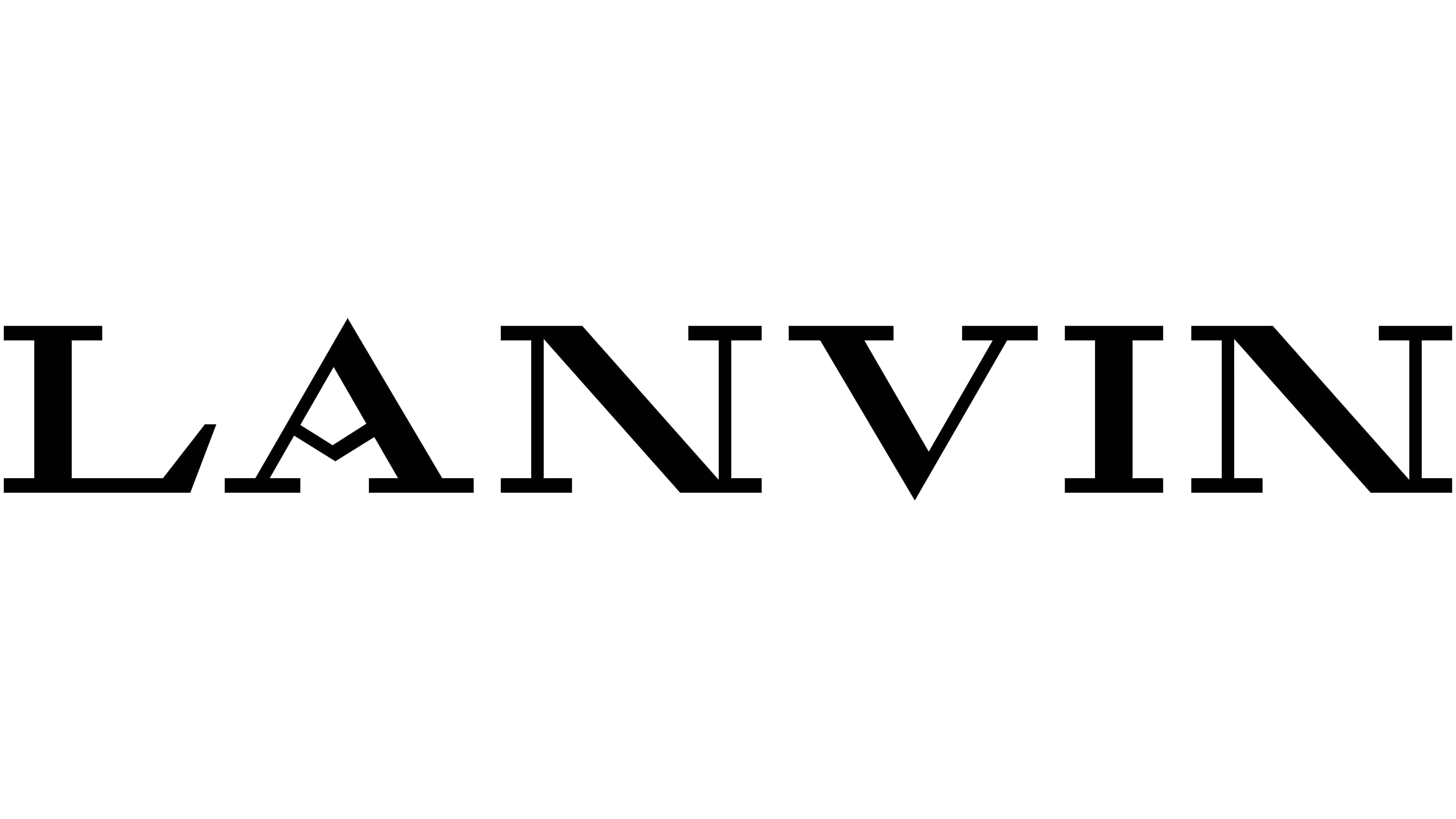
A powder compact from the 1940s in Lanvin’s archives provided the starting point for the logo update in November 2022. Its lettering gave the studio M/M (Paris) a basis for redrawing the surname. Michael Amzalag and Mathias Augustyniak worked on the project at Siddhartha Shukla’s request, who proposed revisiting the house’s archives to reassess its logos and emblems. The compact’s inscription brought historic letterforms into the brand’s contemporary identity. Along with the wordmark, the designers reworked the mother-and-child emblem, reducing the number of lines.
The logo inherited an unusual “A” with an angled bend in its crossbar from the archival reference. Instead of running horizontally, the line bends within the letter. The uppercase serif lettering remained, but the terminals became sharper, and the contrast between thick and thin strokes increased. The triangular terminal of the “L” echoes the angles of the “A” and “V.” Compared with the previous version, transitions between letter sections became more abrupt. The primary wordmark now consisted of “LANVIN,” with the lines “Paris” and “1889” removed.
Pascal Zoghbi developed an Arabic version of the Lanvin wordmark in 2023 in collaboration with M/M (Paris). His study of Thuluth and Eastern Kufic scripts helped align the Arabic lettering with the thick and thin strokes of the Latin wordmark. Zoghbi preserved the structure of the Arabic letters while incorporating features of the updated “LANVIN.” The intersecting initial letters lam and alif reference the bent crossbar of the “A,” the triangular form of fa echoes the “V,” and the terminals correspond to the lower stroke of the “L.” Diamond-shaped diacritical dots complement the angular outlines. A thick horizontal stroke runs along the base of the wordmark, connecting to thin vertical and diagonal lines. Stroke proportions and the shapes of individual components establish a relationship between the two versions while respecting the differences between the writing systems.
An updated Lanvin Blue appeared on the house’s boxes and shopping bags in September 2025 through a collaboration between Lanvin and M/M (Paris). The development of the saturated blue continued Jeanne’s history of color experimentation at the Nanterre dye workshop, where 23 shades of blue had been developed. Peter Copping incorporated the new shade into accessory linings and trim for the fall/winter 2025 collection. Its use on packaging and inside products connected the brand’s contemporary identity to the history of Lanvin Blue. The return to the archives, which began with letterforms, continued through color.