


 Diadora Logo PNG
The Diadora logo emphasizes the brand’s global reach and commitment to athletic achievements. The emblem embodies the company’s drive for its customers’ success, whether in football or tennis, and promises high performance. Additionally, the visual mark highlights the clothing design’s creativity and uniqueness, offering an unconventional approach to sports fashion. This symbol represents the brand and conveys its philosophy, combining sports innovation and a dedication to style, making Diadora products popular among sports enthusiasts worldwide.
Marcello Danieli founded Diadora in 1948 in Caerano di San Marco, Italy. The company began with mountain boots for skiers and climbers, and Danieli personally tested new models in demanding conditions. During the 1950s, production expanded into tennis and other sports footwear, widening the business beyond its alpine roots.
Football boots entered the range in the 1960s and gained use among professional players and Italian teams. In the 1970s, Diadora opened offices across Europe, enlarged distribution, and began sponsoring prominent athletes. Its 1978 partnership with Björn Borg brought the name to a wider international tennis audience.
During the 1980s, the catalog grew to include apparel and accessories. At the same time, Diadora became an official supplier to Italy’s national athletics team. In the 1990s, investment in footwear technology produced the Net Breathing System for improved ventilation and comfort. The company marked its 50th anniversary with a special collection in 1998.
Italian holding company LIR acquired Diadora in 2007 and began restructuring the business. The Heritage line launched in 2009 with retro models based on 1970s and 1980s designs. During the 2010s, limited releases, designer collaborations, and new performance technologies expanded its sports and fashion lines. An anniversary collection appeared in 2015, while online sales, international distribution, and footwear and apparel continued to grow in key markets through 2023.
Meaning and History
What is Diadora?
This Italian company, specializing in sportswear and footwear, has carved out a unique niche in the sports fashion sector. Known for combining Italian design with cutting-edge technology, it creates gear for sports such as cycling, running, tennis, and soccer. The company has a long history of craftsmanship, with many of its high-quality products still being made in Italy. Athletes and fashion enthusiasts appreciate its designs, which often incorporate retro elements and vibrant colors. The brand is well-known for its tennis and soccer shoes, which many elite athletes choose.
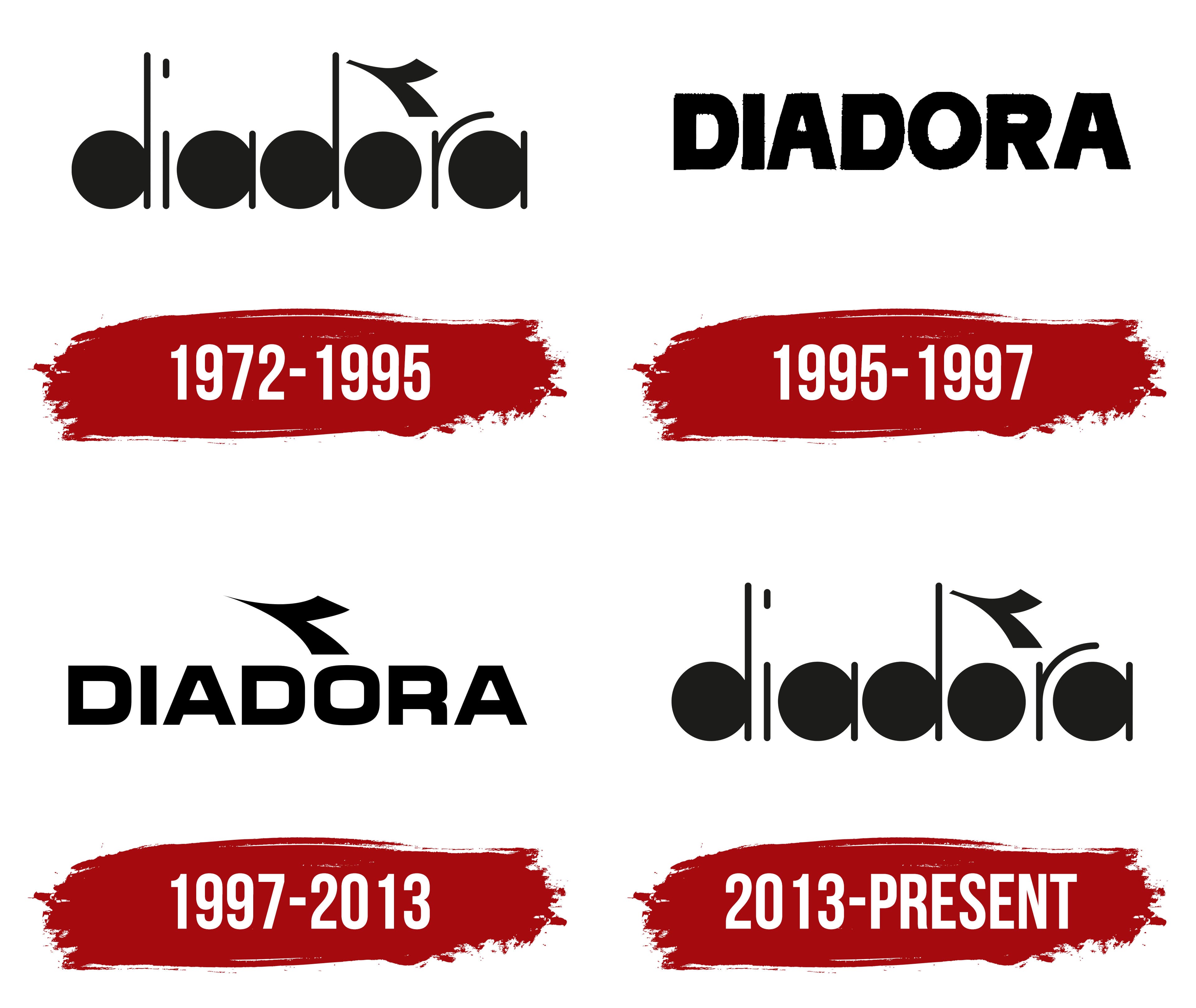
1972 – 1995

The manufacturer’s logo is unusual and original, appearing 20 years after the brand’s founding. The rounded elements of each letter are designed as solid black discs, evoking associations with balls or shot put. This design element hints at one of the company’s key areas, the production and commercialization of soccer balls. The brand has actively promoted, advertised, and sold them since the 1970s, which likely inspired the creation of this emblem.
Diadora produces tennis balls in addition to soccer balls, and this business direction is reflected in the logo. The other elements of the letters are designed as thin lines of varying heights, reminiscent of bars, rods, or the nets of soccer goals and tennis tables. The balls seem to have hit the target and remain still, symbolizing accuracy and success.
The name Diadora may derive from the Italian expression “de Iadera,” associated with the ancient name of a city in Dalmatia. The schematic depiction of an airplane taking off above the letter “O ” provides additional dynamism. This element emphasizes the brand’s global ambitions and international sales, adding a sense of movement and progress.
1995 – 1997

The authentic, original lettering in the logo was replaced with simple, bold black letters that appeared in the mid-90s, when the brand began to focus on selling athletic footwear. During this period, celebrities promoting the products started releasing their lines of boots under the Diadora name. The thick, sturdy letters symbolize the products’ popularity and reliability, emphasizing their durability and quality.
The slight asymmetry of the characters gives the logo a sense of movement, directly linked to the footwear’s purpose of providing comfort during constant activity and of withstanding increased demands. The font evokes Diadora’s original, functional shoe design, which remains a key brand feature.
1997 – 2013

In the new logo, the brand aimed to combine the original elements of its heritage with a modern, confident design. The letters became thinner while retaining their uppercase to emphasize the company’s achievements and prestige. The narrow glyphs evoke associations with the lightness and agility of products focused on sports apparel and footwear.
The return of the airplane symbol represents the brand’s desire to further develop and expand its presence in the global market. This decision highlights the brand’s ambition to make high-quality products accessible to people worldwide, regardless of their location.
2013 – today

After joining Geox, the Diadora brand returned to its roots, sharpening its focus on uniqueness and on finding its core idea. The logo reflected the desire for modernization while remaining true to the traditions of high craftsmanship and innovative approaches. This change highlights the balance between tradition and innovation, which helps the brand remain competitive in the sports apparel and footwear market.
The Diadora logo looks fresh and original due to its simplicity and interesting details. The rounded, clear letters give it a sense of lightness and dynamism, creating the impression of movement, as if it “spins like wheels.” The font is compact, with an emphasis on rounded shapes.
A distinctive feature is the elongated vertical lines of the letters “d” and “a,” creating a harmonious balance between stability and dynamism. These elements emphasize the brand’s effort to blend reliability and energy, which was relevant when the company gained popularity by offering sports footwear and stylish items for an active lifestyle.
The black color underscores its versatility and strictness. This shade, combined with minimalist shapes, makes the logo sharp and confident, conveying a sense of stability and reliability.
The Diadora emblem reflects a time when sports became a full-fledged lifestyle.