Mountain House has long been a trusted name for delicious and convenient freeze-dried meals for outdoor enthusiasts. As a leader in this category, the company has fueled many adventures with hearty and reliable meal options. With a growing demand for flavorful meals, the brand tasked a creative team to elevate its packaging while maintaining its established identity.
The new packaging design places the meals at the forefront, creating a cohesive look across various packages. The redesign focuses on showcasing the deliciousness of the meals, using mouth-watering imagery that captures the essence of each dish. This approach highlights the taste appeal and aligns with the company’s reputation for great-tasting meals.
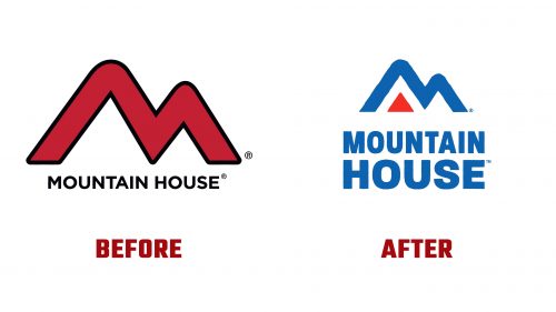
The new logo retains classic elements, ensuring brand recognition among long-time customers. The wordmark uses a modern sans-serif typeface for readability and a contemporary look. The bold and clean letters reflect the firm’s strength and reliability. The color palette includes earthy tones like deep greens and browns, evoking natural environments. These colors are complemented by vibrant accents highlighting the flavors and ingredients.
A notable feature of the new packaging is visual cues that evoke the spirit of adventure and exploration. Elements such as wood grain textures, trail blazes, and illustrations reminiscent of National Park posters create a nostalgic connection to outdoor adventures and inspire customers to embark on their journeys.
The brand partnered with Maxwell to revamp their website, aligning it with its new packaging and identity. The website blends the thrill of outdoor exploration with the convenience of online shopping. The design is simplified and intuitive, making it easy for customers to browse and purchase meals. High-quality images of the meals enhance the overall taste appeal and ensure a seamless transition from the packaging to the digital experience.
The redesign extends to all marketing materials, ensuring a consistent brand presence. The new visual identity is applied across all touchpoints, from brochures and banners to social media posts and email campaigns. This comprehensive approach reinforces the company’s position as the tastiest and most reliable meal option for outdoor adventures.
The rebranding effort underscores the firm’s evolution from a provider of packaged meals into a catalyst for delicious adventures. By centering drool-worthy dishes on the packaging, the brand connects with new customers while renewing its reputation among existing fans. The new identity honors the brand’s legacy while embracing the future of outdoor dining.
The new packaging and brand identity successfully elevate the meals’ taste appeal and capture the spirit of adventure. The design brings the food to the forefront, ensuring the meals look as delicious as they taste. The visual elements inspired by nature and exploration create a cohesive, inviting brand that resonates with seasoned adventurers and newcomers.


