


 M&S Logo PNG
The M&S logo possesses a unique visual beauty. Minimalism and simplicity are unusually combined in the “Marks & Spencer” brand identity, giving the emblem an elegant, restrained feel. It conveys the store chain’s primary idea of reliability, emphasizing its stability. The brand name is rendered in a strict and graphically expressive style. The large symbols convey strength and solidity, implying that the text element is fearless and resilient, unaffected by time or circumstances.
The brand identity is executed in a monochrome palette, with no unnecessary elements. It is dominated by a classic style, except for one symbol presented in a modern format with a unique visual addition. Overall, the visual mark reflects the brand’s philosophy, emphasizing its complete commitment to tradition and stability in its development.
Marks & Spencer began in Leeds in 1884, when Polish-born Jewish immigrant Michael Marks opened a market stall using the slogan “Don’t ask the price, it’s a penny.” In 1894, he partnered with Yorkshire cashier Tom Spencer, creating Marks & Spencer. By 1900, the company operated 36 stores across northern England, and in 1903 it became a limited company.
The business listed on the stock market in 1926 and gradually replaced market stalls with modern shops. During the 1930s, it introduced a returns policy and expanded into food, building customer trust. Wartime bombing and rationing damaged stores and restricted supplies, but trading continued. In the 1950s and 1960s, the St. Michael clothing label supported national growth.
International stores opened in Canada and Europe during the 1970s, alongside furniture and home products. Ready meals and a company credit card followed in the 1980s. Stronger competition in the 1990s led to store redesigns and revised product ranges. The company acquired Littlewoods in 1999, expanding its food retail presence.
Restructuring shaped the 2000s, with store closures, renovations and an online shop. Philip Green’s takeover attempt failed in 2004. During the 2010s, the retailer focused on clothing and food, launched Sparks and announced store conversions in 2016. A partnership with Ocado followed in 2018. From 2020 to 2023, M&S reduced parts of its store network, strengthened e-commerce and continued reorganizing its retail operations.
Meaning and History

What is M&S?
This major British retailer with an international presence specializes in high-quality clothing and home goods. The company operates a network of stores across the United Kingdom and is represented in many countries worldwide. Known for its focus on quality and creativity, it has developed several popular in-house collections, such as Per Una’s women’s clothing line and the St. Michael brand. The company’s food halls are also particularly popular for their gourmet products, ready-made meals, and wines. In response to modern retail trends, the company has updated its online platform to make online shopping more convenient.
1930 – 1954
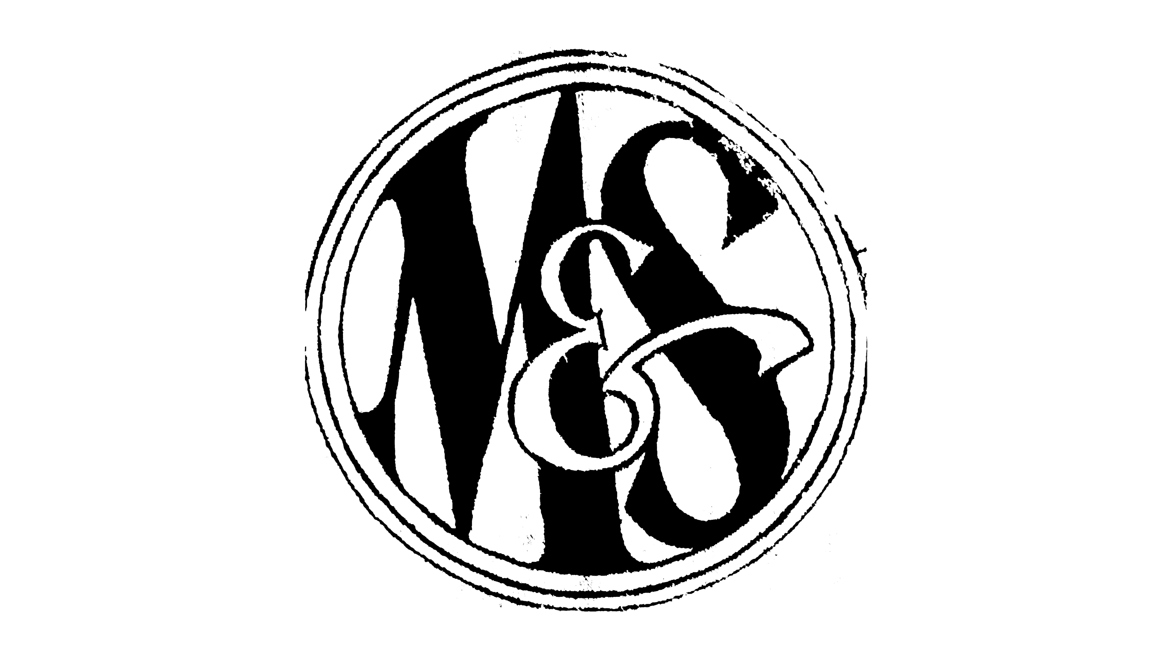
The double-contoured circle was the primary information block in the brand’s identity early on. It symbolized infinity, conceptually shifting focus to the elegant letters, enhancing their visual appeal. This geometric shape allowed the logo designers to successfully capture the audience’s attention, highlight key elements of the identity, and visually separate them.
At that time, black-and-white tones and minimalism were popular among many brands and companies, and M&S was no exception. It chose monochromatic simplicity for its identity. The primary color was white, though it was transferred from one plane to another at one point. This shift in color tone was intended to emphasize the letter “E,” which was intentionally brought to the foreground and placed at the center of the circle.
The remaining letters are rendered in rich black. The consonants forming the brand name appear presentable. Each letter carries its elegance, as an original font was selected. The flourishes and curves on the letters “S” and “E” add a touch of mystery. However, the letter “M” stands out with its monumentality and strength, conveying the company’s power and reliability.
1954 – 1975

In 1954, the logo’s color scheme was changed: light gray replaced the black tone, becoming the background that filled the entire space inside the circle. The geometric shape was retained, but its parameters were updated. The circle had only one outline, with its inner edge touching the gray background, creating a sense of unity and wholeness.
The brand name was also given a new appearance. Looking closely at the letters, one could notice that each appeared equal and significant. Previously, the vowel had held a special position, but now, the name has become more harmonious. White letters were placed on the gray background, fitting perfectly within the circle without touching its outline.
The first and last letters were equal, and “E” was a connecting element. Despite being smaller, it blended seamlessly into the composition and did not stand out from the overall design. The brand name appeared elegant and original, and the unconventional approach to letter display and the combination of straight lines and curves created clear, expressive graphic symbols.
1975 – 1988
The circle disappeared from the brand identity for the first time in many years. This change was necessary to present the full company name. Without the abbreviation, the circle would lose its impact, and introducing “Marks & Spencer” would have made the composition overly heavy if any shape were added. Therefore, the phrase shines beautifully and harmoniously against a smooth white background.
The name is rendered in black with graphic letters, and choosing the font took considerable time. The font’s beauty and elegance emphasized the company’s high status, as its popularity had significantly increased. The logo needed to resonate and look impactful to convey its importance.
Ultimately, they opted for a font with refined serifs, allowing the text to become a true work of art. The initial letters of each word stood out in a superscript position and were perceived as the main elements of the logo. The following letters, of medium size, matched half the height of the capital letters, adding a delicate proportionality. The vowels had smooth curves, creating a sense of harmony and visual fluidity. The “&” symbol was crafted expressively and matched the capital letters in scale, symbolizing the brand’s unity and shared drive toward its goal.
1988 – 2000
As it grew and expanded, the “Marks & Spencer” brand aimed to keep pace with the times. For this reason, designers believed that radical changes in the brand identity could be a way to express the company’s success and dynamism. Creating a new emblem would reflect its growth and contribute to better results, increased popularity, and a larger audience. In 1988, the company introduced a vibrant color palette into its identity for the first time.
The background remains white and uniform, but the text block takes on a sky-blue shade, which, together with the white background, creates a unique and appealing visual pairing. The letters look stylish and bold against the snowy white backdrop, adding a sense of freshness to the overall composition.
The brand name is presented in large graphic symbols: the letters are narrow yet tall, giving the text an elegant austerity. An interesting approach is that the uppercase letters barely stand out in height, just slightly exceeding the others, making the text a cohesive and harmonious element. The letters are centered in the logo and placed closely together, enhancing the sense of unity. The connecting element in the new identity does not stand out and is on the same scale as the other symbols, emphasizing the balance and integrity of the updated look.
2000 – 2007
The brand made its name bright and expressive by incorporating the “moray color” into its identity. The new logo showcases a larger scale and an original color scheme, highlighting its uniqueness.
A text block appears against a white background, featuring the two main words and a linking text, arranged interestingly. Typically, company and brand names are centered on logos, and the store chain follows this practice. However, at this point in the brand’s history, a decision was made to deviate from tradition. The words are arranged in two rows: the first row displays the bold, large letters of “Marks” and the “&” symbol, while the second row contains the word “Spencer.”
The size and height of the letters emphasize the scale and rapid growth of the store chain. All letters are large and capitalized, with forms based on a combination of both wide and narrow straight lines. The interaction of various geometric shapes creates a flawless visual effect. The emblem acquires its elegant character, reflecting the brand’s style and significance.
2004 – 2014
Clarity, conciseness, and simplicity are the three key features of modern identity. The logo remains free of excessive detail, maintaining a beautiful, cohesive look. The white background harmoniously balances the space, while the dark letters look stylish. They have perfectly even contours, with each line and element of the letters crafted thin and narrow this time. This design gives the text a sense of lightness, almost weightlessness. All letters are capitalized and in large type, emphasizing the brand’s reliability and stability.
The “&” symbol is a distinctive element that stands out noticeably from the overall color palette. The brightness used for this accent was intentional: its presence symbolized that “Marks & Spencer” had already become a globally recognized brand.
2014 – today
The modern M&S logo represents a harmonious blend of three key aspects: informativeness, aesthetics, and expressiveness. The identity of the new era seems to embody the best solutions from different periods. White is the primary color, the dominant shade highlighting the company name. The black letters appear exceptionally crisp and radiant, lending the logo a high informativeness. The font also enhances recognizability, creating a sense of gentle movement in the text. The large letters convey the company’s stability and reliability.
The absence of artistic details like curves or serifs underscores conciseness and elegance, the core meanings of this identity. The classic color scheme, combined with the letterforms, evokes associations with “Marks & Spencer” as a retailer of high-quality British goods. This brand has a captivating development history, aiming to remain at the forefront of the modern competitive landscape and affirm its place among the best in the market.