


 Saucony Logo PNG
In its modern form, the Saucony logo combines two key components: a graphic symbol and a text element representing the brand’s name. This allows it to be characterized as minimalist yet meaningful. The logo features a harmonious blend of carefully chosen colors and well-placed elements. This gives the logo a presentable appearance, ensuring its simplicity, high readability, and aesthetic appeal to a wide audience.
The brand’s identity is closely tied to the reliability and quality that underpin Saucony’s philosophy. The static nature of the text element emphasizes the company’s commitment to tradition and stability. The symbol in the logo serves as a reminder of the unparalleled comfort its shoes provide. Every detail of the logo is designed to reflect the company’s philosophy and highlight its high production standards, which, over the years, have strengthened customer trust and loyalty to Saucony.
Saucony began in 1898 in Kutztown, Pennsylvania, when Walter Snyder, Thomas Levan, William Snowden, and William Royer founded the Saucony Shoe Manufacturing Company beside Saucon Creek. Its name came from a Native American expression translated as “fast-flowing river.” The firm first made everyday footwear, then supplied children’s shoes to a local boarding school in the 1910s. In the 1920s, it entered sports footwear with football and baseball models.
Hyde Athletic Industries acquired Saucony in 1968 and shifted the business toward running shoes, research, and product development. The Hornet arrived in 1975 and gained attention from Runner’s World. Trainer 80 followed in 1979 with added support and comfort, while Jazz, released in 1983, became one of the company’s main running models during the expansion of the market.
During the 1990s, Saucony added walking and trail-running footwear. Grid technology debuted in 1991 and appeared across several models. The company marked its 100th anniversary in 1998. Stride Rite acquired the brand for $170 million in 2005, and Wolverine World Wide bought Stride Rite, including Saucony, in 2010.
EVERUN cushioning appeared in 2015, followed by the company’s 120th anniversary in 2018. Product development continued through 2020 and 2021. In 2022, Saucony introduced a new running line with PWRRUN+ cushioning. By 2023, its catalog covered road running, trail running, walking, and performance footwear after 125 years in the industry.
Meaning and History
What is Saucony?
This American athletic footwear and apparel brand is well-known in the running community. Named after a creek in Pennsylvania where it was founded, the brand has become a favorite among runners of all levels, from joggers to world marathoners. The brand is renowned for its performance-oriented sneakers, often equipped with advanced support structures and cushioning systems. In addition to sneakers, the company also offers sports apparel, trail running gear, and walking shoes. With a balance of style, comfort, and durability, the brand has gained loyal followers among runners.
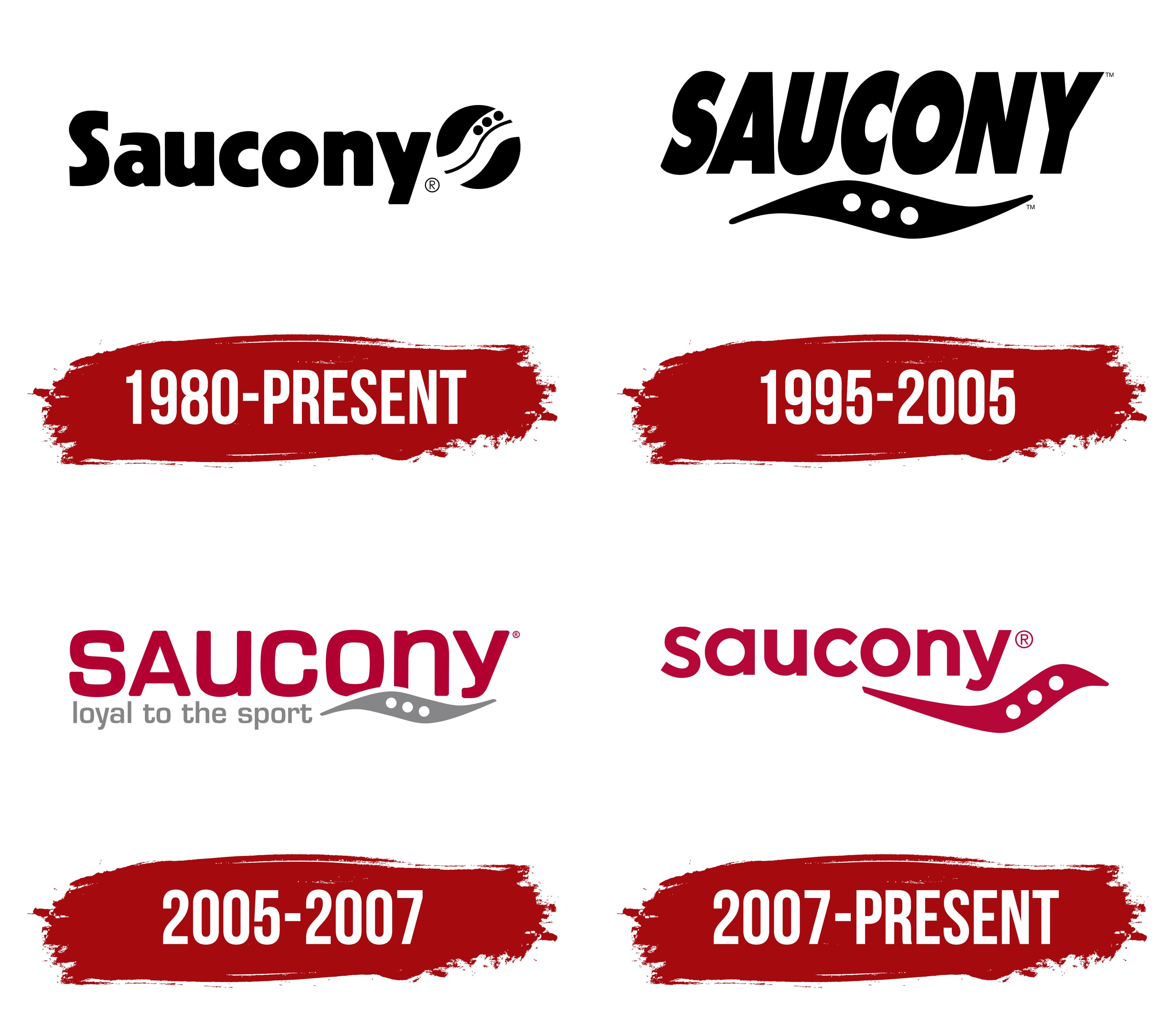
1980 – today

The company’s history dates back many years, specializing in producing high-quality, incredibly comfortable children’s footwear. The brand, founded in Pennsylvania, was initially focused on creating products exclusively for a younger audience. However, over time, its focus shifted, and Saucony began offering consumers unique products for sports and outdoor activities, suitable for both men and women. Since then, the company has remained true to its goals while expanding its sales geography far beyond America. This is what the logo reflected: it was rich in information and attracted attention with its brightness.
The 1980 branding looked aesthetically appealing and modern, particularly for its originality. The color palette was restrained, but this simplicity and the logo’s high readability took center stage and played an important role. A white background, black letters, and a distinctive circle with wavy lines made it memorable. But what exactly was the brand trying to convey by adding such an unusual symbol to the logo?
The geometric shape of the circle symbolized the brand’s rise to the peak of success, while the white wavy lines hinted at the power of water. They also resembled the flow of a river, associating with movement and progress. Three bold dots depicted on one of the waves symbolized stones, representing the company’s stability and reliability.
The company name looked unique, thanks to the chosen font. The first letter, “S,” was written in uppercase, while the other lowercase letters stood out in bold, giving the logo a sense of stability and strength.
This multi-layered symbolism and a classic color palette made the logo so expressive that its relevance remains. Even decades later, it continues to emphasize the brand’s unique style and individuality.
1995 – 2005

The company’s development and expansion of its product lines, along with the growing popularity of products under the Saucony brand, naturally required updates to its identity. However, this did not lead to a complete transformation of the logo. Rather, its style took on a more thematic direction while retaining key elements.
The color scheme remained unchanged. The white background, a distinctive hallmark of the brand, retained its smoothness and purity, emphasizing minimalism and tradition. The black color, symbolizing stability and confidence, also remained unchanged for depicting the symbol and the company name.
The primary changes affected the arrangement of elements and their proportions. The brand name now took center stage and became more prominent, appearing in large uppercase letters, which increased its impact. The font gained dynamism through italicized type, adding lightness and fluidity to its perception. Below the text, a wavy line remained dark, while the symbolic three stones, depicted as white dots, created an interesting contrast and preserved associations with natural harmony. All the changes made the logo more modern and dynamic while maintaining its recognizability and continuity of style.
2005 – 2007
The color paradigm radically changed, reflecting current fashion trends and modern design solutions. According to the creators’ vision, the logo became brighter, more expressive, and developed a unique style thanks to the new tones. When comparing logos from different periods, the only constant element that remained was the white background, symbolizing loyalty to tradition. The company name “Saucony” now shines on this background: neat uppercase letters in a rich red color align and draw attention. Elegant curves give the word a special, almost mystical charm.
The wave and stones, constant elements of the logo, also remained but were shifted to the right, positioned beneath the brand’s last letters. These three gray dots symbolize strength and stability, evoking associations with natural harmony and the timelessness of stone. They highlight the high quality of the products and their durability.
Completing the identity is a slogan placed next to the wave, emphasizing the brand’s commitment to athletic achievements. The logo’s overall color palette harmoniously ties all elements together, creating a unified, cohesive image of the brand that reflects its modernity and dedication to tradition.
2007 – today
The latest version of the Saucony logo stands out for its simplicity and elegance while carrying deep symbolism. It is done in a rich maroon, attracting attention and conveying strength and confidence. This color is associated with energy, passion, and the drive for victory, making it perfect for a brand specializing in athletic footwear.
The main element of the emblem is the name “Saucony,” written in a clear, simple sans-serif font, accompanied by a stylized wave with three circles. This wave represents Saucony Creek in Pennsylvania, where the brand was founded. The three circles symbolize the stones at the bottom of the creek, representing stability and reliability. This element serves as a reminder of the company’s roots and the unwavering quality it has maintained since its founding.
The emblem’s font features soft, rounded shapes, giving it a modern, friendly appearance. It is easily read and memorable, making the logo more attractive and recognizable. The visual mark is concise and conveys the brand’s key values: reliability, quality, and forward momentum.
This logo embodies the company’s desire to stay connected to its past while moving steadily forward. When this design was updated, the sports industry was evolving rapidly. With such a minimalist and stylish mark, the company intended to remain a market leader for many years.