![]() MSNBC Logo PNG
MSNBC Logo PNG
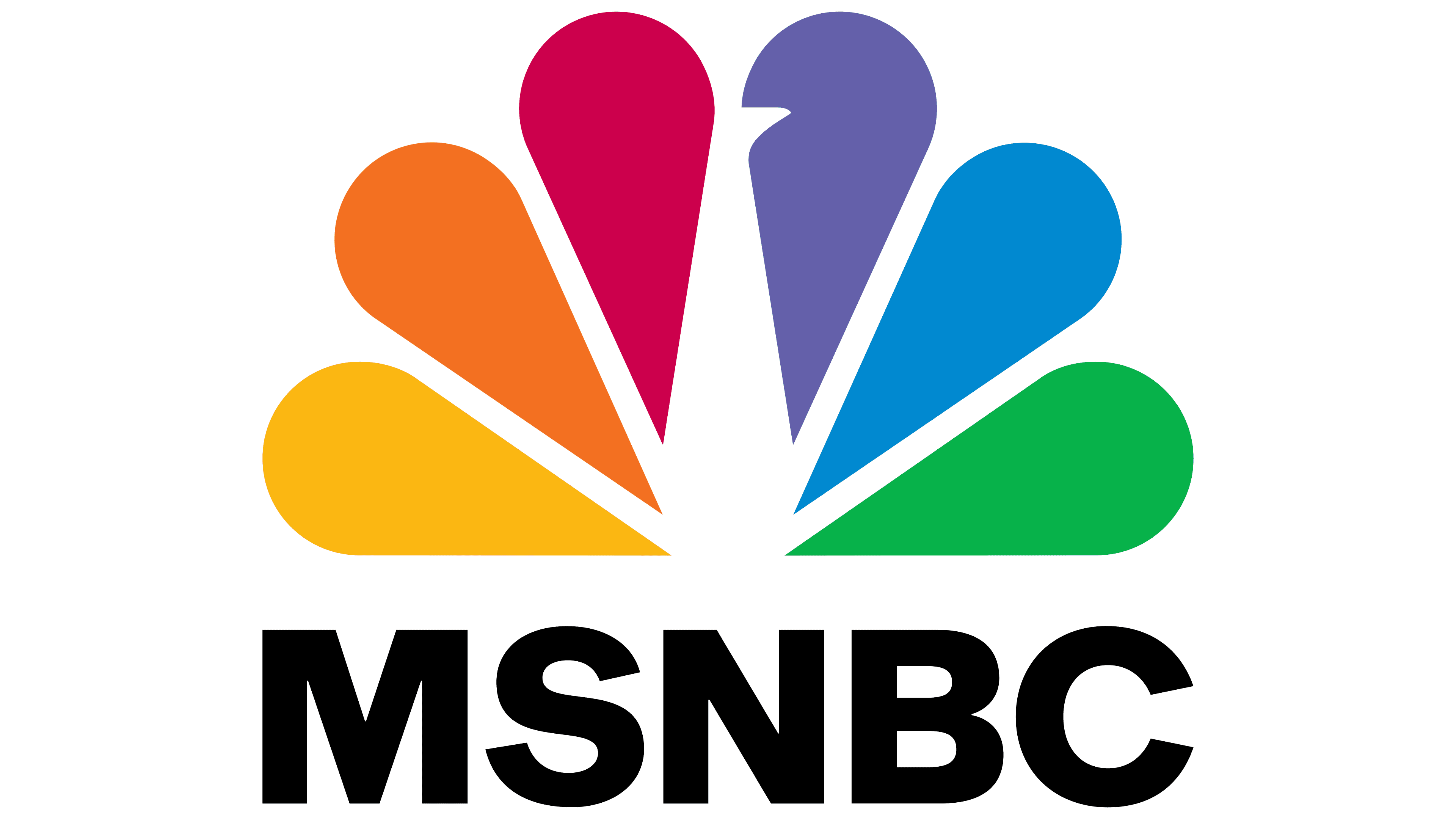
The MSNBC logo demonstrates the brand’s connection with the NBC television network. Additionally, it indicates the diversity of information and the relevance of news material offered by the channel. Abstract elements underscore the programs’ lively, dynamic character.
Meaning and History
![]()
Like other cable channels, MSNBC has created a unique visual image. To be recognizable, it initially used the symbol of its parent company, NBC – a stylized peacock tail. The black brand name complemented the vivid image of several colorful feathers. However, in some logo variants, the “N” was red. The inscription case, the arrangement of the letters, and the font style were changed periodically. Since 2006, the word “MSNBC” has been on the right and is typed in black sans-serif glyphs.
What is MSNBC?
MSNBC is a television news channel, and its website is owned by the channel. It has been in existence since 1996 and is owned by NBCUniversal. Its main office is located in New York. The broadcast area covers the entire United States and Canada.
1994 – 1996
![]()
Before MSNBC appeared, there was the unpopular television channel America’s Talking. Its logo contained a large red letter “A” with a star-shaped cut-out. The blue “T” was pushed to the foreground. A yellow square served as a backdrop for the monogram. The full brand name was at the bottom, divided into two lines with width alignment. The words “AMERICA’S” were typed in Futura Extra Bold font, and “TALKING” was a modified version of ITC Avant Garde. A thin horizontal red line separated the two parts of the blue inscription.
1996
![]()
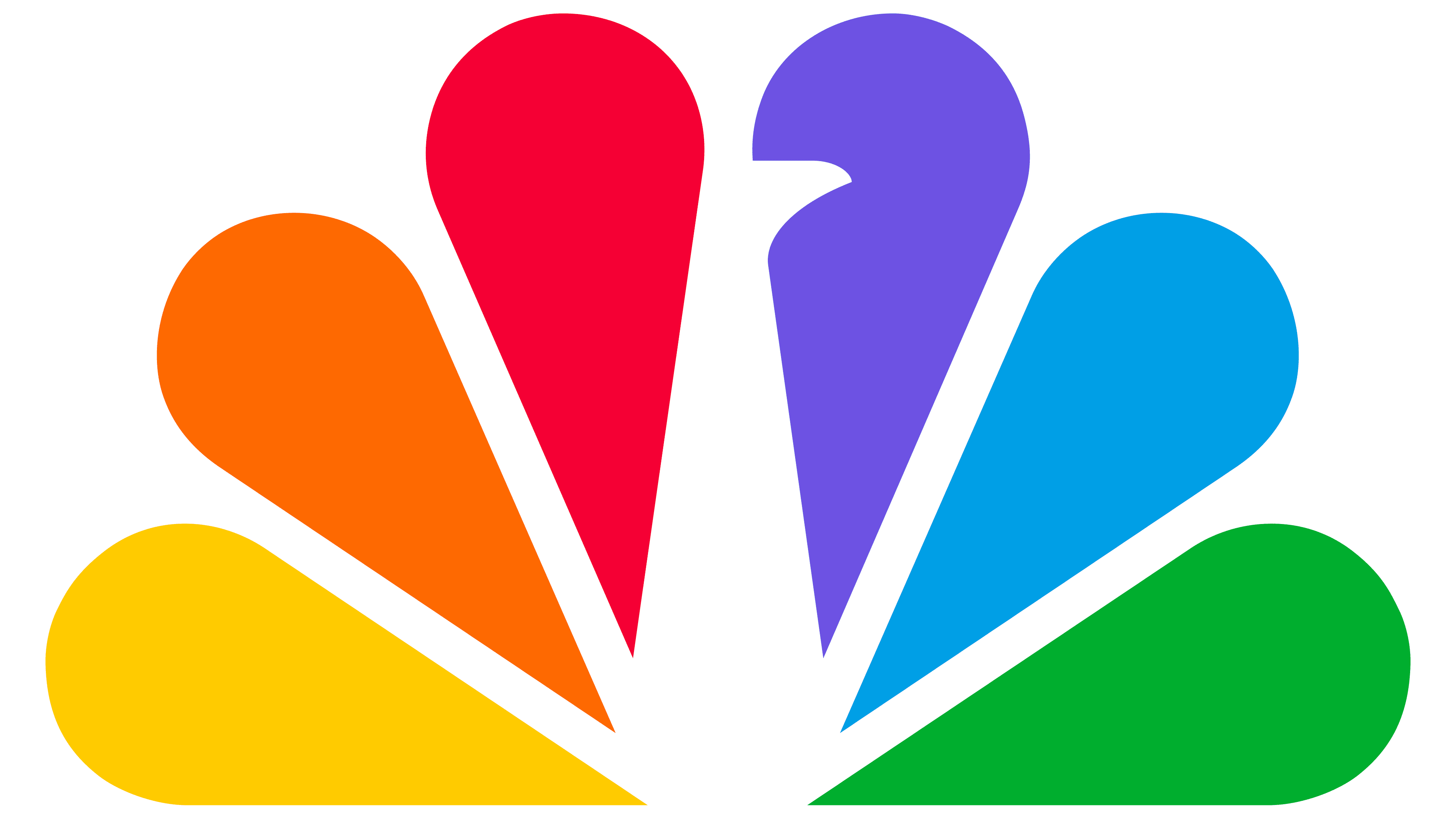
In 1996, the channel MSNBC replaced America’s Talking. It was named after Microsoft (“MS”) and NBC, as it was a joint project of theirs. The prototype of the emblem contained the same peacock tail that appeared on the NBC logo in 1986. Steff Geissbuhler of Chermayeff & Geismar designed this element. It consisted of six colored feathers: yellow, orange, red, purple, blue, and green. And the negative space in the center formed the white silhouette of the bird’s neck and head. At the bottom was the inscription “msnBC,” typed in mixed-case letters. Franklin Gothic was used for “msn,” and NBC Futura for “BC.” The lateral glyphs were black, unlike the slightly enlarged “n,” which was red.
1996 – 2000
![]()
The channel debuted with a square-shaped logo. The stylized peacock tail was placed in the upper right corner. To the left of it were the black letters “MS” (stacked), which hung over the red “N.” And “B” and “C” were written under the feathers. The designers typed the brand name with a modified font, Univers Next Pro 940 Extended Extra Black.
2000 – 2006
![]()
In 2006, the entire inscription became black. However, the positioning of the elements remained the same.
2006 – 2009
![]()
The symbol, a multicolored feather, was reduced and shifted left. The news channel’s name was shifted to the right and arranged on one line. In this form, the logo resembled CNBC’s wordmark.
2009 – 2015
![]()
This version debuted on the screen on June 27, 2009. However, it appeared much earlier: users saw it on the MSNBC website as early as April 2007. The new logo was internet-oriented, so the designers converted all the letters to lowercase and used the attractive sans-serif Gotham Bold font. Matt Ferrin and Sam Mazur worked on the emblem, closely collaborating with the team from SS+K.
2015 – 2021
![]()
In mid-August 2015, the inscription was converted to uppercase. The font and colors remained the same.
2021 – today
![]()
At the end of March 2021, MSNBC updated its logo again. The positioning of the elements remained the same. Instead of Gotham Bold, a similarly styled Arial Bold is now used, which the designers slightly modified.
Font and Colors
The TV channel’s name is set in a bold sans-serif font, making the inscription easy to read. This is a slightly modified version of Arial Bold. The black text creates a counterbalance to the bright symbol, painted in six colors:
- yellow;
- orange;
- raspberry;
- lilac;
- blue;
- green.
Such a color scheme shows MSNBC’s connection with NBC.