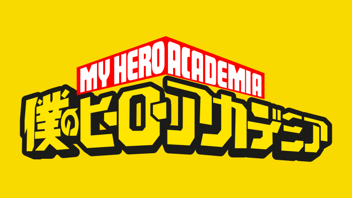
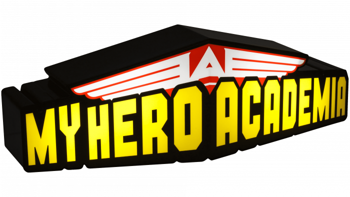
The My Hero Academia logo is filled with pride and grandeur. The emblem shows the desire to be in the forefront to protect the good. Along with the franchise’s heroes, the sign is moving on a powerful front, sweeping away everything evil and unworthy in its path.
My Hero Academia: Brand overview
| Founded: | July 7, 2014 – present |
| Founder: | Kōhei Horikoshi |
| Headquarters: | Japan |
Meaning and History
Manga and anime with the same name were created at different times. First came the Japanese comics My Hero Academia. This happened in 2014 when readers of the weekly magazine Weekly Shonen Jump first got to know Izuku Midoriyta. At the moment, there are more than 30 volumes, and the publication of the manga is still ongoing. The debut animated series My Hero Academia was released in 2018, followed by a sequel, a continuation of the original story. Now work is underway on the third part, which is a joint project of several film companies.
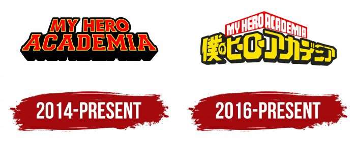
The media franchise does not have one common logo – for each product, be it manga or anime, its identity system has been developed.
What is My Hero Academia?
My Hero Academia is a popular media franchise that includes manga, video games, films, and anime series. The original Japanese comics were created by artist Kōhei Horikoshi and began publication by the major publisher Shueisha Inc. in 2014. The story is set in a world of superheroes and follows a boy born without supernatural abilities. Studio Bones adapted this story into a multi-season anime, with the first season released in 2016.
2014 – today
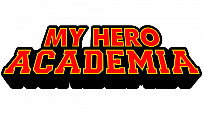
In 2014, readers saw the first chapter of a Japanese manga. A little later, its English version appeared. For the American covers, a logo was created with the words “MY HERO ACADEMIA” in bright red. Due to the specific geometry, the text appears to be tilted backward, as if it were in a different plane. The phrase “MY HERO” occupies the top line and is almost twice as large as the word “ACADEMIA,” written at the bottom. Each letter is outlined in yellow and has a wide black halo. Dark shadows are pulled downward, which creates a three-dimensional effect.
2016 – today
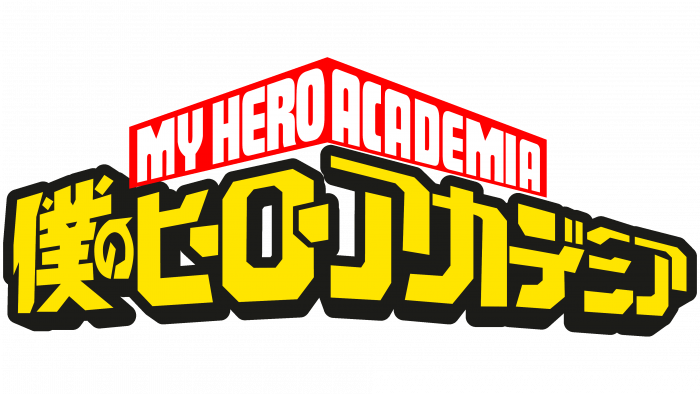
In 2016, Funimation bought the rights to My Hero Academia’s TV series, which was announced back in 2015. The logo contains two-level multi-colored lettering. It is based on Japanese characters – probably the name of the anime in the original language. The symbols are colored in a bright shade of yellow and outlined in black. The phrase “MY HERO ACADEMIA” is inscribed on top inside a red polygon that looks like an arch or boomerang. The letters are white; there are no outlines.
Products related to the media franchise have their logos. They vary in design but have a similar structure because they contain only text (in English or Japanese). The design is not as simple as it might seem at first glance. The designers decided to play on visual perception and, using simple techniques, turned two-dimensional inscriptions into 3D objects. They managed to achieve this with the help of wide black shadows. A certain role was also played by asymmetry – narrowing and different inclination of the letters.
My Hero Academia: Interesting Facts
“My Hero Academia” is a hit manga series by Kōhei Horikoshi, starting in 2014. It’s expanded into anime, movies, games, and merchandise.
- American Superhero Influence: Horikoshi was inspired by American superhero comics, evident in the series’ focus on heroism, unique powers (“Quirks”), and moral challenges.
- Widespread Popularity: Known for its engaging story, complex characters, and fresh take on superheroes, the series has gained global acclaim and a huge fanbase.
- Diverse Characters: It features characters with distinct Quirks and backgrounds, exploring themes like friendship, rivalry, and heroism.
- Complex Villains: The villains add depth to the narrative, challenging societal views on heroism with their motivations and histories.
- Cultural References: Horikoshi includes many nods to American pop culture, especially superhero comics, and films, in character names and powers.
- Anime Success: Since 2016, the anime version has won praise for its animation, story adaptation, and music, reaching fans worldwide.
- Emotional Story Arcs: The story arcs delve into character growth, the societal role of heroes, and power dynamics, noted for their emotional and thematic depth.
- Movies and Spin-offs: There are movies like “Two Heroes” and “Heroes Rising” with new stories, plus spin-off manga like “Vigilantes.”
- School Setting: The series is set in U.A. High School, a training ground for heroes, exploring competition, mentorship, and the use of power in a unique educational context.
- Global Impact: Beyond manga and anime, it’s influenced fan culture globally with cosplays, fan art, and discussions on heroism and representation.
“My Hero Academia” revitalizes superhero stories with its unique perspective and universal themes, resonating widely across manga and anime fans.
Font and Colors
For the logo of the anime My Hero Academia, an analog of the Futura Display font was chosen. The original was designed by the German typographer Paul Renner. The creators of the wordmark have retained the characteristic shape of all letters except “M.” They made it look like an inverted “W.” The elegant sans serif typeface is the exact opposite of the typeface used in the manga logo. The lettering on English-language covers seems cumbersome due to the large rectangular serifs and many corners. And this applies only to the word “ACADEMIA” because the phrase “MY HERO” is made grotesque.
The manga logo looks very bright: the designers combined red, yellow, and black colors in different proportions. The My Hero Academia anime branding is colorful too, but its shades are more subdued. The basis of the palette is white and yellow. They are used for text. Yellow and black serve as background colors that create contrast.
My Hero Academia color codes
| Red | Hex color: | #ff0000 |
|---|---|---|
| RGB: | 255 0 0 | |
| CMYK: | 0 100 100 0 | |
| Pantone: | PMS 1655 C |
| Middle Yellow | Hex color: | #ffe500 |
|---|---|---|
| RGB: | 255 229 0 | |
| CMYK: | 0 10 100 0 | |
| Pantone: | PMS 803 C |
| Eerie Black | Hex color: | #1c1c19 |
|---|---|---|
| RGB: | 28 28 25 | |
| CMYK: | 0 0 11 89 | |
| Pantone: | PMS 419 C |
