


![]() Myspace Logo PNG
Myspace Logo PNG
The created Myspace logo embodies a love of communication and big companies, as it is a social network that brings people together. Friendship, cooperation, mutual assistance, and shared pastimes are all embodied in a simple yet symbolic emblem.
Meaning and History
![]()
The early years of Myspace proved to be promising. People happily registered on the platform, edited their profiles, added music and videos, and met and corresponded with friends. By 2005, this social network had become the most popular globally. And so, when the web resource reached unprecedented heights, it was bought by News Corporation and eUniverse. The media company didn’t hesitate to turn the communication channel into an entertainment portal, making it a product with extensive advertising. She completely changed the site’s look through several major redesigns.
At first, everything was fine: Myspace continued to develop and, in 2006, overtook even Google in the United States in terms of unique users. The turning point came in 2008, when News Corp. decided to turn the social network into a media resource that offered entertaining content. At that time, many users switched to Facebook, where they could communicate without unnecessary features or annoying ads. As a result, Myspace’s customer base decreased by 45% in just one year.
To remedy the situation, the leaders undertook another rebranding, changing the interface design and logo. But this did not help them: the modernization of its appearance made the platform similar to its main competitor, Facebook. An attempt to attract representatives from Generation Z also failed. Therefore, in 2011, News Corp. sold the social network to Specific Media Group. After a few more owners, the once-popular website ended up in the hands of Viant Technology LLC.
The rich history of the Myspace brand is reflected in its visual identity, which changes frequently. Experimenting with the interface and logos, the social network’s leaders sought to attract a global audience and return it to its former glory.
What is Myspace?
Myspace was once the most popular social network globally, one of the first platforms of its kind. Previously, it was Facebook’s main competitor, but it lost to Facebook in terms of user numbers. And all because of the new owner, the company News Corp., which filled the site with advertising and turned it into an entertainment media resource.
2003 – 2004
![]()
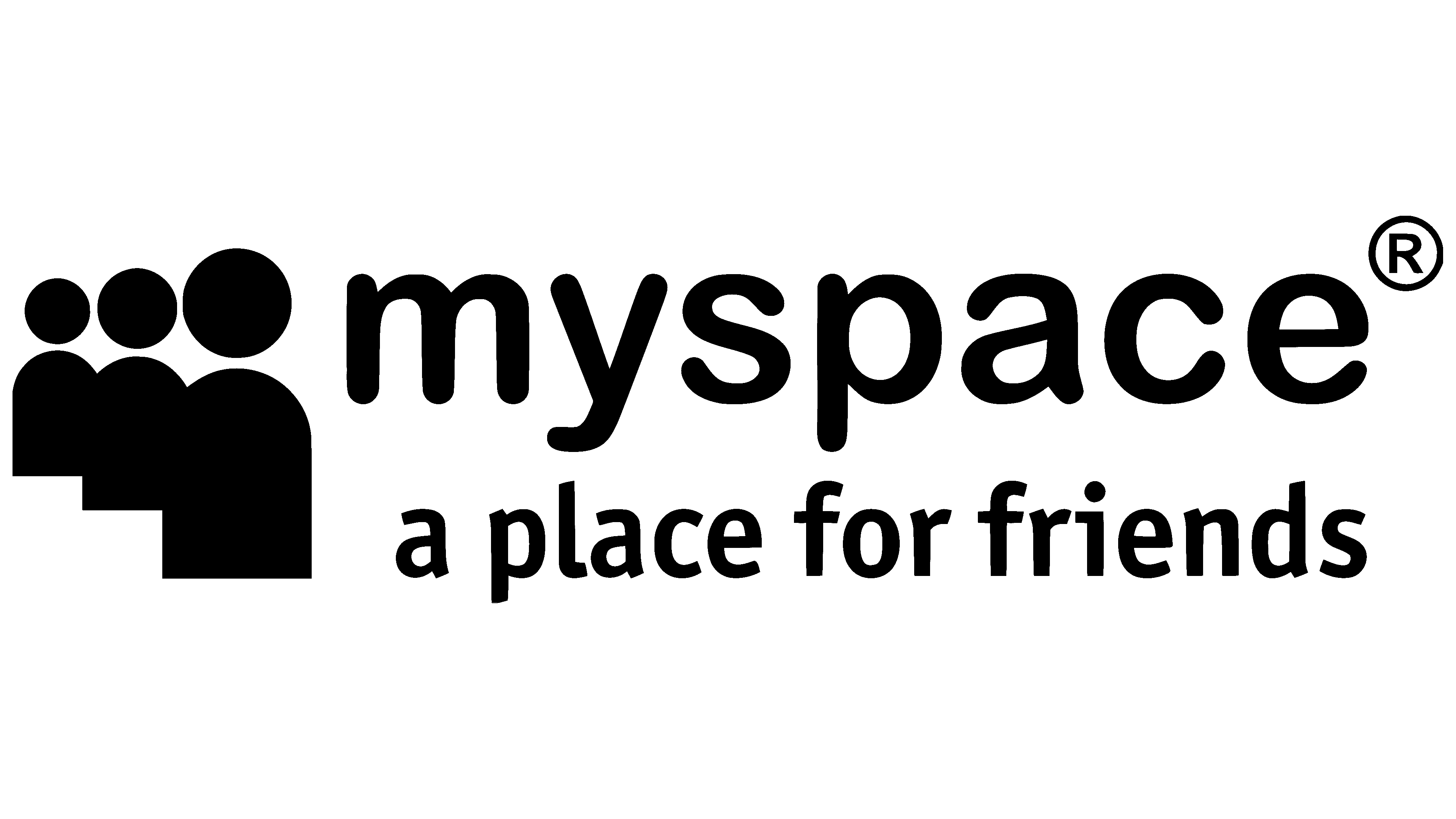
In 2003, employees at the eUniverse agency created a communication site. Its logo consisted of an icon and a two-line inscription. On the left was a sketchy little man with a light gray circle for a head and a yellow semi-oval for a body. He represented the abstract user. The silhouette of the simplest geometric shapes was surrounded by a double-sided arrow, both ends of which were bent and pointed straight at him. The arrow symbolized the circle of communication and the platform’s focus on people’s interests. It was dark gray, as was the text on the right. The top line was the service name, written in bold lowercase letters with rounded corners. Below it was the phrase “a place for friends,” which the designers set in an Arial analog.
2004 – 2010
![]()
In just a couple of years, the Myspace instant messaging platform became the most popular social network in the world. Together with it, its logo was developed: in 2004, the developers repainted it black and changed the icon. Three appeared at once in place of a single human figure, and they were depicted one after another, from smallest to largest. The silhouettes merged, and the symbolic arrow disappeared. The abstract group of people represented users who meet and communicate online. She illustrated the long-standing motto “a place for friends.” This phrase has been slightly enlarged and has a clearer font. The style of the word “myspace” has not changed, but the designers have expanded the letter spacing.
2010 – 2012
![]()
The most notorious logo of the social network was officially adopted in 2010. The company presented it at the Warmgun design conference. However, the upcoming changes became known much earlier, in the summer of 2009. As a result of the redesign, the slogan “a place for friends” was removed, as was the icon of three human figures. This was due to a change at Myspace: the owners decided to turn the site from a communication platform into a media platform for sharing videos, photos, and music. So any hints of finding new friends have become irrelevant.
The logo remains the same, black as before. It contained the brand name, with “my” written in lowercase, followed by a long horizontal line with two short vertical dashes on either side. In both form and location, this element resembled a sign used to highlight the stem of a word. According to the concept, anything could be inside it, but in the main version, there was a second part of the social network’s name: “space.” For the inscription design, the designers chose Helvetica. This sans-serif typeface belongs to the neo-grotesque category.
The underlying strip symbolized a creative space where users could communicate and share interesting content. After all, the redesign was carried out when Myspace was owned by the media company News Corporation, which placed a high priority on promoting the entertainment industry. The same direction was continued by musician Justin Timberlake and Specific Media Group, who bought the social network in 2011.
2012 – today
![]()
While Specific Media Group owned Myspace, it reverted to the classic logo design. At least in 2012, a version without the underscore space after “my” was introduced. The designers returned to the symbol of three little men, but they were depicted not together, but with small indentations. Now the silhouettes are in one row. The font’s overall look has not changed, though the letters have become slightly thinner. Still, the developers modified the lowercase “a” to look like a mirrored “p” with a shortened vertical stroke.
Font and Colors
Although the motto “a place for friends” has disappeared from the logo, the icon of a group of people suggests that the service has sought to return to its social aspect. Its emblem symbolizes like-minded people – those who are interested in the same content. Despite efforts to attract new users, Myspace has never been able to catch up with Facebook.

Now the logo’s typography uses an analog of Helvetica with a modified “a.” There are many similar typefaces: Basecoat Regular by Jonathan Ball, Hurme Geometric Sans 3 SemiBold by Hurme Design, Axiforma Semi Bold by Kastelov, Sentic Text Medium by HeadFirst. These are all sans-serif fonts from the neo-grotesque category. The inscription is traditionally black, as are the icons next to it.