


![]()
British brand Naked Paper produces toilet paper with an unusual idea, a product free from unnecessary chemicals and dyes. The company manufactures rolls from recycled cardboard or bamboo fiber, avoiding bleaching and plastic packaging. The creators asked why people have become accustomed exclusively to white paper and why few think about its composition. The company decided that paper should be soft, high-quality, and environmentally safe.
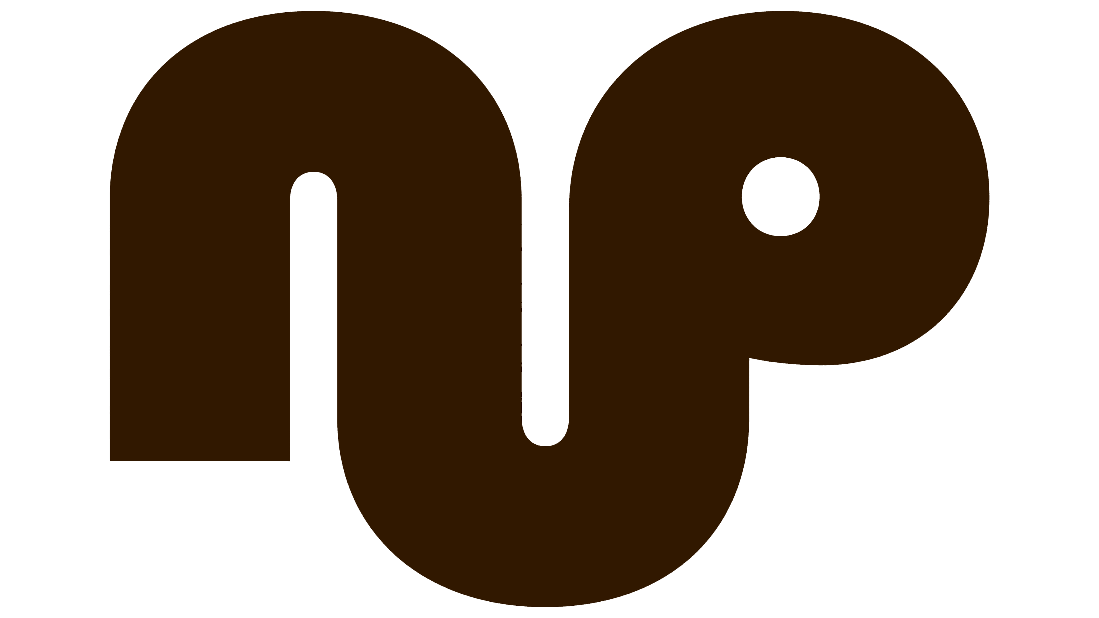
Initially, the brand was called Naked Sprout. The name arose from associations with the material from which the paper is made; however, the word “sprout” evoked strange and uncomfortable associations. Stylistically, the first version of the logo was friendly and neat, but too abstract to convey what was being sold.
![]()
The updated logo and name turned out simple, direct, and clear. Naked Paper sounds more natural and evokes an obvious association with the product. The letters in the logo are designed to resemble toilet paper rolls with cardboard cores. The symmetry in the placement of letters “A” and “E” looks especially successful, creating neat visual harmony.
The company’s branding is designed in calm shades of brown, emphasizing the product’s naturalness. Instead of bright advertising colors, a soft palette close to the natural shades of wood and recycled paper is chosen. The packaging also lacks bright graphics or excessive information, but is minimalistic and clear.
The brand’s main slogans sound natural with gentle humor: “It’s brown because it’s greene,r” and “We didn’t make it brown. Nature did.” This explains the brand philosophy simply and without unnecessary explanations.
The new design turned out bold. The brand is not afraid to show the naturalness of its product without decorative tricks. As a result, Naked Paper has transformed toilet paper from a mundane household item into a thoughtful ecological product with a vivid identity and pleasant design.
![]()