The NAPA logo is characterized by minimalism and precision. No matter how much the symbol has changed, it has always been thematically related to the parts the organization deals with, although it conveys this allegorically. Several simple geometric shapes make the emblem well-recognized in the world of motorists.
NAPA: Brand overview
Meaning and History
This organization has many large and small locations, from specialized stores to technical distribution centers. By acquiring other distribution networks, it gradually changed their logos to its own, fostering brand recognition. Thus, through the method of rebranding, the National Automotive Parts Association is advancing in many countries, having long stepped beyond the borders of the USA. Its locations attract attention with corporate colors – blue and bright yellow. The corporate logo also adorns the hoods of sports cars, as the community sponsors several races. The brand has its own font.
What is NAPA?
NAPA is the abbreviated name for the National Automotive Parts Association, which specializes in supplying automotive parts and is a leader in the repair field. It unites specialized firms and sells retail everything related to passenger vehicles: components, repair tools, and car care products. The community has over 6,000 stores and about 15,000 service stations, managed from the headquarters in Atlanta, Georgia. They operate in the USA, Canada, the Caribbean Basin, and Latin America. The association was founded in 1925. Its owner is Genuine Parts Co.
1925 – 1965
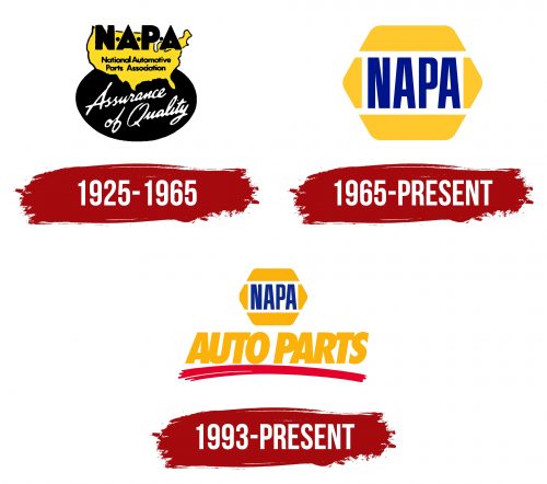
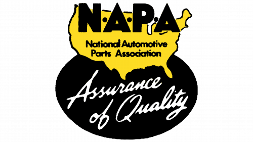
The logo contains a map of the United States with the extra-bold abbreviation “NAPA,” each letter separated by a dot. The U.S. territory is yellow and outlined with a thin black line. The phrase “National Automotive Parts Association” is also in black, as well as the inscription occupying the top part of the map. The full name of the association is set in small font – grotesque, smooth, geometric. The background is a black oval with the slogan “Assurance of Quality.” It is placed diagonally, divided into two lines, and styled in the script as if done in calligraphic handwriting.
1965 – today
The emblem of the trade association NAPA consists of its short name, placed at the center of the sign. Designers completely changed the font: now the letters are semi-bold, tall, and even. Serifs are still absent. At the top and bottom are trapezoids, and on the sides are triangles with a rounded top. They are separated from the text by white stripes, formed due to the background, making the sign look like a cell from a honeycomb. This version of the logo exists in two forms: colored and monochrome.
1993 – today
Another version of the NAPA emblem is used in parallel, featuring a more expanded design. It employs not only the honeycomb sign but also many other elements. The main symbol of the association occupies the top part of a dark blue rectangle and is centered. Below it is the inscription “Auto Parts.” Each word stands separately, but the letters in them are connected. There is also a slight right tilt, which is almost imperceptible on the bold glyphs. The font is uppercase, smooth, choppy, predominantly with straight angles. A curved red line underscores the text. It is of medium width, with a convex middle.
Font and Colors
The brand uses its own font, named NAPA Sans Bold Condensed. In some cases, it is bold; in others – it is italicized. The smooth uppercase letters without serifs look stylish and ensure good readability of the text in the logo.
The official colors of the National Automotive Parts Association are Reflex Blue, 123 Yellow, and 186 Red (according to the Pantone color palette). They are used not only in the emblem and on store signs but also in the full design of locations: they color the walls and building elements.
