The Nas Air logo presents an abstract interpretation of safe flight, which the company strives for by offering high-quality aviation services. The emblem symbolizes an ascent into the vast blue sky, representing the fastest way to reach any point on the planet.
Nas Air: Brand overview
In 2007, Nas Air emerged as Saudi Arabia’s first low-cost carrier, marking a significant milestone in the nation’s aviation industry. This initiative, backed by the Saudi conglomerate National Air Services, aimed to meet the growing demand for affordable air travel. Saudi Arabia stepped into the budget airline sector by establishing this airline, pioneering a new era of accessible flights within the kingdom.
The company commenced its operations on February 25, 2007, with its inaugural flight from Riyadh to Jeddah. The airline began with a fleet of leased Airbus A320 aircraft. This launch introduced a competitive alternative to traditional carriers, fostering a new competitive spirit in the Saudi aviation market.
During its initial years, the airline aggressively expanded its domestic route network, connecting major cities such as Dammam, Abha, and Medina. This expansion enhanced the connectivity of various regions within the kingdom, boosting domestic tourism and making air travel more accessible to the Saudi populace.
By 2010, the carrier had set its sights on international markets, initiating flights to nearby Middle Eastern destinations. The first international routes included Dubai, Beirut, and Amman. This move diversified the airline’s offerings and tapped into new passenger markets.
Between 2011 and 2012, the airline continued to grow its fleet and route network. The addition of several new Airbus A320 aircraft allowed for increased flight frequencies and new routes to cities like Istanbul and Karachi. This period of growth solidified the company’s status as a prominent budget carrier in the region.
In November 2013, the airline underwent a significant rebranding, adopting the name Flynas. This transformation was part of a broader effort to refresh the company’s image and emphasize its modern, dynamic approach to air travel. The rebranding included a new aircraft livery and enhanced onboard services, signaling Flynas’ commitment to quality and innovation.
Following its rebranding in 2014 and 2015, Flynas embarked on a strategic realignment. The airline optimized its route network, focusing on the most profitable destinations. Flynas began to develop a “hybrid” carrier model, blending low-cost fares with select premium services to attract a broader customer base.
In 2016, the airline ventured into long-haul flights, launching routes to Indonesia and Malaysia with leased wide-body aircraft. This expansion provided new travel opportunities for Saudi passengers and pilgrims, connecting them to key Southeast Asian destinations.
In January 2017, Flynas placed its largest aircraft order, committing to 120 new Airbus A320neo jets. This order, valued at approximately $8.6 billion, underscored the airline’s ambitious fleet expansion and modernization plans.
During 2018 and 2019, Flynas continued to broaden its route network, adding new destinations across Europe and Asia. The airline introduced innovative services, including an enhanced online booking system and new in-flight meal options, to improve the passenger experience.
In 2020, despite facing global challenges in the aviation industry, Flynas demonstrated resilience and adaptability. The airline focused on optimizing its operations and adjusting to the changing market conditions while maintaining its position as a key player in Saudi aviation.
Meaning and History
What is Nas Air (Flynas)?
This Saudi low-cost airline based in Riyadh is known for pioneering budget travel in the Middle East. The company operates an Airbus A320 aircraft serving domestic and international routes. It is renowned for its innovative Nasmiles program, one of the region’s first loyalty programs among low-cost carriers.
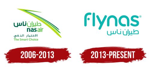
2006 – 2013
A light outline embodies the swift flight, executed at a professional level, which the young airline aims to achieve. Therefore, it reflected its dream in the logo. It features two key elements:
- Text (in English and Arabic)
- A symbol (an abstract drawing in the form of a stripe)
The inscriptions are concentrated at the bottom and divided into two segments: the name and slogan “The smart choice,” expressing the airline concept. They have much in common since both lines are executed in a unified style, emphasizing team cohesion and the brand’s closeness to potential customers. The company uses two languages to convey information about itself for completeness of information and traveler convenience. This demonstrates its customer-oriented approach and reflects its origins.
Bilingualism symbolizes the carrier’s progressiveness, aspiration to establish itself in the international service sector, loyalty to all passengers, equality, and authenticity. This integral structure aims to become a global brand with excellent recognition. Smooth, sans-serif fonts facilitate this.
The English text is typed in uppercase grotesque. All glyphs are smooth and soft to harmonize with the Arabic characters, which are inherently rounded, resembling an oriental pattern. The Arabic inscription is executed with geometric glyphs in the name and patterned signs in the slogan.
The upper part of the emblem is allocated to a graceful long stroke, which resembles a triple hook. It consists of three green stripes of different shades: light olive, dark green, and the color of spring grass. The love for green, in this case, is symbolic, as it is considered key in the Muslim religion and denotes growth, blessing, profit, and development. In other words, it demonstrates the airline’s originality and fully reveals its concept.
2013 – today
In 2013, Nas Air rebranded to Flynas. The logo features the new name in both English and Arabic, with all letters in turquoise. The English letters are rounded, and some segments have been removed for stylistic harmony. Notably, the bottom horizontal stroke of the letter “F” is separated from the vertical line, appearing as a round dot.
The turquoise color symbolizes freshness, calmness, and reliability. The unique design of the “F” adds a distinctive touch, drawing attention to the brand. The bilingual text emphasizes Flynas’s global reach and cultural sensitivity.
The rounded English letters give a sleek, modern look, reflecting Flynas’s commitment to modernity. The separated stroke of the “F” adds visual interest and highlights the brand’s innovative approach.
Using turquoise evokes tranquility and trust, creating a positive and inviting brand image. This color choice helps passengers feel assured and comfortable.
The bilingual logo highlights Flynas’s inclusive nature, catering to international and local audiences. This ensures clear communication and broad appeal, reinforcing the airline’s dedication to excellent service across different cultures.


