


 National Roads and Motorists’ Association Logo PNG
The National Roads and Motorists’ Association (NRMA) logo is one of the most recognizable across Australia. Founded in 1919, the NRMA has over 2.6 million members and is familiar to anyone involved in travel and transportation nationwide.
The logo has changed since the association’s founding, but its current version is considered the most successful. The association used various color schemes over time, but today’s colors are the most harmonious, elegant, and appealing. The font has always been presentable, but the modern version stands out for its size and expressiveness.
As the number of association members grew, the letters in the logo took on greater significance. Today, they reflect the organization’s high status, clearly conveyed by the blue text on a white background. This contrast makes the organization’s name easy to read and memorable.
A beautiful circular wreath surrounding the letters “R” and “M ” enhances the logo and emphasizes the association’s reliability. This design creates a sense of unity and integrity. The crown, positioned at the top of the logo, has been retained from the first version and symbolizes tradition and continuity. It is now crafted with intricate details, highlighting the NRMA’s individuality and prestige.
The National Roads and Motorists’ Association, NRMA, was founded in Sydney on November 4, 1920, by Australian drivers seeking better roads and protection for motorists’ rights. Former Australian prime minister John Christian Watson became its first president. The group started with about 100 members, but rising car ownership and poor road conditions made the association relevant beyond its original circle.
In 1924, NRMA launched its first roadside assistance program, giving members help during vehicle breakdowns. Through the 1920s and 1930s, it lobbied for new roads, bridge upgrades, and improved routes across New South Wales. In the 1930s, it began publishing Open Road, a magazine for drivers with route details, road reports, and technical advice.
During World War II, NRMA supported military transport needs with resources and expertise. After the war, it grew throughout the 1950s and 1960s, adding insurance services. In the 1970s, the association campaigned for compulsory seat belt use, and the law was adopted in 1971. In the 1980s, NRMA expanded its operations to include travel services, including route planning and hotel bookings.
Structural disputes emerged in the 1990s, and in 1995 the insurance business was separated from core services. In 2000, members approved demutualization, creating NRMA Insurance Group Limited, later Insurance Australia Group, as a separate public company. From 2015 to 2023, NRMA expanded EV charging stations, released a mobile app, invested in campgrounds and resorts, introduced car sharing, upgraded online services, and added driver training for electric and hybrid vehicles.
Meaning and History
What is the National Roads and Motorists’ Association?
It is a company based mainly in New South Wales and the Australian Capital Territory that offers a wide range of services to drivers and tourists in Australia. It is known for its roadside assistance program and provides vehicle inspection, travel services, home, car, and travel insurance. With an extensive network of service centers and related companies, the company has become a vital component of the Australian automotive market, providing millions of members with peace of mind through 24-hour breakdown assistance and other car-related services.
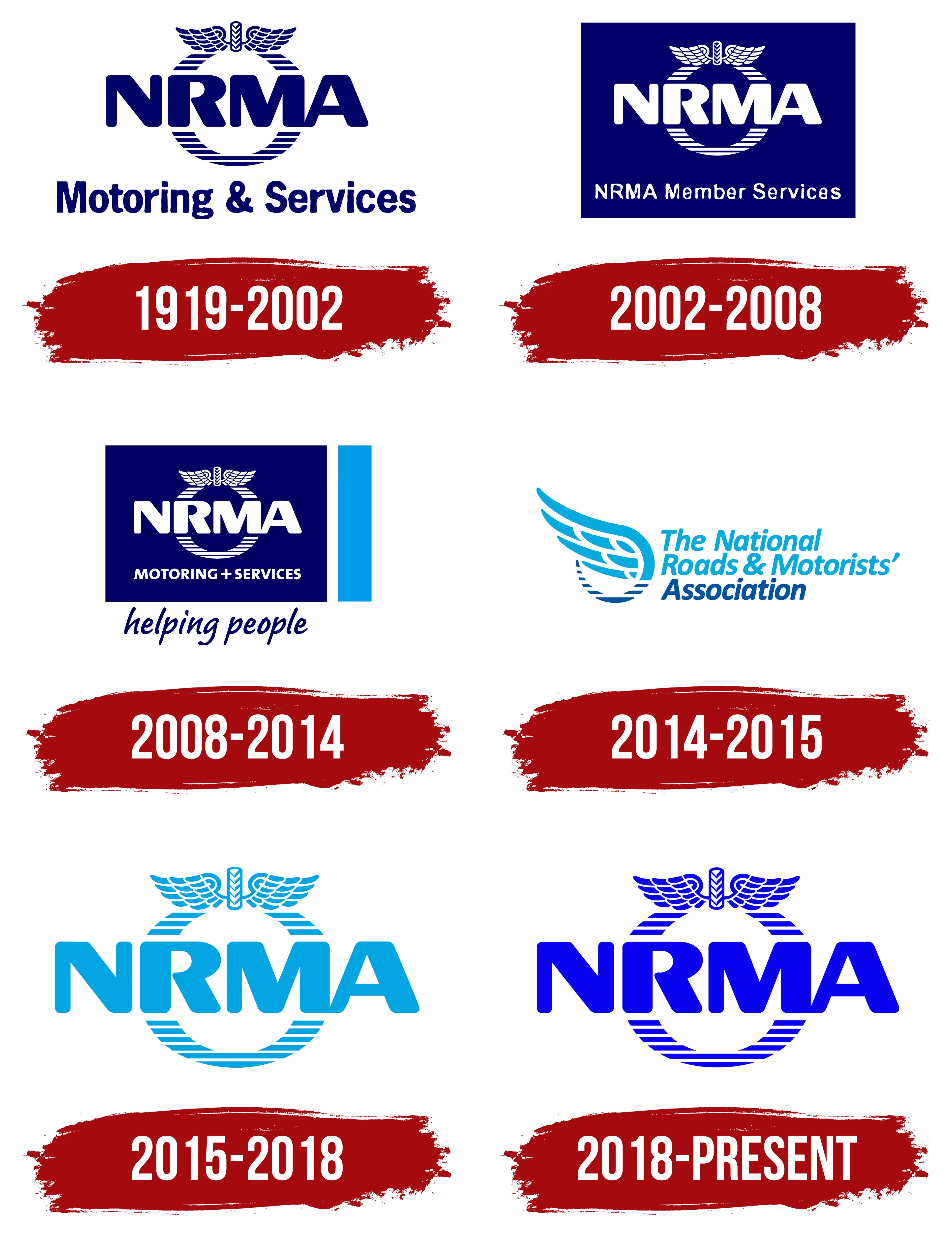
1919 – 2002
The first version of the NRMA corporate identity appeared when the association was founded. Like the organization, the logo focused on all road users through its graphic design, unique imagery, and four letters.
The beautiful font used for the phrase “Motoring & Services ” at the bottom of the logo was a fundamental part of the association’s identity. This phrase emphasized the company’s core activity: cars and services.
The NRMA abbreviation was at the center of the logo. The four equally sized letters, written in blue on a single line, stood out with bold, clear elements, ensuring high visibility and readability. These letters essentially proclaimed the value of the new organization across Australia.
The logo’s key elements, highlighting NRMA’s uniqueness, were the wreath and crown. Together, they resembled a seal, symbolizing the association’s status and reliability, one that all road users could trust. This logo has reinforced the NRMA’s reputation as a respected and authoritative organization.
2002 – 2008
At the beginning of 2002, the NRMA logo underwent not just changes but rather a mirrored transformation. In the previous version, a white background featured all the signs, symbols, and images in blue. In the new design, it’s the opposite. The blue background is the foundation, drawing attention with its contrast and expressiveness. All the logo elements, varying in size, are rendered in white tones, creating clarity and visual harmony.
Interestingly, the updated logo features the abbreviation “NRMA” twice. The first time, it’s placed at the center of the identity, inside the wreath, emphasizing the organization’s significance. The second time, it appears below, in one line with the familiar slogan “Motoring & Services.” However, after the redesign, the symbol “&” disappears for an extended period, adding mystery and simplicity to the new version.
The wreath, as before, retains its ornamental character, with lines of varying lengths that give it dynamism and depth. The crown at the top of the wreath remains unchanged, symbolizing NRMA’s status and traditions.
2008 – 2014
The six years starting in 2008 mark an important phase of change for NRMA. The association made significant progress: its operating area and range of services expanded. Therefore, the branding creators decided to meticulously detail every significant aspect of the logo.
These efforts paid off; the new logo is highly informative and expressive. The logo reflected the association’s essence and unique content. The central focus was on the letters “NRMA,” presented in large white font. The letters were elegantly aligned in a straight line, with slightly elongated side elements that gave them a dynamic look. This version of the logo did not include repetitions of words or abbreviations.
The wreath became an integral part of the abbreviation, its contours gently touching the two middle letters, adding harmony and style to the logo. On a blue background, the wreath and capital letters look elegant. Below them, the words “Motoring” and “Services” were gracefully placed, united by a “+” sign, symbolizing the synthesis of the two areas of activity the association carries out.
The logo also included two new elements: a wide vertical blue line, slightly offset from the blue background, and the phrase “helping people.” This phrase carried a profound meaning. NRMA is always ready to help. As a result, the logo became both presentable and informative, accurately conveying the organization’s mission and values.
2014 – 2015
The logo was completely transformed in 2014; however, this version lasted less than a year. Despite its brief usage, its originality is worth noting. The logo looked unusual and conveyed a completely different message.
This logo focused on the text and image, while the color scheme and contrast took a back seat. Text elements took center stage. The new logo consisted of three words, excluding prepositions and conjunctions, all set in a single italic font, with each word starting with a capital letter.
Alongside the text, the image sat on the same plane. At the center of the logo was a beautifully drawn winged wheel. The lower part of the image had darker tones than the upper part, creating a dynamic effect. The dark color of the lower part of the wheel and the word “association” shared the same color palette, adding unity and harmony to the composition.
2015 – 2018
In 2015, the association returned to traditions and branding familiar to long-standing members and new participants. The updated logo, which incorporated elements from previous versions, reflected the association’s continued development.
Now, NRMA protects road users and offers insurance and legal services when necessary. The logo again featured the four capital letters “NRMA” in light blue, as in this period. These letters were surrounded by a wreath, symbolizing a shield and giving the logo a sense of protection. The wreath consisted of repeating lines and elements with a color scheme identical to the text’s. The background remained solid white, adding purity and clarity to the logo.
This logo design emphasized the reliability and trust that the NRMA continued to provide its members.
2018 – today
The modern NRMA logo represents a harmonious blend of style and graphics. This recognizable element is closely associated with the organization’s reliability and its focus on protecting all road users’ interests.
Introduced in 2018, the logo is designed to remain relevant for years to come. It is concise and simple, yet still informative. Elegant, unembellished letters are positioned in the center, with a neatly drawn wreath surrounding them. The logo is easily recognizable, positively impacting the association’s reputation and emphasizing its stability and commitment to its principles.