


![]() NatWest Logo PNG
NatWest Logo PNG
The NatWest logo exemplifies harmony and the perfect interaction of all parts of the banking structure. The emblem conveys progress, future aspirations, and modern technological equipment. Bright shades give the composition energy and strength.
The history of NatWest combines several long-standing institutions. The Manchester and Liverpool District Banking Company was founded in 1829 in Manchester with a capital of £3 million and rapidly built a regional network. National Provincial Bank followed in 1833 with a plan to operate beyond London, while Westminster Bank appeared in 1834 as one of the first joint-stock banks in the capital.
In 1962, National Provincial absorbed District Bank, keeping its name until a larger consolidation. On March 18, 1968, a merger of National Provincial, Westminster, and District Bank was announced. On January 1, 1970, National Westminster Bank began operations with about 3,600 branches across the UK.
During the 1970s, NatWest expanded and overtook Barclays in scale. It built an international presence, opening Scottish offices in 1975 to support North Sea oil projects and acquiring US institutions including National Bank of North America, First Jersey National Bank, and Ultra Bancorp. By the late 1980s, NatWest USA had 285 branches and around $20 billion in assets. In 1984, the bank introduced NatWest Visa, and in 1997, it launched internet banking.
In 1999, the Bank of Scotland made a hostile bid. Royal Bank of Scotland countered and completed the takeover on February 11, 2000, for about £21 billion, retaining the NatWest brand but integrating operations. Following the 2007 acquisition of ABN AMRO, RBS faced heavy exposure during the 2008 crisis. In 2009, it reported a £24.1 billion loss, leading the UK government to take control of more than 80 percent of its shares. On July 22, 2020, RBS Group rebranded as NatWest Group to reflect its core business. On May 30, 2025, the UK government completed its exit, returning the group to private ownership.
Meaning and History
![]()
The emergence of NatWest is linked to a legendary history dating back to 1658 when Smith’s Bank was founded in Nottingham. This is his first ancestor because he went on to make a long series of mergers and acquisitions before becoming a modern structure. He has professional experience with many banking institutions, including the National Provincial Bank, National Provincial and Union Bank, Westminster Bank, and others.
A series of transformations lasted until the National Westminster Bank was officially established with its charter and personal identity. The badge with three wide arrows was adopted as an emblem in 1968, the year the financial organization was founded, although it began operating only in 1970.
A large banking structure has experienced highs associated with profits, expansions, and acquisitions, as well as serious collapses accompanied by capital restructuring. In 2017, the bank was implicated in the Russian KGB money-laundering scandal. Due to numerous recessions and surges, it repeatedly changed its identity. Now, there are four emblems in its history.
What is NatWest?
NatWest is the short name for National Westminster Bank. It is a large financial institution in the UK. Its parent company is NatWest Holdings, which in turn is part of NatWest Group plc.
1968 – 2003
![]()
After completing the legal settlement of issues surrounding the merger of the three banks into a new organization, the new organization received its icon. The developers focused on merging and created a variant with three wide arrows that follow each other in a circle. They are believed to represent Westminster Bank, District Bank, and National Provincial Bank, which formed NatWest. Simultaneously, the sign has another concept: it symbolizes the endless circulation of the money supply in the financial sector.
The triangular lines are connected to form negative space, with a white spinner or wheel-like watermill at the center. Three blades seem to rake in money, passing it among themselves in a circle. On the right side, the bank’s expanded name is written in three lines: “National Westminster Bank.”
2003 – 2014
![]()
The designers rearranged the main elements and added color. The arrows are red on one side and pink on the other. The lettering is now white, and the background is dark purple. The authors used an abbreviated version of the name “NatWest” with extended letters.
2014 – 2016
![]()
In 2014, the bank approved a new logo consisting of three wide red arrows and purple lettering. To do this, the developers applied the background color to the letters and set the base to white.
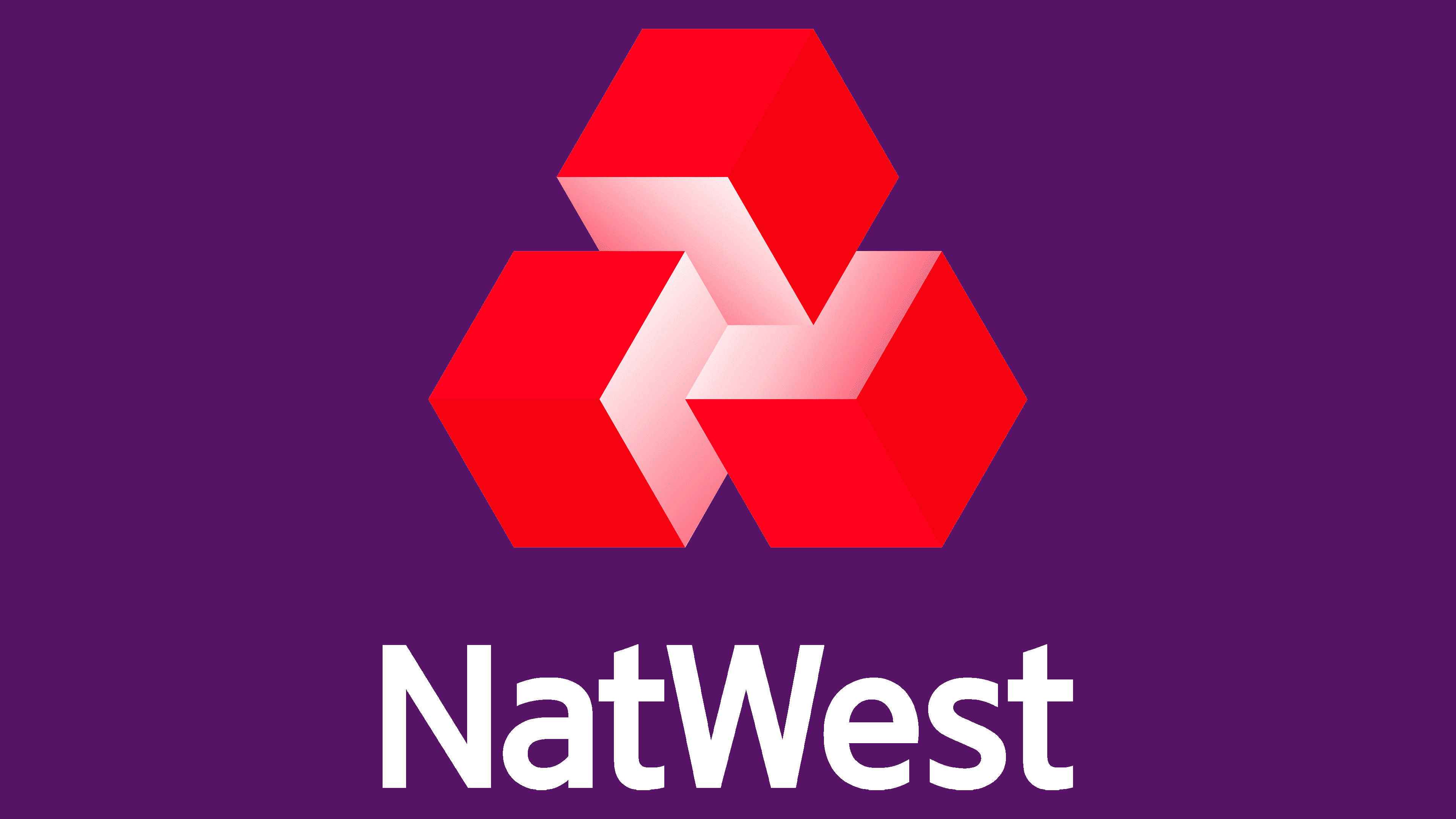
2016 – today
![]()
The management redesigned the logo to modernize and give it a broader meaning. As a result, the arrows turned out to be volumetric cubes. The 3D format has changed the sign’s concept. Now, it personifies a rich range of complex services and the versatility of each banking structure. At the same time, geometric shapes demonstrate the unity of the financial institutions that formed NatWest. To highlight the sides, the designers used a pink gradient. They left the inscription and placed it under the large icon.
Font and Colors

The evolution of the logo reflects the bank’s philosophy in a series of expansions. If the wide arrows initially symbolized the union of three institutions and the circulation of money, they have since become part of the cubes. In turn, the boxes deliver various banking services “in a single package” and a large-scale expansion of the structure. The color scheme also varied – from monochrome to multi-part.
Unlike the graphic part, the logo text did not change. Designers have always used a typeface reminiscent of Overpass Bold, a free, sleek sans serif with a beveled top of the “t” letters. Its creator is Red Hat.
But the palette was colorful. The debut emblem is black and white. Subsequent ones contain a variety of colors and their spectra: red in four variations (# de3c55, # d00028, # d30311, and # fb001f), purple in three shades (# 231744, # 390752, and # 4a0461), and the pink scale presented in gradient transitions.