


Navy Health, one of Australia’s oldest medical organizations, has undergone a complete rebranding for the first time in many decades. The organization was originally established to support the Navy, but its audience has expanded over the years. Today, its clients include service members, veterans, military families, and civilian specialists working in the defense sector.
The new brand marks the shift from a narrowly focused medical service to a more universal organization. The identity now reflects the idea of care and support for its audience while maintaining a connection to its historical roots.
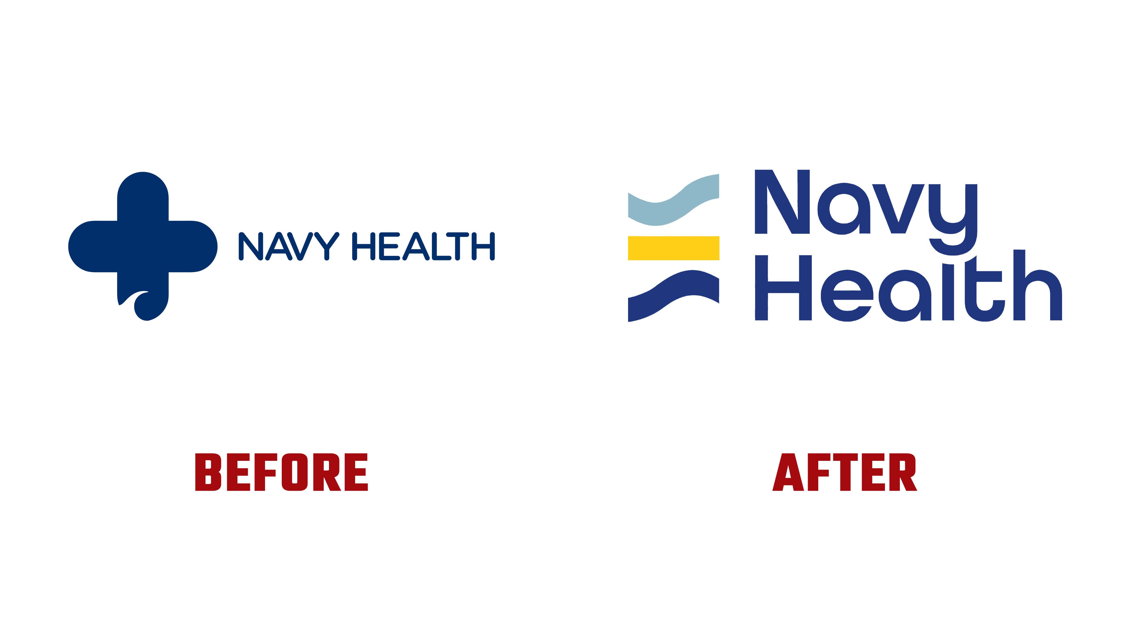
Instead of the medical cross previously used, a symbol based on wave-like lines has been introduced. It refers to the sea and creates an image of moving forward. The color system is built on marine tones, complemented by a yellow accent. This is associated with energy and a positive outlook, emphasizing Navy Health’s mission to be a source of support for its clients.
The name is now set in a new typeface. It has an open structure and high readability. It looks modern and remains convenient for use across different formats, from printed materials to digital platforms.

Navy Health’s goal is to simplify communication and make it more accessible for different generations, as the organization works with both young military families and veterans who have been associated with Navy Health for decades.
According to management, the updated style reflects the changes in the organization’s structure. Today, Navy Health sees itself not as a separate medical service but as part of Australia’s defense community. It provides services and support to everyone connected with the sector, creating a unified space of care and support.
The organization has been operating for nearly seven decades. During this time, Navy Health has grown from a specialized service into a large institution capable of serving diverse population groups. The new style helps emphasize continuity and demonstrates readiness for further development.