The emblem evokes joy, good mood, and fun. The company’s programs attract people with completely different interests. The NBC logo is an example of diversity and coverage of various issues.
NBC: Brand overview
NBC (National Broadcasting Company) is an English-language broadcasting and television network. It is a commercial entity of NBCUniversal, a Comcast subsidiary. Its appearance is considered in 1926 when terrestrial radio was launched. Now, the service forms one of the Big Three television networks in the United States and has headquarters and large offices in other cities. The base station is in New York, and two more are in Chicago and near Los Angeles.
The broadcasting service was founded by RCA (Radio Corporation of America) jointly with its parent company, GE (General Electric). However, due to antitrust charges, GE was forced to sell both organizations (RCA and NBC) in 1932. However, many years later, she regained control of the National Broadcasting Company, buying the Radio Corporation of America in 1986 for $6.4 billion. Management eliminated nearly all RCA’s departments while retaining NBC and its unique logo.
Meaning and History
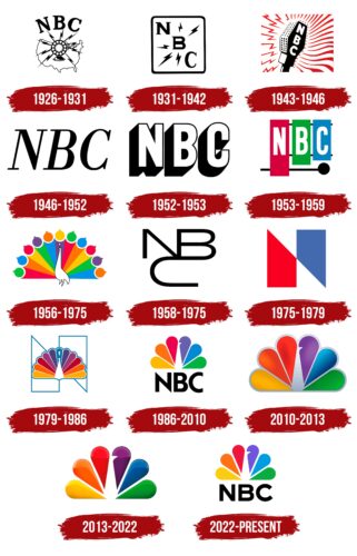
The history of NBC logos can be roughly divided into two eras: before and after the peacock. In recent years, the bird emblem has evolved markedly, moving from a detailed illustration to an image of multicolored feathers that represent subdivisions of a large media network. But why the peacock?
The National Broadcasting Company began using color television technology in 1953, well before its competitors. And in 1956, she got the earliest badge with the image of a bright peacock. Contrary to misconceptions, this was not an official logo but an element of on-air identification that was supposed to make people buy color TVs.
The fact is that at that moment, NBC was part of the Radio Corporation of America. An electronics company wanted to show viewers the benefits of expensive color televisions. To do this, she decided to decorate the NBC broadcast with something colorful. Rainbows and butterflies were dismissed as too bland. A peacock came to the rescue, reflecting the slogan “proud as a peacock.”
The multicolored bird did not appear on the official NBC logo until 1979, when it was discovered that the abstract N logo, created a little earlier, was similar to the symbol of the Nebraska ETV Network. Moreover, the National Broadcasting Company paid $700,000 for its sign, while the Nebraska television station paid much less than $100. To avoid copyright infringement, NBC had to add an image of a peacock with a large tail to the stylized letter “N.”
What is NBC?
This is the name of the American television company and its broadcasting network. NBC has been the second oldest television station in the world since it was formed in 1926. The network is part of NBCUniversal and has been owned by Comcast since 2009.
1926 – 1931
The radio company’s career began with a black-and-white emblem, which depicts a round studio microphone with a foot surrounded by nine zippers. The background is an unmarked map of the United States of America. It schematically repeats the country’s borders, circled as if by a microphone cord. Above them, in the form of an arc, are three large letters—the abbreviation of the company’s name. “NBC” is in all caps with serifs.
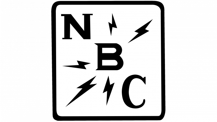
1931 – 1942
In 1931, the broadcasting studio approved a different logo from the debut one. First, it was not graphic but textual. Secondly, the focus is on the name of the company. To do this, the designers placed the abbreviated NBC lettering diagonally in a square with rounded corners. It goes down from left to right and contains letters with thin serifs. All lightning bolts are now centered around “B.” The square inside is white, outlined by a black stripe forming a continuous frame. The transition to a geometric figure of this form is associated with the spread of the television network.
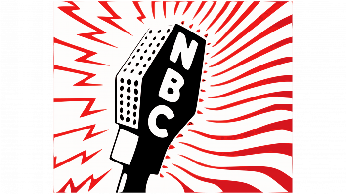
1943 – 1946
The developers redrew the logo by removing the black border of the square and filling it with long red lines. On the left are short zigzag lightning bolts for the radio network; on the right are long wavy lines for the television network. They radiate from the new-style studio microphone used at the time: elongated, on a handle. The abbreviation “NBC” in vertically running white letters is in the middle of the microphone.
1946 – 1952
For the next few years, the broadcasting organization chose a laconic logo—-text. It consists of its name placed horizontally. For him, the letters were taken from the identity of 1931-1942. Subtle serif marks are slightly elongated and slanted. They are painted black and have a white background.
1952 – 1953
The company used a minimalistic text logo for another year, but the designers completely changed the lettering style. They removed the serifs, set the symbols straight, and made them smooth and voluminous. To do this, the authors added black shadows to the left of the white letters. The symbols turned out to be expressive, large, and three-dimensional.
1953 – 1959
In 1953, a radically different logo was introduced. It is made in the form of a xylophone and a hammer, which denote the NBC service chimes, first heard in 1927 as a seven-tone sequence. This symbolism was adopted during the Tournament of Roses Parade in December. Subsequently, the number of notes was corrected and reduced to three due to problems with the correct orchestration.
The xylophone emblem was first used to signal the Federal Communications Commission’s (FCC) adoption of a new color standard. It consists of three vertical rectangles, red, green, and blue, marked with white letters from the company’s name. Below is a black hammer for playing the instrument.
1956 – 1975
At this time, another version of the logo appeared – a color in the form of a peacock. He accompanied the western “Laramie” for the first time, so he was popularly nicknamed “Laramie peacock.” John J. Graham and Herb Lubalin designed it from Sudler & Hennessey. The emblem is an exotic white bird that stands against the backdrop of an open tail. It has 11multicoloredd stripes, repeated twice. At the end of each is a small ball with a sharp spike, symbolizing the tip of a long feather. The paints repeat the rainbow colors and go in the same sequence: red, orange, yellow, green, blue, and violet (there is only one in the logo – the central one).
1958 – 1975
The next logo is “NBC Snake” because it is an animated abbreviation whose letters grow from one another and look like snakes. It was used in parallel with the Laramie peacock. Its developer is also John J. Graham.
1975 – 1979
The authors of the next logo are Lippincott & Margulies and Dolphin Productions (TV). It was called “Big N” and was used for a limited time because it was canceled due to legal action from Nebraska ETV. The logo looks like a stylized geometric letter from the Helvetica Bold font. She has two cut rectangles, inverted and connected in the center.
1979 – 1986
In this version, the authors (Lippincott & Margulies, Fred Silverman) left only the blue outline from the capital letter and placed a peacock with its head high on its background. Therefore, this logo is popularly nicknamed “The Proud N.” A thin blue stripe surrounds the bird. Her feathers are mirrored (in pairs on the left and right) and end in the center with one blue color, marked with a white stroke that resembles a drop.
1986 – 2010
After the redesign, the number of stripes in the peacock’s tail was reduced to 6, and the designers turned its head to the right so that it looked into the future. They made a beak in the form of a triangular notch at the edge of the purple feather. The network name is now placed at the bottom. The authors of this version are Chermayeff End Geismar, Harry Marks, and Pacific Data Images.
2010 – 2013
Adjustments for the media format gave the emblem a “glassiness” because the translucent gray color replaced the white. He also stroked along the contour of the tail.
2013 – 2022
Now, the logo is used with many highlights and a large peacock. Due to the reflections, the logo gained volume and became three-dimensional.
2022 – today
The new National Broadcasting Company logo was unveiled in November 2022 and officially launched in December. After the redesign, the gradient disappeared. Colors have been muted to match the NBC logo with the Peacock streaming service launched by NBCUniversal in 2020.
New York-based design studio Sibling Rivalry slightly increased the space between the feathers to make the pattern look more harmonious. The asymmetric deepening in the purple part of the tail does not interfere with the visual balance. This is the peacock’s beak, formed by negative white space.
The new NBC logo was inspired by the 1986 version by Steff Geissbuhler of Chermayeff & Geismar Inc. But the modern font is noticeably different. The lettering at the bottom uses a custom typeface called NBC Tinker. It was custom-made and based on Sweet Sans Pro.
NBC: Interesting Facts
The National Broadcasting Company (NBC) is a cornerstone of American television, boasting a legacy that has deeply influenced the country’s media scene.
- Foundational Years: Launched in 1926 by the Radio Corporation of America (RCA), NBC is the oldest significant broadcast network in the US, transitioning from radio to television.
- Pioneering TV Broadcast: In 1939, NBC aired one of America’s initial TV programs featuring President Franklin D. Roosevelt at the New York World’s Fair, marking the first presidential television appearance.
- Color TV Trailblazer: NBC led the charge into color TV, broadcasting the opera “Carmen” in color in 1953 and fully embracing color programming by 1965.
- Iconic Peacock Logo: Introduced in 1956, the peacock logo underscored NBC’s commitment to color broadcasting and was designed to draw attention to the emerging color TV technology.
- ‘Saturday Night Live’ Legacy: Since 1975, “Saturday Night Live” has been a defining feature of NBC’s lineup, propelling numerous comedians and actors to fame and becoming a cultural mainstay.
- ‘Must See TV’ Era: In the 1990s, NBC’s Thursday night lineup, dubbed “Must See TV,” captured the American audience with hits like “Friends” and “Seinfeld,” cementing its dominance in the ratings.
- Olympics Coverage: Since 1988, NBC has been the go-to network for the Olympic Games in the US, holding exclusive broadcasting rights and delivering comprehensive coverage of the spectacle.
- News Programming Innovations: NBC News introduced pioneering programs such as “Meet the Press” and “The Today Show,” contributing significantly to the evolution of news broadcasting.
- Commitment to Public Service: NBC has been known for its “The More You Know” PSA series since 1989. The series has utilized its platform to address social issues, featuring network stars in educational spots.
- Ownership Evolution: Initially a collaboration among giants like General Electric and AT&T, NBC underwent several ownership transitions, with Comcast securing full ownership of NBCUniversal in 2011.
From its inception to becoming a broadcasting titan, NBC’s journey reflects its integral role in shaping television, technological innovation, and American pop culture.
Font and Colors
The identity of the broadcasting company is divided into two periods: before the peacock and with him. It is very important for the service, as it is associated with the history of television in general, not only with this company. Its tail marks the transition from black-and-white image standard to color.
The logo has used Helvetica Bold, ITC Serif Gothic Bold, and NBC Futura (custom version) at various times.
The logo’s six colors convey the RYB palette and NBC sections. Yellow represents news, green represents performances, blue represents networks, purple represents radio stations, red represents entertainment, and orange represents sports.
FAQ
Why did NBC change its logo?
The brand updated its logo to keep up with changes in how media is used. They started this update at the end of 2021 and introduced the new logo in December 2022. It’s designed to work well across various platforms, from TV to social media to mobile apps. This means the logo will look good, whether large on a billboard or small on a phone screen. The refresh helps the brand maintain a clear and consistent look throughout.
What is the bird on the NBC logo?
The logo features a peacock chosen for its vibrant colors. This peacock first appeared in 1957 and was animated to represent the brand’s transition to color television with the show “Your Hit Parade.” The peacock’s colorful feathers reveal the exciting new world of color television.
What does the NBC logo represent?
The logo features a peacock with a tail comprising six multicolored elements, each representing a different part of the brand’s business. The colors have specific meanings:
- Purple signifies radio, reflecting the brand’s history and current role in audio broadcasting.
- Green represents production, emphasizing the creation of brand content.
- Orange is dedicated to sports, indicating the brand’s participation in sports broadcasts.
- Blue represents the network, indicating the infrastructure for distributing NBC content.
- Red symbolizes entertainment, highlighting the brand’s fun and exciting shows.
- Yellow indicates news, demonstrating the brand’s role in journalism and news coverage.
What is hidden in the NBC logo?
The logo features a peacock with a colorful fan tail as a design element. As television transitioned from black and white to color, the brand used this colorful peacock to promote the new technology of color television. The colorful peacock tail was chosen to showcase the exciting possibilities of color television and help the brand become a leader in this technological shift. This made the peacock not just a logo but a symbol of how television viewing changed.
How was the NBC logo created?
John Graham, the brand’s design director, designed the iconic logo. He wanted to show the exciting possibilities of color television. Graham chose the peacock because of its bright and colorful feathers, symbolizing the transition from black and white to color television. This design successfully highlighted the brand and established it as a leader in the television industry, promoting technologies that would shape the future of television viewing.
Is the NBC logo a peacock or a turkey?
The logo features a peacock, chosen in 1956 to symbolize the brand’s transition from black-and-white to color television. The design cleverly uses negative space to form the peacock’s body, with its beak visible on the purple element. The peacock was chosen for its vibrant, multicolored feathers, representing the new era of color television. This design marked an important technological step forward and became an enduring symbol of the brand.
