The NBC News logo is bright yet minimalist. It embodies the union of creativity from the entertainment industry and business from the contemporary media space. Its elegance evokes a sense of joy and sets the tone for a positive perception of the content. At the same time, it is a strict symbol with a perfectly thought-out concept, without a single superfluous detail.
NBC News: Brand overview
Meaning and History
For a broad broadcasting reach, this television service has not just one but several headquarters located in different regions of the planet. They are united by a common theme of work and shared visual identity. In some logos, the inscription is made in the NBC Tinker font, while in others, it is in NBC Futura. Although the second variant is outdated, it remains relevant for some programs, social networks, and digital resources of NBC News.
What is NBC News?
NBC News is the very first and foremost news service in the U.S. It pioneered news broadcasting, starting with simple readings in front of a camera of current event summaries. This occurred in 1940 with Lowell Thomas as the program’s host. The channel is a division of the media company NBCUniversal, which is owned by Comcast. Its central management is located in New York City, with additional offices in London, Singapore, Washington, California, and Hong Kong.
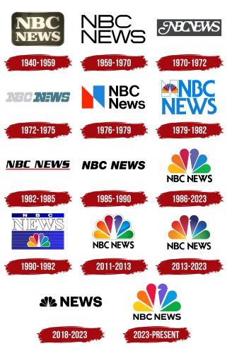
1940 – 1959
The logo is textual: it consists entirely of the name of the news channel, with a visual emphasis. For impact, designers placed the abbreviation “NBC” in a rectangle with rounded corners. The background color is dark beige, with gold letters and a frame. The font is in uppercase, extra-bold, with some thinning in places. The glyphs are designed with massive serifs.
1959 – 1970
The emblem became maximally simple. It features an open inscription, not complemented by a background, frames, or other elements. The wide letters are made of semi-bold black lines, forming interesting geometric shapes of a refined form. The phrase occupies two levels, aligned to the left edge. The strict styling emphasizes the business nature of the news and the practical approach to their collection, composition, and broadcasting. Smooth outlines are only present in “C” and “S,” while “B” is semi-rounded.
1970 – 1972
A strict logo with the news service’s name appeared on the air. The phrase “NBC News” is written together, placed in one line, and set in uppercase glyphs with roundings. In this form, the emblem resembles a monogram with swirls – elegant and creative. This was necessary to maintain dynamism on the TV screen, as the symbol served as a title screen. The white inscription stands out sharply against a dark background.
1972 – 1975
The text became incredibly massive, maintaining a single-line layout. The designers separated the words “NBC” and “News” but connected some letters together. For example, “N” and “B” are joined, as well as “N” and “E”, sharing one common side. However, “W,” although adjacent to them, stands separately, as it only touches “E” at one point – at the top left. The glyphs are complemented by wide rectangular serifs. The left side of the name is painted gray, and the right – turquoise.
1976 – 1979
At the beginning of 1976, an emblem was launched, developed by the studio Lippincott & Margulies. A complete redesign brought a new style, changing the mood of the logo. Now, it features bright colors (red and blue), balance (harmonious combination of angles and roundings), and a simple font (Neue Haas Grotesk). The first element is a symbol composed of two geometric shapes, forming the initial letter of the news channel’s name. This glyph is from the Helvetica Bold font. It is formed from two rectangles, cut at an angle, flipped mirror-like, and joined in the middle. Next is the text. It occupies two lines.
1979 – 1982
To emphasize its affiliation with the media company Comcast, the news program adopted a new logo featuring a stylized peacock with a rainbow tail formed from 11 teardrop elements. They are colored in pairs (left and right), ending in the center with a blue feather. Besides this color, yellow, orange, burgundy, purple, and dark blue are also present. The large letter “N” became outlined with a white center. It was nicknamed “The Proud N” by the public. The bird is also outlined with a thin line. Adjacent is an inscription, set in Serif Gothic Bold with mini-extensions at the ends. The lines are aligned to the right side.
1982 – 1985
The simplified NBC News logo adopted the Serpentine Bold Italic font. The two parts of the name are again combined into one line, but at the same time, a large space is maintained between the words. The inscription is extra-bold, italic, and underscored below with a solid red line.
1985 – 1990
The emblem style remained the same – business-like, strict, minimalist. Only the miniature serifs and the red underline disappeared. The name became smooth and uniformly bold. For this, designers chose the Helvetica Bold Oblique font.
1990 – 1992
This design shows the connection of NBC News with its parent company, Comcast. For this purpose, the original logo created by the studio Lippincott & Margulies was used. It features a peacock with a huge multicolored tail with six feathers: green, blue, yellow, red, orange, and lilac. Between them, the bird’s head is camouflaged, so only the beak, looking like a white triangular notch, is visible. Above the peacock is the name of the channel. The first line forms a cobalt rectangle with a white abbreviation “NBC.” The second row is occupied by the word “News,” where white letters are outlined with a thin border.
1986 – today
The minimalist NBC News logo consists of a multicolored peacock and the name on a white background. The inscription is in the individual NBC Futura font with sharp ends (on “N” and “W”) and evenly trimmed tops (on “C,” “E,” and “S”).
2011 – 2013
Designers expanded the space between the feathers and framed the tail, outlining it with a narrow silver line. For optimal contrast, they added shadows.
2013 – 2023
Shadows and outlines around the peacock were removed from the logo and replaced by more intense colors and gradients in the tail feathers. The name remains black, semi-bold, set in the NBC Futura font.
2018 – today
The classic design of the NBC News emblem received a monochrome treatment. The peacock icon is reduced to the size of the inscription and placed on the right side. The new logo concept was developed to refresh the visual identity of NBC News websites NBCNews.com, MSNBC.com, and TODAY.com. To emphasize the name, the authors switched from an antique font to a grotesque one, using bold uppercase letters.
2023 – today
The current logo is two-dimensional: it has a simplified form. The image of the peacock is flat. The tail is colorful and wide, with significant space between the feathers. Thanks to the enlargement of the white separating stripes, the body and head of the bird became more distinct. The colors are light, simple, and without gradients. The inscription is also simplified: sharp tops on the letters are cut off. Now, the proprietary NBC Tinker font is used, custom-created based on Sweet Sans Pro with smooth and geometric letters.
Font and Colors
Various original fonts of several types have been used in NBC News logos over the years. These include Neue Haas Grotesk, Serif Gothic Bold, Serpentine Bold Italic, and Helvetica Bold Oblique. Later, individual typefaces, NBC Futura and NBC Tinker appeared. The channel’s corporate palette consists of the color spectrum of the parent company, Comcast, and includes green, orange, blue, yellow, purple, and red.
