The NBCUniversal logo is simple and minimalist. It shows the creative union of the two most important companies in the media space and entertainment industry. The inherent elegance sets the mood for a creative perception of the proposed content. However, the emblem is not devoid of a business vein, as it does not contain a single extra element.
NBCUniversal: Brand overview
| Founded: | May 11, 2004 |
| Founder: | Comcast |
| Headquarters: | New York City, United States |
| Website: | nbcuniversal.com |
Meaning and History
As expected after the giants’ merger from two adjacent fields, the newly formed structure was named in their honor. There are two reasons for this. First, these are well-known and well-promoted companies, so the conglomerate doesn’t have to win over the audience from scratch. The second is that the founder indicated the sphere of activity this way, explaining the choice of the name for his TV service.
Naturally, not only the names of the parent organizations were transferred to the newcomer in the entertainment and media industry, and their visual symbols. It took the most recognizable details, typical of the basic services – writing style, graphic elements, and general design. However, over time, the conglomerate reformatted them according to its preferences – effectively personifying the emblem.
What is NBCUniversal?
NBCUniversal is a major representative of the entertainment and media space industry. It appeared in 2004 after the NBC radio and television network merger from the Big Three in America with the famous Hollywood film studio Universal Pictures. As a result, a powerful conglomerate centered in New York City emerged. Comcast Corporation now owns it.
2004 – 2011
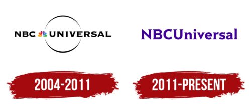
The central element of the NBCUniversal logo is an open ring. It is in the middle and is horizontally divided by the name of the television company, so the circle looks like two mirror-arranged arches. This is the so-called rotating planet, inherited from the symbolism of Universal Pictures and stylized as a circle with a thin rim.
The inscription is split into two parts that are not connected; that is, they are not merged. Between them is the famous peacock, taken from the emblem of the parent organization – the NBC studio. This is its most famous and recognizable sign. The bird’s multicolored feathers appeared in 1956 to highlight the standard of color television. The tail contains green, blue, purple, red, orange, and yellow colors.
The text is set in a bold font in uppercase. All letters have sharp serifs. They are miniature and look like needles sticking out at the ends of the glyphs. The inscription is strict and black, with a narrow intercharacter space.
2011 – today
The author of this logo is designer Wolff Olins. He decided not to emphasize the brand’s origin but to give it an individual face. The developer abandoned the images inherited from the parent companies – the peacock and the stylized globe. This was a natural step toward NBCUniversal’s popularity. The logo became much simpler and lighter, as it was not overloaded with visual effects from other organizations.
However, the creators still maintained some connection with the identity of the original brands. Their similarity is not entirely obvious but rather superficial. Some thin serifs have been preserved – not long, but sharp. In addition, the two inscriptions are combined into one, which serves as a reason to use the lowercase font. The first four letters (abbreviation and initial glyph) remained capitalized, and the rest were turned lowercase. The diagonal bar of the “N” at the top and bottom had become sharp, whereas before, it was flat.
Font and Colors
The text in the emblem is written in bold font with miniature serifs. The first case resembles Copper Penny DTP sm_UC by The Fontry or Universal Serif Regular by Khiam Mincey. In the second case, a special typeface was developed to order – Rock Serif. It has thin and elegant serifs.
Previously, the only bright element in the logo was the peacock because its tail was painted in six bright colors: green, blue, yellow, orange, purple, and red. Everything else was monochrome. Then the colorfulness went away, and a restrained purple appeared.
NBCUniversal color codes
| Indigo | Hex color: | #400095 |
|---|---|---|
| RGB: | 64 0 149 | |
| CMYK: | 57 100 0 42 | |
| Pantone: | PMS Violet C |


