


![]() NC-Wilmington Seahawks Logo PNG
NC-Wilmington Seahawks Logo PNG
The University of North Carolina sports division uses a logo featuring the team’s mascot and the acronym of its name. The hawk symbolism in the NC-Wilmington Seahawks emblem reflects strength and vigilance, attentiveness and determination, aggression and insight.
The UNC Wilmington Seahawks program began in 1947 with the opening of Wilmington College. Students selected the Seahawks name, inspired by the Iowa Pre-Flight Seahawks and the city’s coastal setting. Green and gold were chosen to reflect ocean water and Atlantic beaches. In 1951, Bill Brooks arrived and built the athletic structure, leading both basketball and baseball.
Early success came in baseball with national junior college titles in 1961 and 1963. The school became a four-year institution in 1963 and joined the University of North Carolina system in 1969. By 1977, teams moved to NCAA Division I and into Trask Coliseum, facing programs like Wake Forest. In 1984, the university joined ECAC-South, which was later renamed the Colonial Athletic Association.
Basketball reached its first conference final in 1987 and won its first title in 2000 against Richmond, earning an NCAA Tournament berth against Cincinnati. In 2002, the team upset USC in overtime, one of the notable tournament results of that year, before losing to Indiana. Another appearance followed in 2003, ending on a late shot against Maryland, and a second conference title came in 2006 with a win over Hofstra.
Baseball peaked in the 2000s with four consecutive 40-win seasons from 2003 to 2006 and a 44-win record in 2008. More than 90 players advanced to professional leagues. In 2017, the basketball team set a program record with 29 wins under Kevin Keatts and returned to the NCAA Tournament. In 2022, the team won the College Basketball Invitational, marking its first postseason title outside the main NCAA field.
Meaning and History
![]()
The sports organization has had several logos throughout its history, but its most famous image appeared in 1977. This hawk is strong, keen, carefree, and attentive.
What is NC-Wilmington Seahawks?
The NC Wilmington Seahawks is a sports department part of the University of North Carolina at Wilmington. It consists of 19 men’s and women’s teams competing at the NCAA Division I level and is a member of the Colonial Athletic Association.
1977 – 1986
![]()
The first logo featured a feathered predator in mid-flight. Its wings were widely spread, and its talons, with sharp claws, were drawn together as if it were about to capture prey it had spotted. The white hawk had a green border emphasizing the tail and left wing. The other lines were thin, precisely depicting a real bird.
1986 – 1992
![]()
In 1986, the emblem featured a cartoonish image. The predator was drawn full-length, on humanoid legs, with a distinctive ring-like structure at the base. Instead of talons, it had three round protrusions. A sailor’s hat adorned its head, and it wore a T-shirt with the horizontal inscription “UNCW.” The anthropomorphic character, painted in a toxic green color, was depicted with tightly clenched fists and gritted teeth. Its eyebrows were menacingly drawn, and its black eyes looked forward.
1992 – 2015
![]()
During this period, the sports association’s emblem used an abstract hawk. The bird was depicted in profile, looking left. Its beak was sharp, hook-like. The eye was placed on a dark horizontal line. The top of the head was cut off, and below was the department’s acronym, underscored by a wide line with slanted edges. Beige and blue were added to the traditional green color.
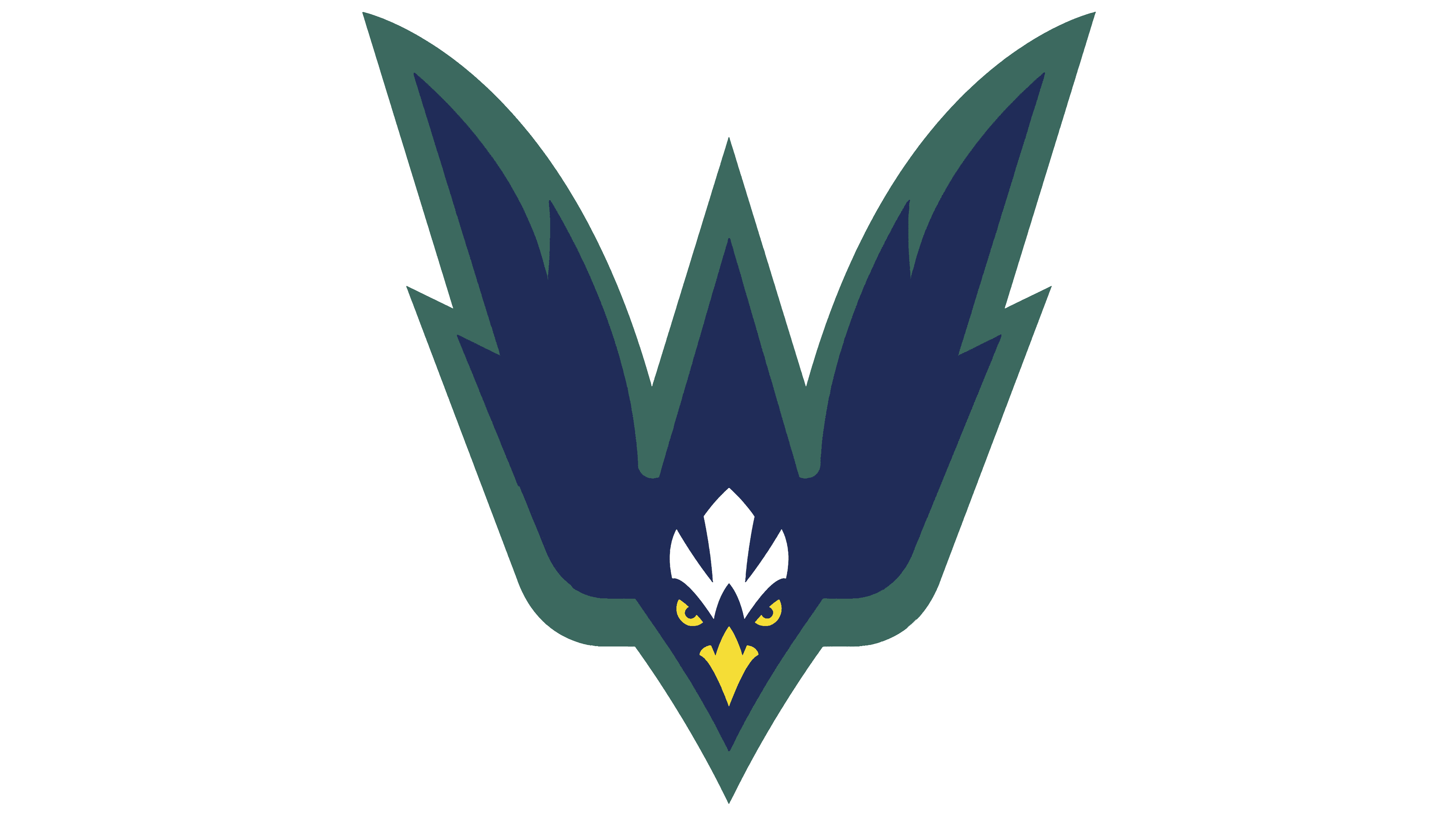
2015 – today
![]()
The current logo, updated in 2015, features a full-length hawk. It has a menacing, intimidating look due to the triangular shape formed by the wide neck plumage and the narrow, sharp beak. Three raised feathers are drawn on the back of the neck. The eyes are semi-circular as if narrowed in a gaze. A white, wavy mark on the forehead closely resembles the contours of the yellow beak.
Below is the word “UNCW” written in block letters. Below that is the inscription “Seahawks.” It is smaller, consists of capital letters, and is divided by two arc-shaped lines.
Font and Colors
The NC-Wilmington Seahawks Sports Association’s branding has always featured the main image: the hawk. The bird is played with in different places and styles, but its predatory nature is emphasized everywhere as swift, aggressive, gripping, and forceful. The color palette, consisting of various shades of green, yellow (sandy and golden), white, and blue, remains constant.