


 NCCU Eagles Logo (North Carolina Central Eagles Logo) PNG
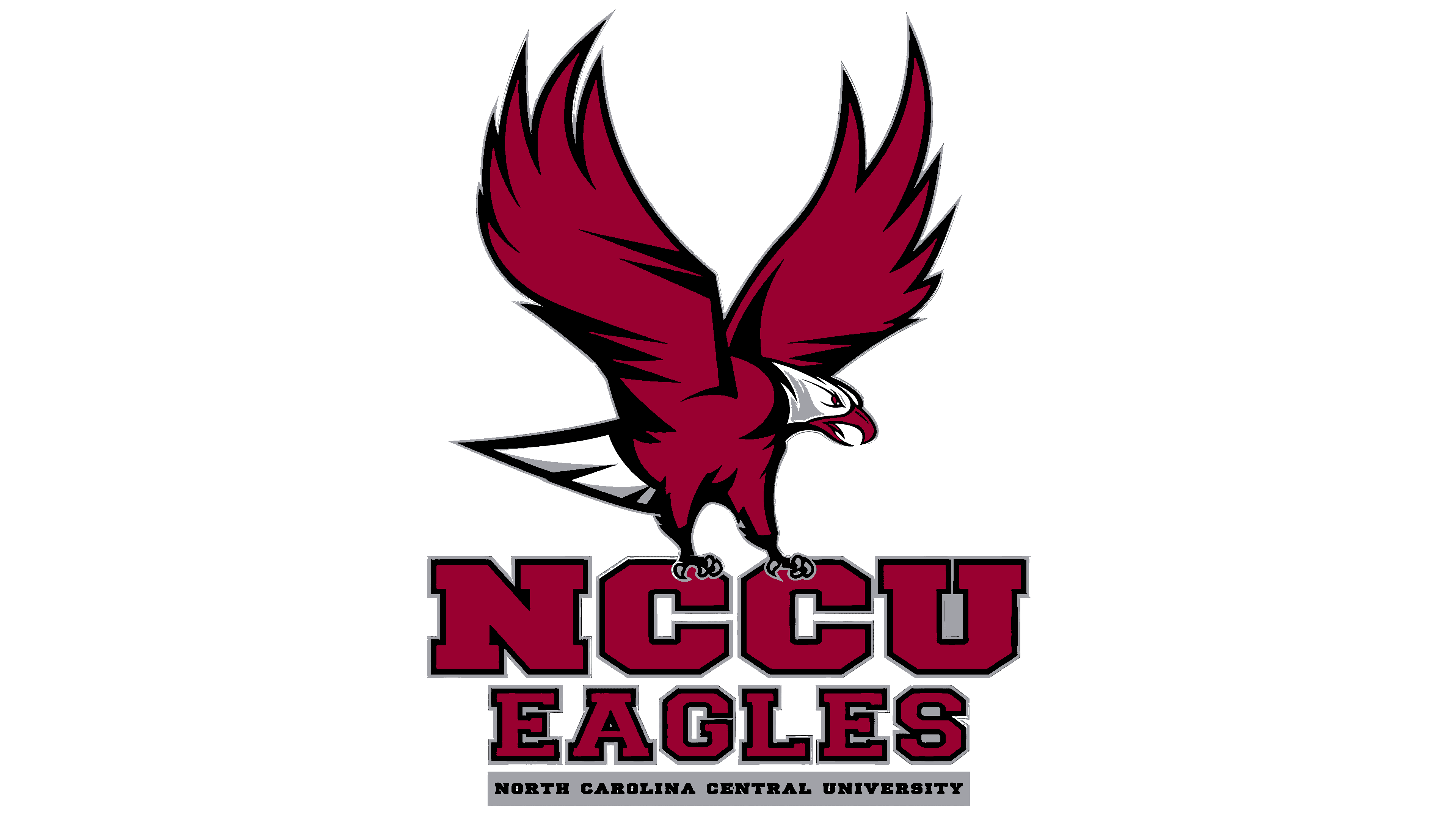
The NCCU Eagles logo highlights the university’s athletes; the central element connects to the name, and the text reinforces it. The eagle’s composition and the text symbolize constant readiness for attack and dynamism.
The NCCU Eagles program began in 1910 in Durham, when James E. Shepard founded the school under its original name. From the first years, the eagle symbol and maroon-gray colors became part of campus identity. The first intercollegiate team appeared in 1911 with baseball, and in 1928 the school entered the CIAA, collecting 41 conference titles over the following decades.
Basketball developed into a key sport under coach John B. McLendon from 1940 to 1952, posting a 239–68 record. He introduced fast break play, zone pressure, and structured offensive sets that later spread across college basketball. In 1944, NCCU played Duke University Medical School in a secret game during segregation and won 88:44, an early example of interracial competition.
Sam Jones emerged as a leading player, later joining the Boston Celtics and winning multiple NBA titles. Track and field also gained national visibility under Leroy T. Walker, whose athletes produced Olympic medalists from 1956 to 1980 and maintained a steady pipeline to international competition.
In 1971, NCCU became a founding member of the Mid-Eastern Athletic Conference and won football titles in 1972 and 1973. The program left in 1979 to remain at the Division II level, then returned to Division I in 2007.
Basketball reached a major milestone in 1989 with the NCAA Division II championship after a 28–4 season and a final win over Southeast Missouri State. In Division I, the team won conference tournaments in 2014, 2017, 2018, and 2019, including its first NCAA Tournament victory in 2014.
Meaning and History
What are the NCCU Eagles?
NCCU Eagles, more precisely North Carolina Central Eagles, is the athletic department of North Carolina Central University, comprising 14 teams competing in intercollegiate programs. It is located in Durham and competes at the NCAA Division I level (FCS), representing the Mid-Eastern Athletic Conference. The golfers are members of the NEC.
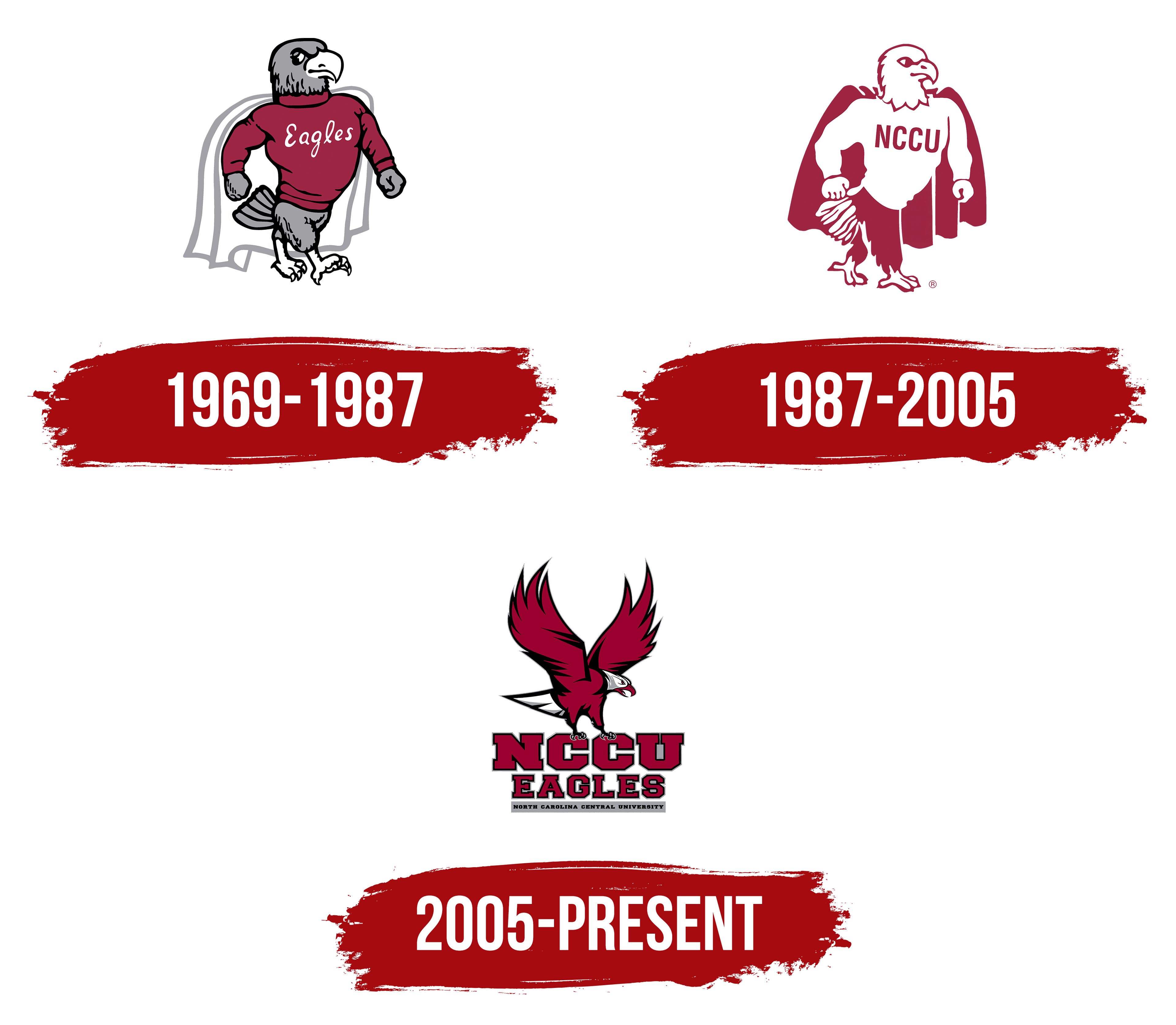
1969 – 1987
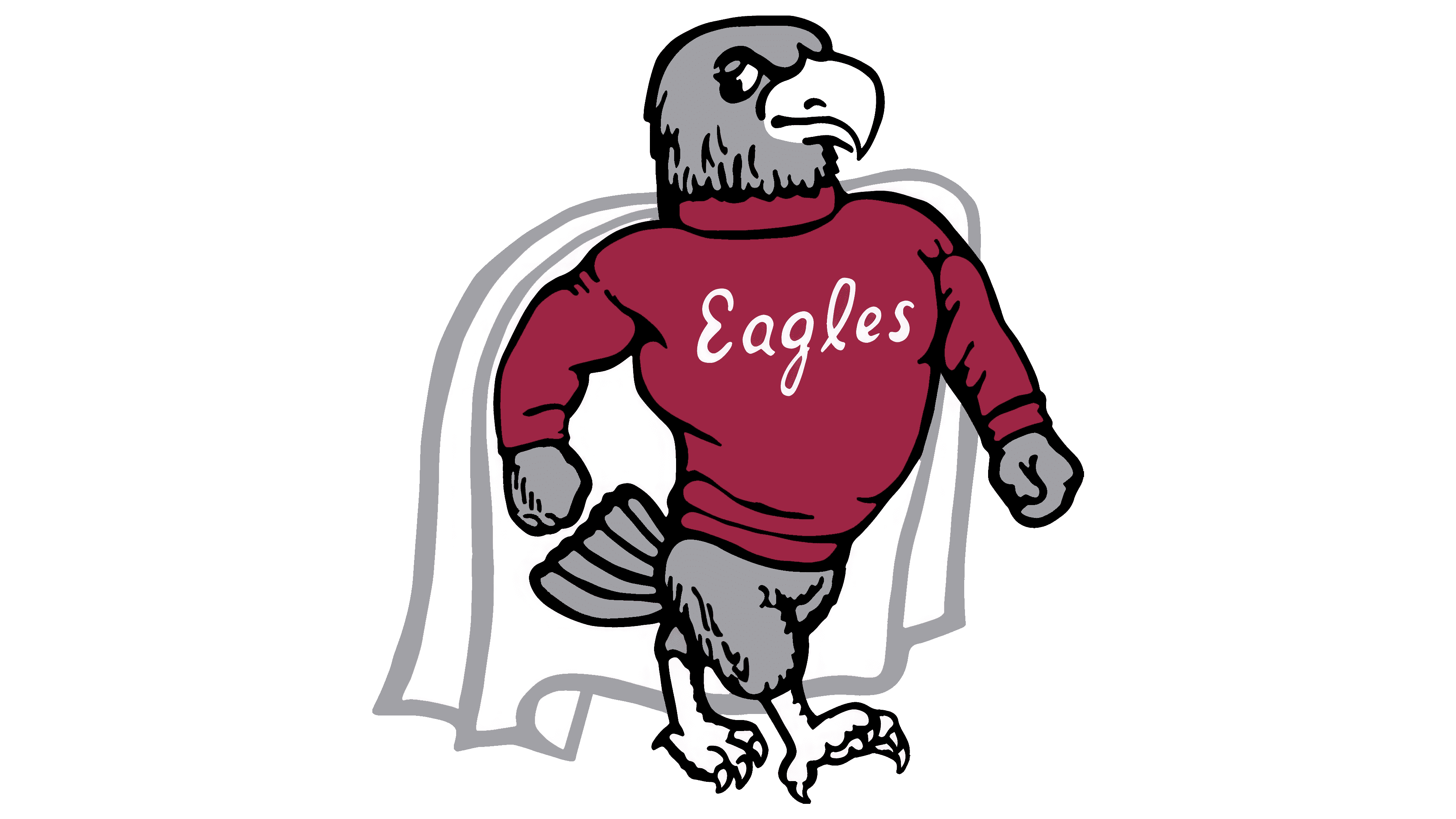
The North Carolina Central Eagles emblem used from 1969 to 1987 depicted an athletic eagle wearing a comic-book hero’s cape. By then, the bird was already part of university tradition, rooted in the teachings of founder James Edward Shepard. The athletic illustration gave human features to a symbol of achievement and freedom.
The North Carolina Central Eagles, or NCCU Eagles, represent North Carolina Central University in Durham. The institution began in 1910, when Shepard opened the National Religious Training School and Chautauqua for African Americans. Following several changes, it became North Carolina College at Durham in 1947. In 1969, it gained university status as North Carolina Central University. The new name gave rise to the NCCU abbreviation.
University tradition connects the eagle to Shepard’s addresses to students at the start of the academic year. He compared it with ordinary barnyard birds and contrasted its solitary flight with the sparrow’s tendency to stay in a flock. These comparisons encouraged students to aim high and rely on their own abilities. The eagle became part of campus life long before the modern athletic emblems. Maroon and gray became NCCU’s traditional colors and appear in the alma mater, “Dear Old N.C.C.,” with lyrics by Annie D. Shepard.
In the 1969–1987 emblem, those colors are distributed between the clothing and feathers. A maroon sweater covers the torso, while the head, arms, tail, and feathers beneath the sweater remain gray. White script Eagles lettering appears across the chest, with an uppercase “E” and connected lowercase letters. Black lines define feathers, fabric folds, and facial features, while a gray outline frames the white cape.
The eagle strides to the right, chest thrust forward, arms bent, and fists clenched. A heavy hooked beak and a brow lowered over the eye give it a stern appearance. Short tail feathers fan out behind the body, and clawed feet extend below. Human shoulders and arms combine with an avian head, tail, and feet. The sweater and cape suggest a comic-book hero’s costume. The eagle’s figure and the draped fabric form the emblem’s outer silhouette.
1987 – 2005
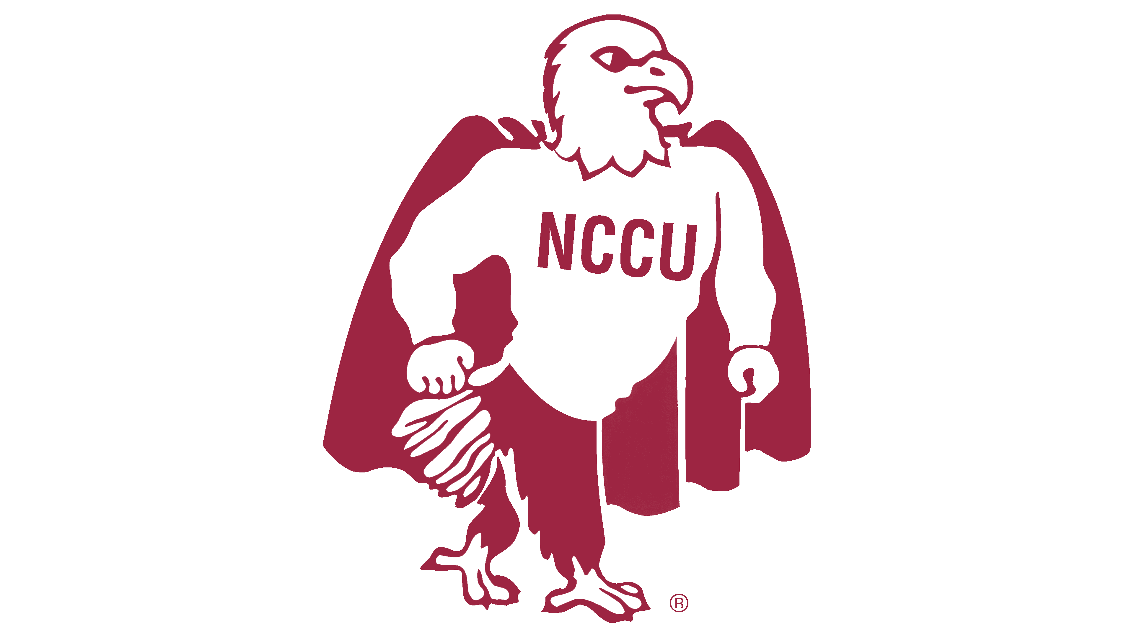
In 1987, NCCU replaced Eagles on the North Carolina Central mascot’s chest. Four uppercase sans-serif letters identifying the university replaced the script athletic nickname. The revised emblem remained in use until 2005. The character retained its striding pose, clenched fists, and cape.
The main change involved color placement. Maroon and white replaced gray fills and black lines. The cape became entirely maroon, and the sweater became white. Maroon outlines defined the head, beak, and feet, with white areas inside. Short strokes and broad openings suggested feathers and clothing folds.
The athletic collection also included a gray eagle in flight. It faced left in profile and bore NCCU on its chest. The shared abbreviation connected both the caped, striding character and the flying eagle to the university.
2005 – today
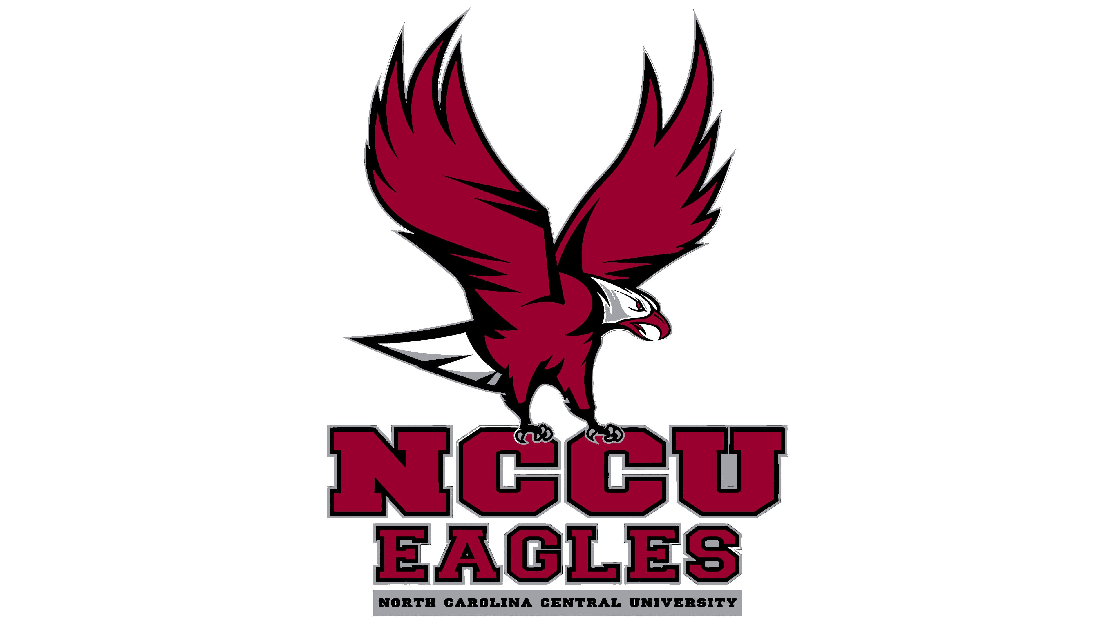
For the 2005 season, NCCU introduced an athletic identity combining eagle imagery with university lettering. SME Inc. developed the collection. A bird replaced the sweater-and-cape character with human arms. The name moved from the mascot’s clothing into a separate wordmark. The new marks were intended for athletic teams and fan merchandise, while the university seal retained its distinct official purpose.
Preparations began in 2004, when Chancellor James H. Ammons appointed a mascot redesign committee. Sharon Saunders, special assistant to the chancellor for public relations, and general counsel Kay Webb chaired it. The committee was tasked with creating an emblem that would earn support across the university community and represent NCCU athletics. Before meetings, members showed the latest options to colleagues, then discussed the feedback they had gathered.
The unveiling was staged as a campus celebration with music and refreshments. Participants included Ammons, athletic director William “Bill” Hayes, student government president Renee Clark, trustees, and Durham mayor William “Bill” Bell. The chancellor connected the update to the university’s growth and a desire to convey the teams’ energy.
In the primary emblem, the eagle raises its wings above its body, forming an arc open at the top. Long, pointed feathers give the silhouette a vertical emphasis. The tail extends downward, the head faces right, and the open beak points slightly down. Black areas divide the maroon plumage, while gray shadows define the white head and light-colored tail. Outer outlines separate the bird from the background.
Clawed feet sit above large NCCU lettering. EAGLES occupies the next line, followed by NORTH CAROLINA CENTRAL UNIVERSITY on a narrow gray band. The three lines present the abbreviation, athletic nickname, and full institutional name. Black and gray outlines surround the maroon NCCU and EAGLES letters. Heavy strokes, rectangular serifs, and clipped corners follow American collegiate athletic lettering traditions. The text forms a separate lower section of the emblem.
The 2005 guide specified Collegiate FLF and Collegiate Black FLF as the typefaces. Maroon was Pantone 202 C, gray was Pantone 423 C, and black was Process Black. Digital specifications were RGB 136, 0, 35 for maroon and RGB 142, 144, 147 for gray. Color and black-and-white versions were prepared for light and dark surfaces. On dark backgrounds, light outlines preserve the boundaries of the letters, head, and feathers. Backgrounds shown in the samples serve only to demonstrate the logos.
A secondary version places a large head above NCCU EAGLES. Long, pointed feathers sweep left, while an open maroon beak faces right. White and gray areas define the crown, cheek, and neck, and black lines outline the eye and beak. The head, raised-wing eagle, and wordmark may each be used independently. The collection accommodates surfaces of different sizes with either a full emblem bearing the university name or a compact profile.
In April 2018, a new academic emblem introduced six quadrilaterals beside NC Central University lettering. The shapes reference the corner masonry of the historic administration building and suggest eagle wings. The athletic department retained the 2005 eagle. The abstract, architecture-inspired design represented the academic identity, while the detailed bird continued to identify the Eagles.
Font and Colors

The eagle is depicted with large, spread wings. They are raised upwards as if in the moment of a stroke. The tail fans out and ends in a sharp, protruding tip. The bird’s claws grasp the central letters “CC.” The head is pointed downwards. The beak is half-open, with the tip of the tongue sticking out. All details are outlined in black. The internal strokes match the outline color. With its menacing appearance, the predator intimidates its enemy, signaling its readiness to attack.