


![]() Neon Logo PNG
Neon Logo PNG
Like a glowing sign above the cinema, the Neon logo invites viewers to visit the institution and watch an interesting modern film. The emblem is a tribute to progress and the development of the film industry. It also indicates the studio’s innovative approach to filmmaking and choice of topics.
Neon grew out of Tom Quinn’s long career in independent film distribution. He worked at Samuel Goldwyn Films, Magnolia Pictures, and Radius-TWC, building ties with directors including Bong Joon-ho. On January 13, 2017, Quinn founded NEON Rated, LLC with Tim League of Alamo Drafthouse Cinema, starting with 12 employees split between New York and Los Angeles.
The first Neon release was Nacho Vigalondo’s Colossal in April 2017. That same year, the company bought the rights to Craig Gillespie’s I, Tonya at the Toronto International Film Festival for about $6 million. The film earned $30 million in the US, and Allison Janney won the Oscar for Best Supporting Actress. Neon treated the awards strategy as part of the distribution from the start.
In 2018, 30West, part of The Friedkin Group, bought a controlling stake, giving Neon stronger financial backing. Quinn then acquired US rights to Bong Joon-ho’s Parasite at Cannes. Neon spent about $20 million on marketing and awards promotion. In 2019, Parasite earned $53 million in the US, passed $200 million worldwide, and won four Oscars, including Best Picture and Best Director.
After Parasite, Neon became a major force in international auteur cinema, competing with A24 from a different angle. It handled Cannes Palme d’Or winners Titane (2021), Triangle of Sadness (2022), Anatomy of a Fall (2023), and Anora (2024). In 2024, Longlegs opened with $22.6 million, a record indie horror debut. By early 2025, Neon had a $200 million credit line, 52 employees, and more than 30 Academy Award nominations.
Meaning and History
![]()
At the fourth meeting of the Annual Zurich Summit, producer Tom Quinn announced that he would be able to produce films that appeal to young audiences under forty-five who have no aversion to violence, nonfiction, or foreign language. This kind of bet culminated in the emergence of Neon, which became a partner of Blumhouse Productions in the fall of 2017 to create and manage BH Tilt.
The successful activity led to 30West, the media venture arm of the world-famous Friedkin Group, buying a controlling stake two years after the new film studio’s emergence. The studio’s owner is a businessman to the marrow of his bones, so he would not invest in a hopeless project. In Neon, he sensed a considerable prospect.
The young organization has been actively developing and, in 2021, launched a joint project, Decal, with Bleecker Street to promote and distribute home entertainment. Although two firms own it, it is independent of them, simply focusing on distributing entertainment content rights from Bleecker Street and Neon.
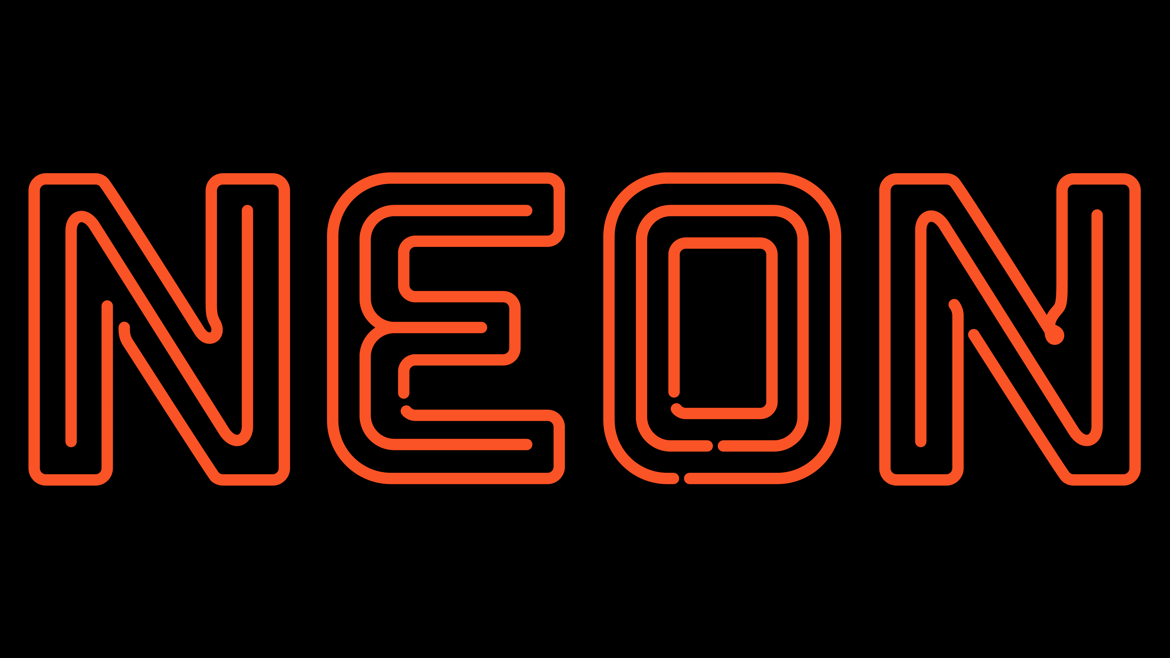
The young film company’s identity appeared immediately upon its opening. It reflects the specifics of the name: the logo looks like hollow neon tubes, ready to light up and shine with the originally intended light. That is, his aura (style, opinions, and how the audience perceives him) depends on the films he presents for hire. Therefore, the logo shows only a minimalist combination of “lamp” letters in neutral white.

The studio chose a simple, monochrome visual identity mark to present to a wide audience. Although it is made only in text format, paradoxically, it contains graphic details. That is, it is, in fact, a harmonious symbiosis of drawn and verbal elements. Letters perform the role of icons (four at once).
Printed signs look like figuratively twisted neon lamps, ready to light up with the light they are functionally tuned to. That is, “glass tubes” convey the aura of the films offered to the audience. This young company already has many films and has been nominated for the highest film award. In 2018, her film “I, Tonya” received three nominations and one win for Best Supporting Actress. The following year, “Border” was awarded the Best Hair and Makeup Award. But the most Oscar-winning year for Neon was 2020: then “Parasite” and “Honeyland” were nominated for eight awards. And one of the films was recognized as the best.
The inscription on the emblem is concise and typed in upper case. The symbols are large and wide, consisting of inner and outer lines. One forms a kind of core, and the second forms the contours of the letters. Such an allegory conveys the essence of the film company’s professional position: to do what has been started, not to deviate from what was planned, to implement clear plans, and to present integral works with an inner core.
The letters are carved into hollow tubes and look like they’re about to burst into inviting neon light. Each line that forms the signs has a beginning and an end that are not connected. Moreover, there are no sharp corners – all joints and transitions are rounded.
Font and Colors
The creators chose a magical font with a double riddle for their emblem. The inner lines are thin and inexpressive, forming the inscription, but they are surrounded by additional stripes that form large, catchy letters. There is a wide hollow space between the outer and inner strokes.
The color scheme also has a mysterious quality because the neon light is very bright. But this only happens at night, while such an inscription looks white for the rest of the period.