


![]() NetApp Logo PNG
NetApp Logo PNG
The NetApp logo symbolizes the data warehouse because the company is related to such technologies. The emblem testifies to the brand’s commitment to continually develop and deliver high-quality, effective products to consumers.
NetApp was founded in Silicon Valley in 1992 by David Hitz, James Lau, and Michael Malcolm. The company’s original name was Network Appliance, Inc., reflecting its basic idea: a dedicated network device for file storage. At the time, most companies kept data on local servers, and storage management was complex and labor-heavy.
Its first product, introduced in 1993, used WAFL (Write Anywhere File Layout), a file system designed by David Hitz. Instead of overwriting old blocks, WAFL wrote data into free disk areas. That structure enabled fast snapshots, allowing companies to return to earlier data states within seconds and improving backup and recovery times.
The young company entered a market led by EMC Corporation and IBM but took a different route: rather than large, expensive storage arrays, Network Appliance offered simpler network storage that appealed to small- and midsize corporate clients. In 1995, the company went public on NASDAQ, using the capital to expand its product line and sales during the late 1990s tech market boom.
The dot-com boom increased demand for network storage, while the 2001 crash forced the company to adjust to tighter IT budgets. Later acquisitions added key technologies: Spinnaker Networks in 2003 for clustering, Decru in 2005 for encryption, and Topio in 2006 for replication. In 2008, Network Appliance officially became NetApp. In 2015-2016, the company bought SolidFire for about $870 million, entering the fast-growing market for all-flash storage systems.
Meaning and History
![]()
The company was founded by a group of qualified engineers who had worked at Auspex. The result of the efforts of Michael Malcolm, James Lau, and David Hitz was the new company NetApp, which was officially introduced on the world stage in 1992. It began developing new secure storage systems using the latest technology. This is how the WAFL product was born. But the company did not stop there, and in the following years, it experienced rapid growth and a capital increase.
Old
![]()
The first NetApp logo was a clear image with the company name and a bottom caption. The latter was translated as simplified data management. This was the company’s main goal – to create a reliable information storage system with an easy-to-use, user-friendly interface.
The color scheme consisted of a single color: rich blue. It symbolized confidence, stability, and high quality. The overall picture was complemented by the letters being of the same color. This meant the unity of all systems and technologies used by the company. The only caveat was the font size. The lowercase lettering was set in smaller, more delicate letters, while NetApp was set in larger, more massive letters.
The emphasis on the name meant a tribute to the brand’s value and its heritage. In addition, the two halves, Net and App, although connected, each began with a capital letter. It was a special stylistic solution that added a “zest” to the emblem and corporate identity. The sphere above the company name was an unusual image that symbolized the main achievement: the high-quality WAFL file system.
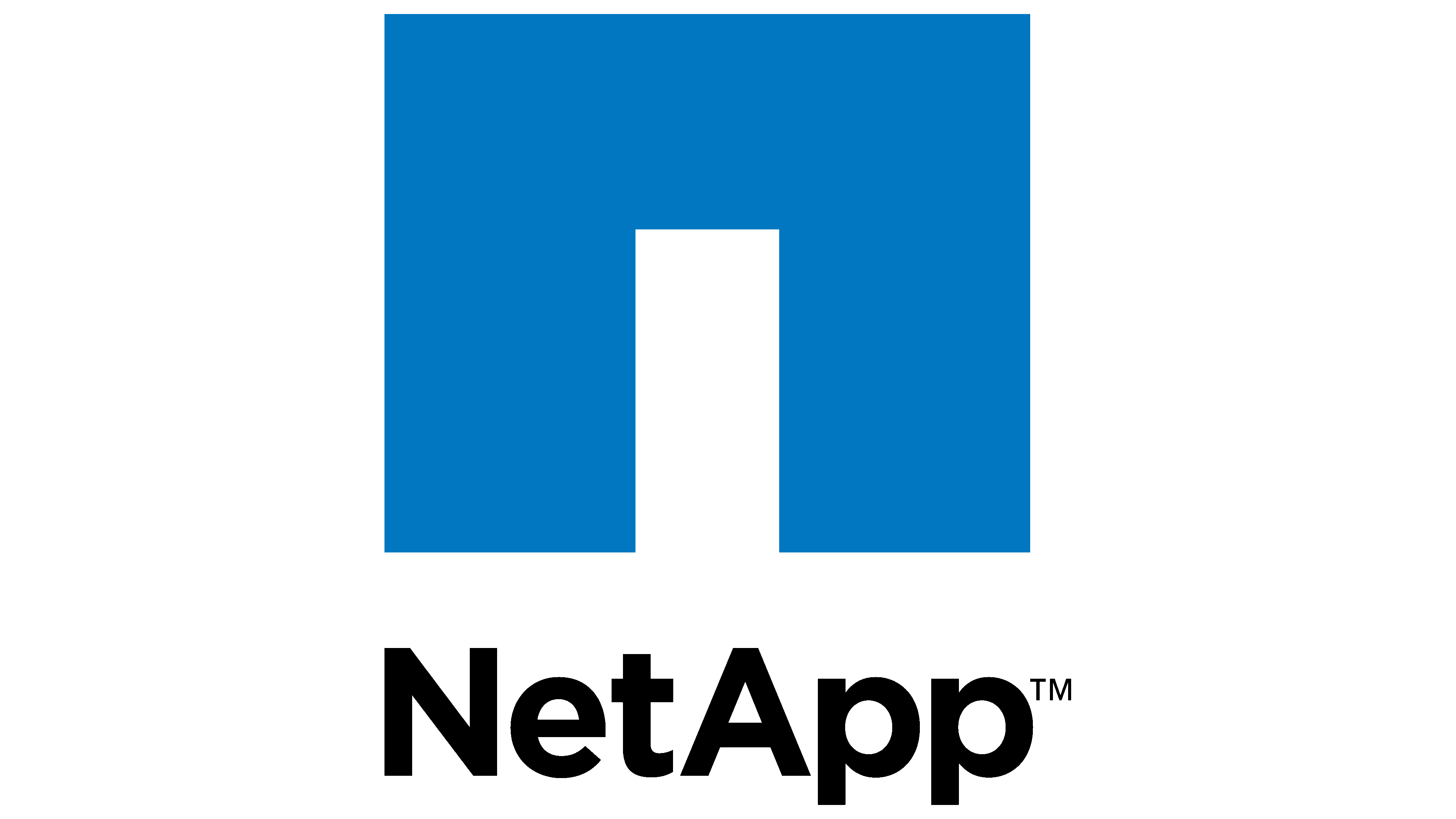
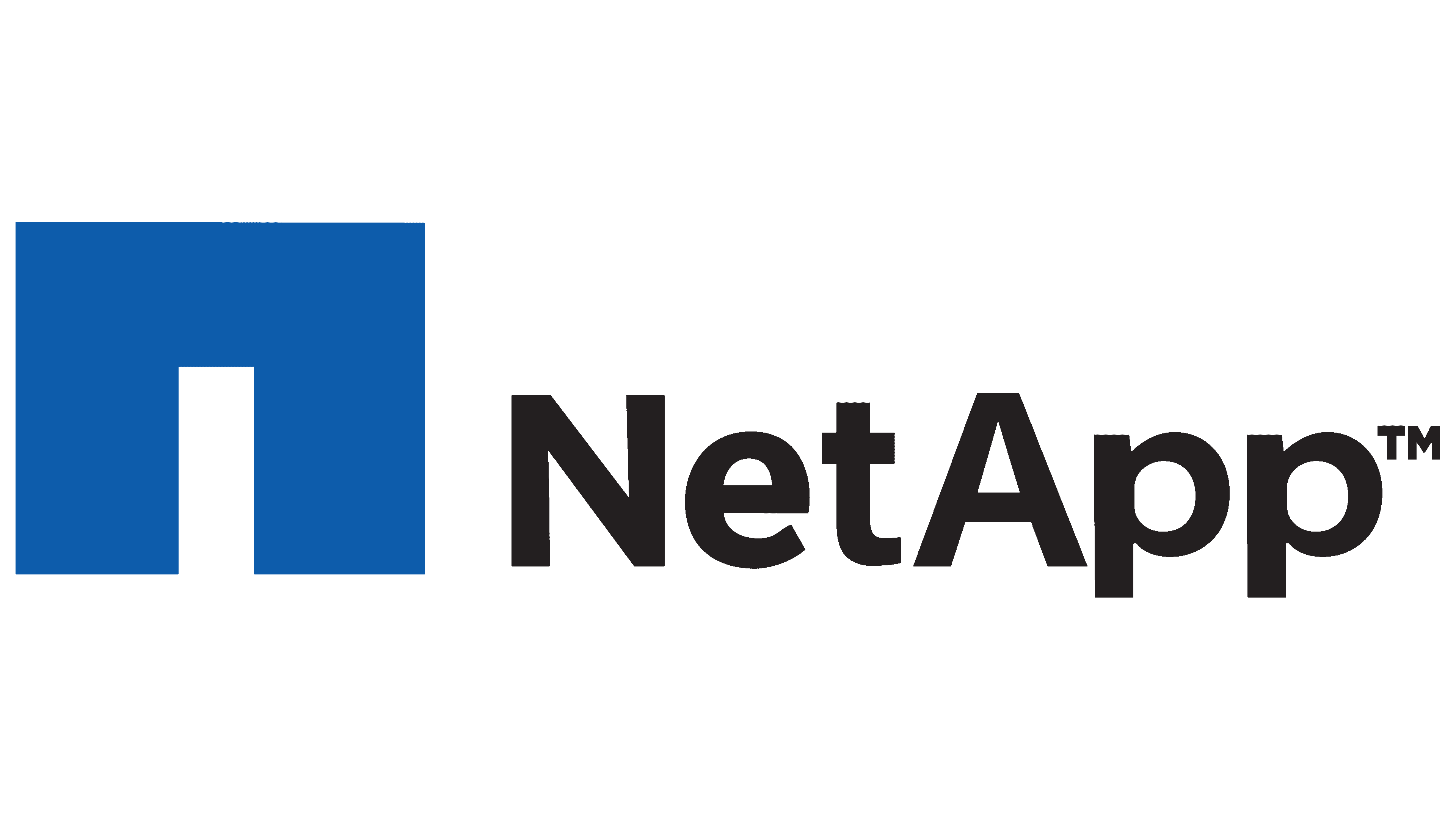
New
![]()
The original logo was used for many years. But as early as 2013, the company decided to rebrand and redesign its brand. The changes were dramatic. They touched on the color scheme, font, and general styling. Even the words of the lower inscription have changed, while the company’s name remains the same. The phrase “NetApp” remained the basis of the logo.
But now, the name was made in a different font and turned black. Compared to the previous version, this one looked more expressive. This meant that the company’s position in the world market was strengthening, and its reputation was improving. The lower inscription was an additional confirmation of this.
It was translated as “how to go further, faster,” which meant grandiose plans for the future. An additional update was the clarification of the font. The inscriptions have become more accurate and thinner. As above, the image was complemented by a large arch that resembled the room’s entrance. The element seemed to signify a transition into a new space of improved technologies. This logo is still in use today.
Font and Colors
The main goal of the NetApp logo is to convey the main qualities of an innovative information storage system:
- speed;
- insights;
- simplicity.
To emphasize these features, an appropriate color scheme was chosen. It consists of 3 colors: white (background), black (inscription), and blue (arch). Together, they convey the company’s main style and principles. A special type of commercial font, Dienstag Black, was chosen for the inscriptions. The capital letters of the title are slightly condensed. The presented design is a harmonious display of the company’s main values.