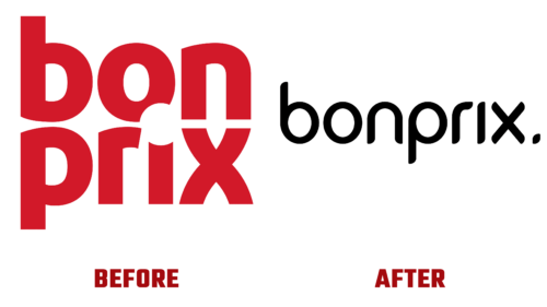
The fashionable German company Bonprix decided to implement a new corporate style. To do this, they redesigned the logo and changed the slogan. Both became simpler, lighter, more relevant, and fit into the concept of the modern digital world. The work on visual identity was carried out in collaboration with Studio Oeding from Hamburg. The result was announced in mid-March of this year.
The changes were radical. Instead of the bulky symbol with a two-level inscription in a loud color and block letters, a refined and elegant monochrome emblem with a single-line name appeared. It exudes novelty and restraint, bringing the brand closer to the cream of the fashion industry. The rebranding of the identity was prompted by several factors:
- desire to remind people of the brand;
- aiming to cover a large segment of clients;
- intent to stand alongside the giants of the fashion world;
- show themselves as a strong competitor;
- simplify the visual perception of the logo.
The single-line structure makes the emblem adaptable to any information carrier, which corresponds to Bonprix’s new statement that fashion has become smarter. Thus, understated elegance and high style harmoniously resonate with advantageous practicality and strict businesslike attitude. This is even reflected in the company’s name, formed from two French words:
- bon (good, kind);
- prix (price, cost).
The new logo conveys this very clearly, as it does not have bright colors, gaudiness, flirting with consumers, disjointedness, or poor readability. The message is clear, precise, and restrained. Moreover, a different font is used in the emblem, adding elegance to it. Letters on pointed stems resemble fashionistas on high heels.
The glyphs have a maximum of smooth lines and a minimum of angles. Therefore, the inscription is filled with air and the spirit of free choice. And also – femininity, as women are the key segment of buyers. It’s no wonder that the lowercase “n” resembles a hairpin for hairstyling, and the dot – an elegant manicure.


