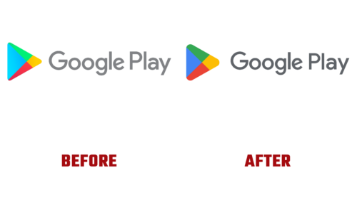
After a 2012 rebrand, the Google Play iconography is celebrating its 10th anniversary. In connection with the round date, the service decided on a visual transformation, choosing the path of combining its own projects. On July 25, 2022, he introduced a different emblem to users. The Google Play logo has become brighter, more visible, and progressive. So he unified the digital family, continuing the theme of Chrome’s recent identity update.
Indeed, as you can now see, all programs are brought under a common design. The geometric factor dominates them with thin lines and precise figures separated by color. Red #EA4335, yellow #FBBCO4, blue #4285F4, green #34A853 are preferred. Moreover, they are more intense and bold than before, so they immediately catch the eye.
Green is almost 66% green, 32.55% blue, and over 20% red. Yellow is made up of 98.4% red, about 73% green, and nearly 1.5% blue. Blue light percentage: 95.69% blue, 52.16% green, about 26% red. Red is a combination of over 91% red, 26.27% green, and over 20% blue. This correspondence is dictated by the need to bring the visual identity closer to a common denominator in order to have common features with the logo of other applications.
Although this is not a revolution, but still an evolution because if you look closely, you can notice another change. Forms. Due to the rounded corners, the play button has become more compact. The ratio of color segments has also changed: now, each of the four parts is equivalent in volume. This provides the perfect balance and visually balances the Google Play logo. According to the vice president of Tian Lim, the redesign more closely matches the branding of the family’s products and better reflects the company’s vision.


