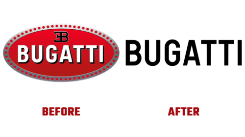
The French car manufacturer has decided to become not just a cult but a mega-luxury brand with a wide reach of fans of hyper sports cars. Therefore, the first thing he did was to change the design of the corporate badge, which he announced on July 25 this year. From now on, the Bugatti logo is minimalistic but universal.
What has changed in it? All! Gone is the horizontal ellipse with the gray perforated border. There is no red background, which the authors considered too aggressive for the new concept because the brand wants to be attractive to everyone. With the help of an updated identity, Bugatti intends to promote ultra-expensive luxury electric vehicles in the professional market and not just record-breaking hypercars.
A feature of the modernized corporate identity was the single sign ZB (the initials of the founder – Ettore Bugatti), removed from the main logo. The automaker will no longer use it on cars. The French company decided to decorate its own magazine, website, factory, showrooms, dealerships, and other corporate objects with this monogram.
Whether the laconic inscription in bold sans-serif will appear on the hoods of next-generation cars is also not yet clear. Because Bugatti has said that the new emblem will not replace the symbol used on its products, although it will be available as an option. As the head of sales and marketing, Hendrik Malinowski noted, in any case, they analyzed the historical connection with the roots and took into account the changes in the world over the past ten years.
The result is a simple, clear, strict, and businesslike Bugatti logo emphasizing the name. It is made in capital letters, from which the shadows have disappeared. It is two-dimensional, easily scalable, and conceptual. The glyphs are stretched vertically, so they look tall. They have clear edges and even corners. Only “B,” “U,” and “G” have natural rounding. Intra-letter space is free, as is inter-character spacing. Representatives of the company are confident that these are bold steps that will help them stay in the lead.


