The simplicity of the Bugatti logo conveys the streamlining and lightness of the design, which are the main features of the manufacturer’s sports cars. The absence of unnecessary elements and massive parts helps develop greater speed and be among the first at the finish line.
Bugatti: Brand overview
Bugatti is a French car brand specializing in the design and production of sports cars. Ettore Bugatti, an Italian-born designer, created it. The brand is now called Bugatti Automobiles SAS and belongs to the Volkswagen Group, which acquired it in 1998. The head office is located in the commune of Molsheim (Alsace, France).
The conviction fueled that sports cars should be light and, secondly, beautiful; the industrial designer set to work creating the car of his dreams. Ettore Bugatti’s cars turned out to be conceptual because they immediately conquered everyone with their beauty and numerous race victories.
However, a brilliant career was slowed down by the unexpected death of the founder, the main inspirer and creative designer. Together with him, the company died, so the company’s automotive career was called into question. The tragedy took place in 1947. Almost ten years before that, the family experienced another terrible incident—the death of Jean Bugatti, the son of the company’s owner. It crashed while testing one of the sports cars.
Over the entire period of its existence, the brand stopped its activities several times, and they tried to revive it several times. It changed hands until it was acquired by the Volkswagen Group in 1998, making it its subsidiary. The stubborn desire to revive the brand is the unique car design that has won many competitions. Therefore, many wanted to see her emblem among racing cars and were not ready to say goodbye to her forever. Since the company’s career was moving slowly, only one logo was obtained initially.
Meaning and History
All Bugatti cars have one important thing in common – and it’s not powerful engines or impeccable appearance, as you might think. It’s about the company logo. Both classic models produced before and modern hypercars are necessarily decorated with the automaker’s name. For a long time, he used the same emblem in different interpretations.
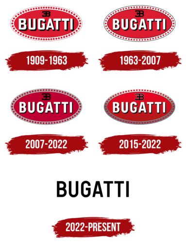
All versions contained a red oval with dots around the perimeter, a white word, and a black monogram. This symbol remained the only one until 2022 as a tribute to the brand’s historical heritage. But nothing lasts forever: after much thought, the French company’s owners updated the design so that the legendary logo was replaced by a very simple and concise word mark. He represents Bugatti in public space, and the red oval emblem can now only be seen on cars.
What is Bugatti?
This is the name of a private car manufacturer from France and its namesake brand. It is part of the German concern Volkswagen Aktiengesellschaft.
1909 – 1963
Bugatti began as a family project, and everything was done together. Even the first logo is the result of the joint work of relatives. To create it, a person was required to understand the avant-garde and find the perfect balance of shapes and colors. It turned out to be Carlo Bugatti, the father of the automotive designer Ettore, who started sports car production in Molsheim. Carlo had a small business making musical instruments, Art Nouveau furniture, and jewelry. As a creative person, he took up the creation of the emblem with enthusiasm.
What exactly Carlo wanted to express in the vertical red oval is unknown. Perhaps its color symbolized the passion for driving or the power of cars. The edging of 60 red dots on a white frame also looked ambiguous. On the one hand, these could be precious stones hinting at the author’s connection with the emblem’s connection with jewelry. On the other hand, the circles looked like nuts or bolts lined up. The fact is that Bugatti, unlike other luxury car manufacturers, used locking wires to fix the fasteners securely. And he could reflect that in his logo.
The company’s name was written in the center of the oval, for which Carlo chose a bold rectangular sans-serif font. The designer made all the glyphs white, but they added black shadows concentrated on the right edge and at the bottom for contrast. Above the inscription was a black monogram of the letters “EB” – a reference to Ettore Bugatti. “E” was turned backward and connected by a vertical part to “B.”
1963 – 2007
In 1963, Bugatti became the property of Hispano-Suiza. By then, Carlo, Ettore, and his son Jean had already died. Left without heirs, the legendary family went out of business. However, the new owners decided to keep the brand’s image and show its connection with the founders. Therefore, all elements have been preserved on the logo, although their proportions have changed. The monogram has slightly increased, and the circles, on the contrary, have decreased. The inscription has become more compact due to the new font with more rounded letters. The designers highlighted the thin stroke along the edges of the frame in black to outline the boundaries of the oval visually.
2007 – 2022
The original personal identity sign successfully and harmoniously combines graphics and text. The base is a horizontal ellipse bordered along the edge by a gray-violet stripe with large dark crimson dots. Then, there is an oval completely colored in dark crimson.
There are two text elements inside the geometric shape. The first and most catchy is the brand name. It is made in large white letters with light shadows on the right side. This artistic technique makes them rise above the surface. The word “Bugatti” is written in large, slightly elongated printed characters. The font is simple, grotesque (sans serif), uppercase.
There is a black monogram above the brand name. It is a geometric interweaving of two capital letters from the founder’s first and last names: “E” and “B” from Ettore Bugatti. Moreover, the signs are turned “backs” to each other. One common line connects the letters because the “E” faces the opposite direction.
The developers chose a simple and clear typeface from the chopped category for the logo – this is the Uniform Cond Bold with a slight blackout on the right. The font was written by designer Richard Miller and first published by Miller Type Foundry.
The branded palette includes two basic colors: burgundy (# bf002c), which is rich and thick, and gray-purple (# aaacac), which is close to light purple (#aaacac). The emblem has two more colors: classic black (letter shadows, monogram) and white (brand name).
2015 – 2022
In 2015, a three-dimensional version of the logo was presented. Designers have achieved a 3D effect with a gradient. At the same time, they made the frame silver to get a metallic sheen. The central oval has become much brighter because a scarlet hue has begun to be used instead of the dark crimson color (as in the previous version). The thin, one-sided outlines made the circles look like perforations inside the frame. All elements of the monogram were outlined in silver lines. The black shadows in the “BUGATTI” lettering also have a light border, making the letters more voluminous.
2022 – today
In 2022, a sports car manufacturer decided luxury style is more important than historical heritage. In addition, he has long lost all ties with the Bugatti family, which was left without direct heirs. Therefore, holding on to the logo created by Carlo no longer made sense. At least, that’s what the brand’s owners thought, and they turned to the consulting company Interbrand for world-class experts to help rethink the outdated concept.
As conceived by the designers, the new visual identity should show Bugatti’s flexibility, variability, and willingness to adapt to fashion trends. Its main idea is the transition from hypercars to luxury cars, that is, the rejection of maximum speed in favor of luxury. Now, the logo contains just a black inscription without additional graphic elements, and the monogram of the letters “EB” exists separately as an icon. This shows minimalism, which is now very popular.
The wordmark looks bold and modern. Partner dealers are expected to use it and represent the brand publicly, including at official events and social networks. The old logo, as before, will continue to decorate Bugatti cars. No one completely abandoned it—the company’s owners felt it looked too good on the bumper to change it.
Bugatti: Interesting Facts
Bugatti, known for luxury and speed, has been a big car name for over 100 years.
- Start: Founded in 1909 by Ettore Bugatti in Molsheim (now France), Bugatti quickly became famous for fast, beautiful cars.
- Racing Wins: Bugatti’s early cars won thousands of races, including the first Monaco Grand Prix in 1929. The Type 35 is one of the most successful race cars ever.
- Classic Designs: Bugatti cars, like the Type 57SC Atlantic, are celebrated for their unique designs and rarity.
- Bugatti Veyron: Launched in 2005, the Veyron was once the fastest car in the world, with a top speed of 267.856 mph and 1,001 horsepower.
- Bugatti Chiron: Introduced in 2016, the Chiron broke further records with its powerful engine, hitting 249 mph in 42 seconds.
- Exclusivity: Bugatti produces only a few cars of each model, making them rare and sought after by collectors.
- Bugatti Royale: The Royale, meant for royalty, is one of the world’s rarest cars due to its production being impacted by the Great Depression.
- Volkswagen Ownership: Volkswagen bought Bugatti in 1998, revitalizing the brand with remarkable supercars.
- Future in Electric: Bugatti is looking into electric and hybrid technologies for upcoming models, reflecting the industry’s move toward sustainability.
- Partnership with Rimac: In 2021, Bugatti and electric car maker Rimac announced a joint venture to develop electric models.
Bugatti combines engineering, design, and speed, standing out as a pinnacle of automotive excellence. Each car is a testament to Bugatti’s legacy of luxury and performance.
Font and Colors
The automaker’s name uses Bugatti’s custom font, a bold geometric sans serif. It hadn’t changed much since 1963 when designers rounded off some of the “B,” “U,” and “G” parts. However, in 2022, Interbrand employees slightly increased the letter space so that the inscription without a base looks clear and proportionate. The Neusa Next Pro Condensed Medium is a similar typeface by The Northern Block.
The color scheme is also very simple: after the rebranding, the red base has disappeared, and the word mark has become black. But the identity now allows the use of a bright blue shade of Bugatti Blue, which reflects its French roots, according to the company’s owners.
FAQ
What is the emblem of Bugatti?
The emblem is easily recognizable due to its unique and striking design. It features a vibrant red background that symbolizes strength and passion for driving. The “BUGATTI” lettering is white, and the “EB” emblem is black. These colors make the logo stand out against the red background and convey a sense of luxury and performance. The “EB” in the center stands for Ettore Bugatti, the company’s founder. The white letters spelling “BUGATTI” are bold and modern, making the name instantly recognizable. Surrounding the emblem are 60 red dots in a thin white frame, highlighting the brand’s attention to detail and its storied history in the automotive world.
What font is the Bugatti logo?
The Bugatti logo uses a narrow font called Ff-zwo, which has a modern look with tall letters and square curves. It makes the logo feel contemporary and inviting. The text design helps convey an elegant and upscale atmosphere befitting a luxury car brand.
The logo features a unique pencil-effect design that gives it a handcrafted feel. This showcases the brand’s attention to detail and personal touch. Pairing this traditional font with the modern Ff-zwo font creates a balanced visual identity.
What is the Bugatti logo?
The Bugatti logo is a simple but striking design demonstrating the brand’s high status and rich history. It features an eye-catching red oval that symbolizes the energy and passion at the brand’s heart. Surrounding the oval are sixty small circles, showing the brand’s commitment to precision.
Inside the oval, the brand name is written in bold white letters, making it easily recognizable. Above the name is a black monogram with the initials “EB,” representing Ettore Bugatti, the company’s founder.
Is Bugatti an Indian company?
Bugatti is a French brand, not an Indian one. An Italian-born designer founded it and made it known for producing some of the world’s most luxurious and powerful cars. Despite their international popularity, luxury cars are rarely seen on Indian roads. This isn’t due to a lack of interest from wealthy Indians but may be due to high import taxes, expensive maintenance costs, and local road conditions that are less suitable for such cars.
Who made the Bugatti logo?
The famous red oval logo was designed by Carlo Bugatti, father of Ettore Bugatti, the brand’s founder. Carlo Bugatti was a renowned artist and jeweler in Italy. His skills in art and design played a key role in creating a logo that epitomizes luxury and elegance. This design gives the brand a personal touch and unites the creative heritage of the Bugatti family with the respected automobile company founded by his son.
Is Bugatti Italian or French?
Despite its Italian and German connections, Bugatti is officially recognized as a French company. Founded by the Italian Ettore Bugatti in Molsheim, the city was part of Germany at the time due to its borders. Today, Molsheim is located in France. This history gives the brand a rich cultural identity, combining Italian design and French automotive tradition. Although its founder was Italian, Bugatti primarily developed as a French luxury car manufacturer.


