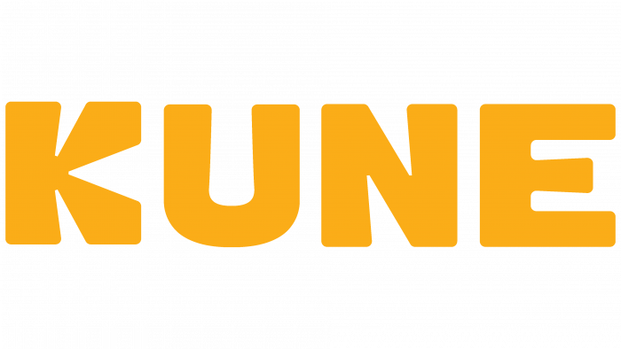
A young Kenyan food technology company, KUNE, has unveiled its new “sunny” logo. Established in 2021 as a homemade food delivery business in Nairobi, the company claims to be the best home cooking at affordable prices. The company’s philosophy is to form a community of food lovers that can build a completely new world where everyone can eat well. Its slogan is “Tastier. Healthier. More accessible” has already been appreciated by the student youth and workers of Nairobi, where the concentration of this category of the population in Kenya is especially high.
The company turned to lead design agency Bracom from Ho Chi Minh City, Vietnam, to shape a “tasty” and attractive design. The main challenge for the developers was the need to creatively implement the idea of visualizing the spirit and philosophy of KUNE. It was important to make the main differences and advantages of the company accessible and visually understandable; its goal is to deliver ready-made food at prices affordable for everyone. Bracom approached the problem creatively and managed to find exactly that visual way of conveying information, which attracted attention with its uniqueness. The original interpretation of the company’s philosophy of “affordable food for everyone” has been interpreted through the visual perception of sunlight. The idea of presenting everything in a sunny color provided the analogy that just as the light and energy of the Sun are distributed to everyone on Earth, the food from KUNE is available to everyone. At the same time, it simultaneously pleases and unites.
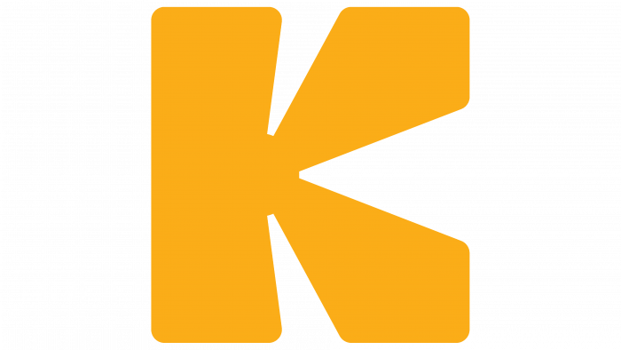
The shaping of this visual identity for Bracom was carried out by creating images like a sunbeam. It is ideally suited to the required perception of the information conveyed through it about the way the product is distributed and to create a unified community that is passionate about the idea of KUNE. Optimism and happiness, the freshness of products and their quality – all this is effectively conveyed by the chosen color palette. To better convey information, the logo was created in a modern minimalist style – only the “sunny” name of the new brand, in which the first letter “K” was first created. Its shape was the best way to create a stylized image of outgoing rays. The best option for such a presentation of visual information was the Rubik typeface, which symbolized the naturalness of the food offered by KUNE with its shape and roundness.
