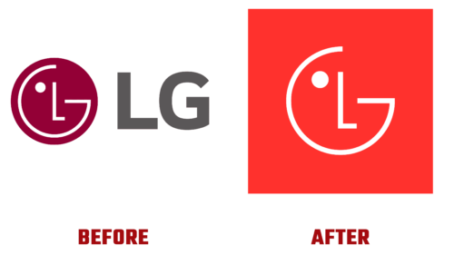
The digital giant from South Korea decided to transform its visual style to attract the attention of a new consumer segment. The target audience consists of the younger generation, raised on electronic technologies, for whom smileys and emojis are not just expressions of feelings but everyday occurrences. As a result, in mid-April 2023, the company introduced a modernized logo and updated font.
The new corporate style of LG Electronics indeed consists of emojis, which the designers have cleverly played with emblem winks, nods, and smiles. But the innovations did not stop there. The developers made several other important modifications:
- selected a different shade of red (light, called LG Active Red);
- used two-dimensionality, abandoning the 3D format in favor of simplicity;
- added lightness to the design, making it dynamic and energetic.
At the same time, they retained the logo’s shape and neutral white color and more broadly implemented the original slogan “Life’s Good.” Now, it will sometimes accompany the emblem and more frequently adorn product packaging.
The flat version of the “face” lost its background gradient, making the sign much clearer and cleaner. The round border was replaced with a solid wide background, and an animated version was introduced for advertising purposes. In this way, the brand aims to convey its innovations, friendliness, and warmth to the end consumer. According to the company’s management, these innovations will resonate with customers of different ages and from different regions.
The LG logo has achieved the desired expressiveness: it seems to come alive, as it now looks like a face with a squinted eye. The cold shade has been replaced with a warm one, adding even more friendliness, which the company expects in return from its customers.


