Movie rentals and their production are key factors embodied in the New Line Cinema logo. The former is a long history; the latter is modern relevance. But it perfectly combines them, showing a close relationship between directions and times. This is a tribute to high cinema art, reflected in the visual identity.
New Line Cinema: Brand overview
| Founded: | June 18, 1967 |
| Founder: | Robert Shaye |
| Headquarters: | Burbank, California, United States |
| Website: | warnerbros.com |
Meaning and History
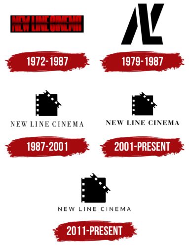
A long time ago, when New Line Cinema was just a small movie rental point, it didn’t use a constant logo. It appeared in the early 70s and was text-based because the company needed a suitable sign to represent it and make it memorable among potential service consumers. Therefore, it adopted its first official emblem in 1972 after stabilizing work and a confident growth in the number of clients.
What is New Line Cinema?
New Line Cinema is an American television and film company specializing in producing and distributing films. The company skyrocketed to success after producing A Nightmare on Elm Street, which became a global blockbuster. Student Robert Shaye founded the company to showcase domestic and foreign films in university towns. It was established in 1967. In 2008, it became part of Warner Bros. Discovery and ceased to exist as an independent unit, becoming a division of the giant of the film industry.
1972 – 1987
The emblem consisted of a horizontal black rectangle containing the name of the film rental studio. The letters were geometric, vertically elongated, smooth, carved, and contained many sharp internal and external angles. This was most evident with “W” and “M,” presented as inverted copies. The capital glyphs were painted red with thin black lines horizontally crossing them. The widest foggy stripe ran along the entire inscription and was located in the middle. It seemed to cross out the phrase “New Line Cinema.”
1979 – 1987
This logo was characterized by brevity, expressed as a minimalist composition. It looked like a monogram composed of the abbreviated name of New Line. The letters were stencil-like, bold, smooth, and carved. The glyphs were superimposed on each other, so “L” overlapped “N,” simultaneously serving as its diagonal crossbar. This looked stylish and futuristic, as “N” comprised two pointed lines on the right and left. The emblem was monochrome.
1987 – 2001
The predominance of black and white remained in the next logo, which was not textual, but graphic, as the drawing took up almost all the space of the sign. The text was also present but was hidden at the bottom and looked monotonous – a single-line inscription with thin letters. Even the uppercase font didn’t make them bulky and flashy. But the image looked large. It was a frame from a film strip, colored black with side perforation consisting of three full and two half squares in white. A second such strip was located in the top right corner.
2001 – today
The modernized New Line Cinema logo includes a black square with several holes along the left edge and a perforated strip that crosses the top right corner. The inscription is made in semi-bold Roman font. The letters are not tall but expressive. They are slightly flattened, so they seem wide.
2011 – today
The emblem is designed in a traditional style: a black film strip frame with the left edge perforated. In this case, a square but a vertical rectangle is not used, so the geometric figure is taller than in other versions of the logo. All of its corners are rounded. The bold serif font has been replaced with a thin sans-serif one, adding a visual lightness to the sign.
Font and Colors
Each New Line Cinema logo uses a specific typeface that does not correspond to the previous one. Specifically, these samples resemble Bauer Bodni Bold, Times New Roman Condensed, and Apple Garamond Bold. There is also a smooth sans-serif font with thin and rounded glyphs.
The corporate palette mainly includes monochrome, which predominates in almost all emblems. However, one of the logos features an intense red color with highly concentrated energy.
New Line Cinema color codes
| Black | Hex color: | #000000 |
|---|---|---|
| RGB: | 0 0 0 | |
| CMYK: | 0 0 0 100 | |
| Pantone: | PMS Process Black C |


