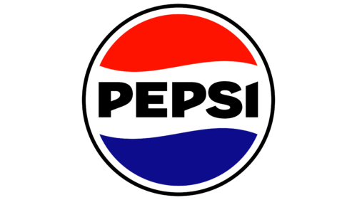
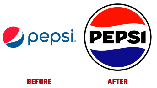
Amazingly, the top soft drink manufacturer that has gained worldwide fame has reached its 125th anniversary. Therefore, the company decided to rejuvenate itself – to update its visual identity to look modern. In late March 2023, PepsiCo announced the innovation and unveiled the revamped logo aimed at drawing attention to Pepsi Zero Sugar.
To emphasize historical ties and showcase its deep roots, the brand borrowed old features and embodied them in the new emblem. As a result, a relevant image was created. As Mauro Porcini (the company’s lead designer) noted, the style connects the brand’s legacy with future generations. It’s a bold vision of what’s to come. So how does it manifest?
- The redesign retained the iconic Pepsi planet (circle), which occupied a central position in the emblem in the mid-20th century but returned to the two-dimensional aspect characteristic of the 1980s/1990s.
- The brand name has been moved to the center of the sphere and is set in bold uppercase font. It has changed so much that it’s simply unrecognizable! The original typography enhances the sense of product individuality. Moreover, it focuses on confidence and unconventional thinking.
- The word “Pepsi” is colored black, which effectively highlights it against the striped background. It also spreads throughout the space surrounding the sphere with a white frame. This color has always been associated with the Pepsi Zero Sugar line, so it is very fitting. The blue has also transformed: it has become much darker and more expressive.
The new logo will soon appear on all Pepsi packaging and products in North America. The rest of the world will see it implemented in 2024.


