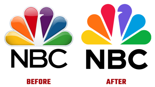
The NBC logo has a holiday in December: it has been updated! This happened for the first time in a long time because the visual identity of a news channel needs to be stable. Designers agreed, so they proposed an option almost indistinguishable from the previous one. And this “almost” is hidden in the negative space because it was on it that the main manipulations fell.
Refined modernization has turned a colored fan into an exquisite peacock. Yes, this bird with a magnificent tail was present in the logo before, but now it has been made more explicit. A brilliant update added expression to the identity because the emphasis on the white center (beak) became clear, so even with a fleeting glance, it is clear: it depicts a peacock.
At the same time, Senior Vice President for Creative Design Juliet Garrett noted that the logo was made with love for the audience. This is a heartfelt message to them. After all, the legacy of the NBC television network has not disappeared.
- The emblem still retained six drop-shaped elements directed with a sharp end to the middle. But now the distance between them is twice as large as before. This added clarity to the sign and enlarged it.
- A color change accompanied scalability: colorfulness remained and, conversely, became even brighter. Saturated shades of yellow, orange, red, purple, blue, and green played in a new way.
- The font used in the name of the TV channel has also been changed. NBC chose the bold glyphs and widened the space between them so that they stand freely.
The subtle redesign brought balance to the logo and breathed newness into it. Moreover, the updated symbol appeared on the channel quite imperceptibly.


