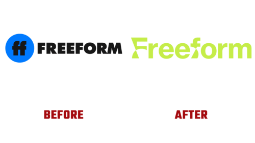
In essence, the change in visual identity for Freeform (a Disney cable operator) took place in September 2022. It was timed to coincide with the launch of the series “The Come Up,” just as the management wanted, before the release of the grandiose TV projects “31 Nights of Halloween” and “25 Days of Christmas,” scheduled for 2023. This was an animated sign with moving letters, symbolizing a reluctance to stand still.
The marketing company Collins was responsible for developing both the pink and green versions. They created a modernized design based on the word “Freeform” (previously the channel was called ABC). The first letter is now uppercase, and the rest are lowercase. However, that’s not the main point. The key factor here is movement and evolution.
This concept is embodied in the curves of “F” and “f.” The unconventional legs reflect the brand’s flexibility and adaptability to various platforms, including streaming and social networks. These two glyphs appear as if they are in motion or about to start moving, even if the emblem is static.
- The curvature in this case expresses openness to change and the ability to evolve.
- Arches, narrowing, and diagonals are symbolic points from which an entirely different system began to form after the channel’s management update.
- It all originates from the two “f”s, then confidently expands, develops, and acquires a clear form.
- The icons have no analogs and were developed based on individual requests.
The Freeform logo consists of the name arranged in a single line. It is set in bold, lowercase typeface without serifs. The letters are smooth, even, and rounded, except for the “F” and “f,” which convey the idea of constant motion.


