Among the emblems of American football teams, the New Orleans Saints logo stands out for its historical significance. The team’s heraldic visual representation, showcased in minimalist, sleek simplicity, is a nod to the region’s history and its French founders.
New Orleans Saints: Brand overview
| Founded: | November 1, 1966 |
| Founder: | Gayle Benson |
| Headquarters: | New Orleans, Louisiana, U.S. |
| Website: | neworleanssaints.com |
The New Orleans Saints is a professional football team and a member of the NFL, representing the NFC’s Southern division. Officially founded in 1967, the team was actually established in 1966. The team is based in New Orleans, Louisiana.
The franchise was initiated by New Orleans entrepreneur Dave Dixon, who made an informal deal with Congressman Hale Boggs, Senator Russell Long, and NFL Commissioner Pete Rozelle. The founding group also included John W. Mecom Jr. and New Orleans residents, who managed the club until 1985.
Subsequently, businessman Tom Benson bought the club. This happened due to Senator Edwin Edwards’ statement that the New Orleans Saints were on the brink of being sold and might have to relocate to Jacksonville, Florida. Recognizing the potential for disaster, especially during a period of deep economic downturn due to unstable oil prices, Benson announced his intention to purchase the franchise. The NFL approved his decision on May 31, 1985. Later, his successor, Gayle Benson, took over as the club’s manager and has owned it since 2018.
The team’s name was decided based on fan votes organized by the New Orleans authorities. However, it would have been named “Saints” regardless, as NFL Commissioner Pete Rozelle announced its establishment on November 1st — All Saints Day. The city’s jazz heritage, epitomized by the famous tune “When the Saints Go Marching In,” also played a significant role.
Meaning and History
The New Orleans Saints’ logo depicts the same graphic as the city. The Fleur-de-lis (the design element’s name) pays homage to the French founders of the metropolis. The heraldic lily is found on several coats of arms in France and other European countries. The franchise adopted its modern version — minimalist and beautifully simple. The primary color palette of the logo includes black, white, and old gold.
What is New Orleans Saints?
The New Orleans Saints are one of two NFL teams to have won the Super Bowl in just one game. The team has been part of the NFC South since 2002. It was established in 1966 and, for the first couple of decades, consistently lost: it didn’t make the playoffs for twenty seasons. In 1987, the situation stabilized, and the football club earned its first record.
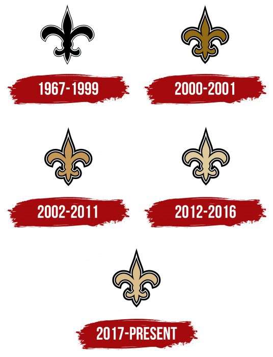
1967 – 1999
During this period, the club used a stylish lily, a symbol associated with New Orleans and the French royal family, particularly the globally renowned House of Bourbon. The first version of the New Orleans Saints logo was executed in black with a black-and-white outline: the bright inner line was wide, while the dark outer was narrow.
2000 – 2001
In 2000, the fleur-de-lis design was updated. Compared to its predecessor, it became clearer and more expressive. The black color was complemented by a golden hue. Dark outlines were increased and became much wider.
2002 – 2011
This version of the New Orleans Saints logo features a slightly different shade of old gold. The logo was given a platinum finish, lending it a dignified patina of age. Otherwise, the graphic elements remained the same in style and size.
2012 – 2016
In 2012, the logo’s color palette was revised again, with the tones muted. Now, the golden heraldic symbol looks even more mature, befitting the theme of the French royal house.
2017 – today
The modern Fleur-de-lis has a light shade of old gold. The new New Orleans Saints logo is almost indistinguishable from the previous one. The only difference is an additional tone added to the color intensity. The lily’s outer lines are wide, while the inner contour is narrow.
New Orleans Saints: Interesting Facts
The New Orleans Saints, a football team from New Orleans, Louisiana, started in 1967 and have a dedicated group of fans and a colorful history.
- How They Got Their Name: They became a team on November 1, 1966, which is All Saints Day, influencing their name “The Saints.” It fits New Orleans’ Catholic culture and the famous song “When the Saints Go Marching In.”
- Their Stadium: They play at the Mercedes-Benz Superdome, an iconic place that opened in 1975. It’s known for big events like the Super Bowl and helped people during Hurricane Katrina.
- Hurricane Katrina: In 2005, Hurricane Katrina damaged New Orleans and the Superdome, so the Saints had to play games in different places that season. Returning to the Superdome in 2006 was a big moment for the city’s recovery.
- Winning the Super Bowl: In 2009, the Saints won their first Super Bowl, beating the Indianapolis Colts. Drew Brees, their quarterback, was the MVP. This win meant much for New Orleans, bringing hope after tough times.
- Drew Brees: Drew Brees was a key player for the Saints from 2006 to 2020. He broke many NFL records and helped the team and the city.
- Who Dat?: Saints fans have a chant, “Who Dat?” It’s short for “Who dat say dey gonna beat dem Saints?” and shows how much the fans love their team.
- Bounty Scandal: In 2012, the NFL found out the Saints had a bounty system from 2009 to 2011, where players got extra money for injuring opponents. The coach, Sean Payton, was suspended for a year.
- Hall of Fame: Some former Saints players, like Rickey Jackson and Willie Roaf, are in the Pro Football Hall of Fame because they were good.
- Mascots and Colors: The team mascots are Gumbo the Dog and Sir Saint. The Saints’ colors are black and gold, representing strength and resilience. Fans and the city wear these colors proudly on game days.
The New Orleans Saints’ story is full of big wins, strong community spirit, and bouncing back from hard times, making them a team loved in their city and across the NFL.
Font and Colors
The New Orleans Saints logo resonates with the city’s coat of arms, featuring the so-called fleur-de-lis — a Bourbon lily made up of three petals. In many cultures, it symbolizes royal authority and high social status. In heraldry, the flower represents honesty, justice, and hope.
The emblem is minimalist, as it features nothing but the fleur-de-lis. The graphic has five variations used at different times. The first and last versions are very similar, except for the updated color palette and minor differences in the length and width of the lines. The modern lily has a more compact form compared to how it looked in 1967.
The designers didn’t develop a specific font for the New Orleans Saints, opting to focus solely on the graphic part of the logo. The absence of text is compensated by proportions, perfect symmetry, deep symbolism, and a harmonious color selection.
The fleur-de-lis base is painted in a shade of baked milk. The 2017 emblem is warmer than the one used from 2012. The outlines are traditionally wide and black, with a white stripe separating the two dark lines in the frame.
New Orleans Saints color codes
| Old Gold | Hex color: | #d3bc8d |
|---|---|---|
| RGB: | 159 137 88 | |
| CMYK: | 37 40 74 8 | |
| Pantone: | PMS 467 C |
| Black | Hex color: | #000000 |
|---|---|---|
| RGB: | 0 0 0 | |
| CMYK: | 70 50 50 100 | |
| Pantone: | PMS Process Black C |
FAQ
Where Did the New Orleans Saints Emblem Come From?
The football team uses the city symbol of New Orleans as its logo — the fleur-de-lis. This sign has ancient roots dating back to Babylon and Egypt.
Why Does the New Orleans Saints Have a Fleur-de-lis?
The fleur-de-lis has left its mark in the history of New Orleans. Explorer Sieur de La Salle once planted a flag with this symbol on the city site, now serving as a tribute to French culture. It’s no surprise that the New Orleans Saints use the fleur-de-lis as their logo. Some consider this sign offensive, as runaway slaves were branded with it.
What Does the New Orleans Saints Logo Represent?
The New Orleans Saints logo is a classic fleur-de-lis. The main part of the drawing is painted beige, with black-and-white outlines.
Is the New Orleans Saints Logo a Plant?
The New Orleans Saints logo features a plant, specifically a lily flower with three characteristic petals. This is a well-known heraldic symbol.


