


![]() New York Giants Logo PNG
New York Giants Logo PNG
The concise monogram emblem is a stylish, modern representation of the New York Giants. The New York Giants logo focuses on the city where the team is based, reflecting a radical shift in the game’s concept while simultaneously paying tribute to its historical roots.
The New York Giants are a professional American football team that plays in the National Football League (NFL) as a member of the National Football Conference (NFC) East Division. It was founded in 1925. The team plays its home games in East Rutherford, New Jersey.
The first owner of the club was Tim Mara, who purchased the NFL franchise for New York for $500. He owned the team until he died in 1959. Mara left the Giants to his sons, Jack and Wellington. They were co-owners of the team until 1964.
From 1965 to 1990, the team was owned by Wellington and Tim J. Mara. Mara sold his share to Bob Tisch in 1991 for $ 80 million. Since then, the franchise has been owned not only by the Mara family but also by others. Since 2005, John Mara and Steve Tisch have been the team’s co-owners.
Owner Tim Mara chose “Giants” because his team would play at the Polo Grounds, where the New York Giants baseball team is based. Mara “borrowed” the Giant name from the city’s Major League baseball team because its owner, Charles Stoneham, organized and promoted the professional football team, the New York Giants, in 1919. The team disbanded before its first game. Originally, the “Giants” got their name from the city’s giant buildings.
Meaning and History
![]()
Throughout its history, the New York Giants team experimented with several logos. Giants’ logos have revolved around three different concepts:
- A giant football player is ready to throw a pass.
- The word “Giants.”
- Variations on the theme of New York initials.
The team’s official colors are white, red, and royal blue. These colors have been used almost always, except during the first 25 years and from 1955 to 1976, when the logo did not include red. The font is individual, with lowercase letters.
What is New York Giants?
The New York Giants are a professional American football team in the National Football League (NFL). The franchise was formed in 1925. It is now part of the Eastern Division and the NFC. The club plays its home games at MetLife Stadium in East Rutherford, near New York City.
1945 – 1949
![]()
During this period, the “New York Giants” used the image of a giant quarterback. He is passing against the backdrop of the New York skyline, his right hand throwing a pass, and his left extended to the side. The quarterback in uniform stands on a yellow-orange background. Around him is the white inscription “NEW YORK FOOTBALL GIANTS.” Below are dark blue shadows (on the silhouettes of skyscrapers). The Giants’ emblem is oval-shaped, resembling a football.
1950 – 1955
![]()
In 1950, another logo design, created by Marie Barclay Steimmuller, was approved. The logo again depicted the Giants’ quarterback about to throw a football, but the style and color palette were changed. The logo became more modern, featuring colors of red, blue, and white. The words “Giants” on the player’s jersey and “1950” at the bottom, against the backdrop of buildings, were added. The main details remained the same.
1956 – 1960
![]()
This version again depicts a giant blue quarterback playing on the team’s nickname. The difference is that the quarterback towers over Yankee Stadium, not over New York’s main skyscrapers. Yankee Stadium was the team’s home arena from 1956 to 1973. The red color was removed from the logo, leaving only white and blue. In addition, the image of the quarterback is now only half-length.
1961 – 1974
![]()
Starting in 1961, a stylized blue “NY” was used as the New York Giants’ updated emblem. The lowercase letters “NY” stand for New York. The graphically elongated leg of the letter “y” stands out, forming a kind of platform for “n.” The emblem’s color is dark blue.
1975
![]()
In 1975, designers revisited the New York Giants logo elements. So, instead of a solid blue “NY,” they suggested stylized letters and added a thin white middle contour. They also changed the font and replaced lowercase letters with uppercase. The letters “NY” stand for New York.
1976 – 1999
![]()
A year later, the New York Giants’ logo was updated again. The lowercase letters “NY” were replaced after the season with the team’s nickname, written in dark blue font on a white background with a thin red outline. All elements converge at the intersection points. There is a wide underline of the same color as the team’s nickname below the letters. This change was due to the team moving to the Meadowlands in New Jersey.
2000 – today
![]()
In the 2000 season, the club decided to return to one of its old logos, from 1961. As the New York Giants’ main logo, the lowercase letter “NY” returned. They updated the stylized dark-blue color and the red border. The leg of the letter “y” extending to the side looks the same as in the original logo.
Font and Colors
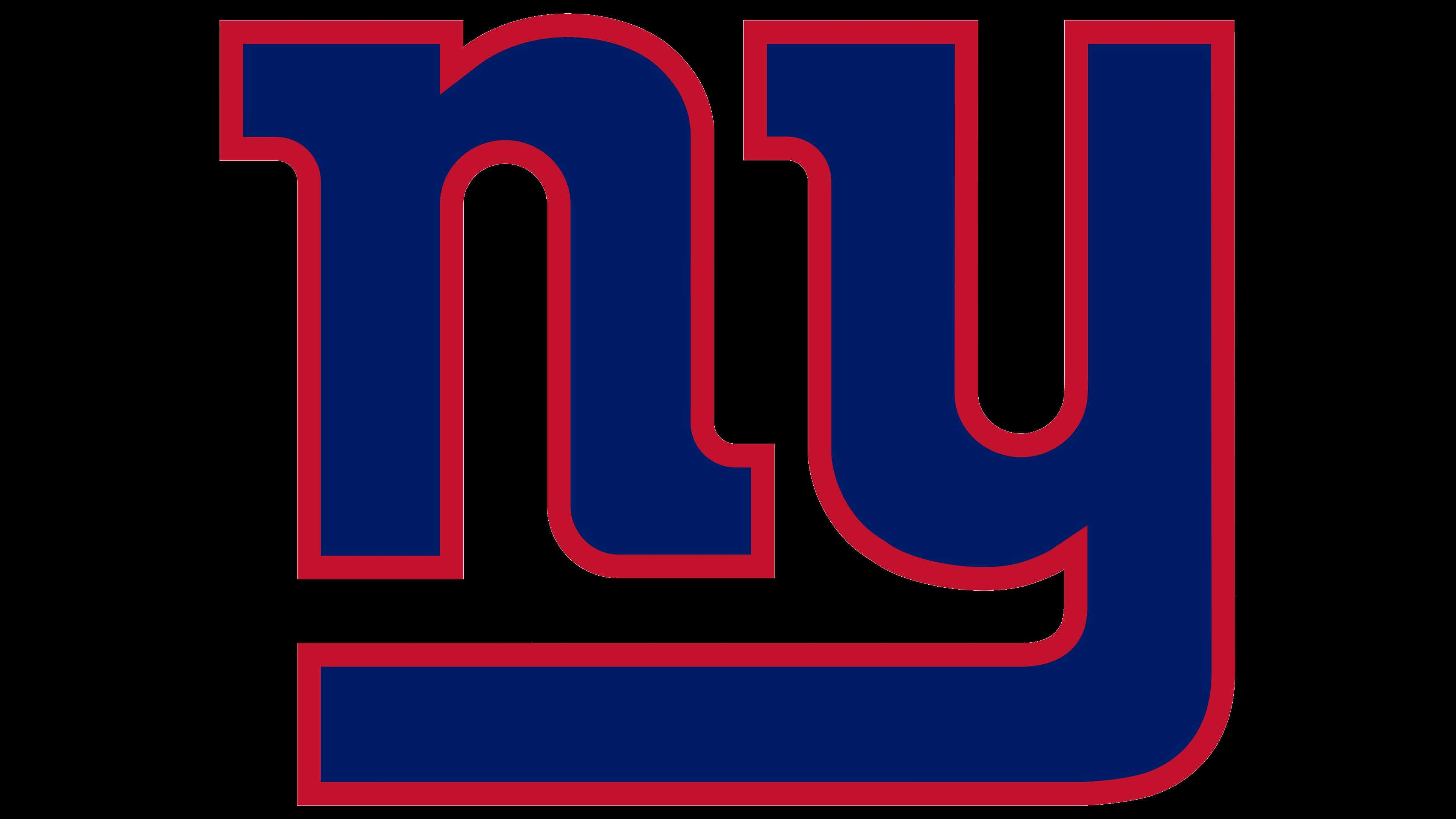
Since 2000, the New York Giants have used a text emblem containing only two letters: “NY.” It demonstrates its patriotism and is a tribute to fashion, as logos featuring the city’s name are popular on the sports field.
The first club badge with the abbreviation “NY” appeared on the New York Giants back in 1961. It has transformed several times until the words “GIANTS” appeared on the emblem. After the revival, the “NY” combination acquired a thin red outline. This version is significantly different from the logos the team had before 1961. Early identity elements included a football player with a ball against the backdrop of New York skyscrapers or Yankee Stadium.
The logo uses an individual font developed in 1961 specifically for the New York Giants. Both letters are lowercase and bold, with rounded sides and rectangular serifs. The lower horizontal stroke of “y” extends to the left and goes directly under “n.”
The color palette is classic: dark blue for the letters, red for the outline, and white for the background. The red line is the only difference between the current logo and the version the team used from 1961 to 1974.