The New York Jets club logo reflects its history, professional affiliation, and national commitment. The club’s name became a reflection of the “jet age” in the country. The emblem, distinguished by its impact, provided rapid recognition.
New York Jets: Brand overview
| Founded: | August 14, 1959 |
| Founder: | Woody and Christopher Johnson |
| Headquarters: | Florham Park, New Jersey, U.S. |
| Website: | newyorkjets.com |
The New York Jets are a professional American football team based in New York City. They play in the National Football League (NFL) as a member club of the American Football Conference (AFC) East Division. The team was founded in 1960. The team’s headquarters are located in Florham Park, New Jersey.
The franchise’s first owner was Harry Wismer. He attempted to prevent the sale by filing for bankruptcy. He claimed that moving to Shea Stadium would generate enough income to make the team profitable. A syndicate of five people, led by Sonny Werblin, saved the team from bankruptcy by buying the “Titans” for 1 million dollars. This syndicate, consisting of Townsend Martin, Leon Hess, Donald Lillis, and Philip Iselin, owned the team until 1977.
Hess became the full owner of the “Jets” in February 1984: he bought out the shares of his partners – Townsend Martin and Helen Dillon, who inherited a share from her father, Donald Lillis. He bought Martin’s share for 5 million dollars and then bought Dillon’s share for another 5 million dollars. Leon Hess became known for his Hess Corporation gas stations, but he played a significant role in the development of the Jets. Hess often fought for improvements while the team was a tenant at Shea Stadium, allowing football players to dig into sports matches.
Hess died in 2000, and when the team was put up for sale, two potential buyers emerged. Philanthropist Woody Johnson was considered the person who wanted the best from his employees. He had a passion for sports and wanted to own his team.
The franchise’s name was given by its owner – Werblin. He chose the names of 500 candidates after the previous team was disbanded. It was named so because of the location of the new stadium between the two main airports of New York. Additionally, “Jets” sounded similar to the New York baseball team “Mets.”
Meaning and History
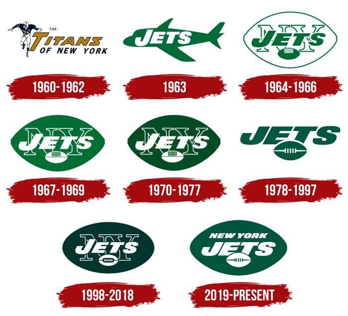
At different times and in different statuses, the franchise had several logo concepts. After the “Jets” received their current nickname, they changed their logo. They did not differ much in design – only the details reflecting the current state of the club were reviewed. The official colors remained green, symbolizing hope, novelty, and positivity, and white.
What is New York Jets?
The “New York Jets,” formerly known as the “New York Titans,” have been playing in the National Football League and the AFC East Division since 1970. Their headquarters are located in Florham Park, New Jersey, and their home arena is MetLife Stadium. The official legal status of the franchise is LLC.
1960 – 1962
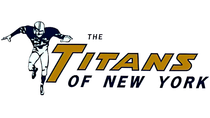
When the team was called The Titans of New York, their logo depicted a running football player in uniform. Next to him is the inscription “The Titans of New York,” executed in several different fonts. The word “Titans” is in a golden color with a dark outline. All elements are placed on a white background.
1963
1963 marked significant changes in the athlete’s career, reflected in the logo. It was changed to a green airplane with the white inscription “JETS” inside the shape of the airplane. The word “JETS” occupies almost the entire visible surface.
1964 – 1966
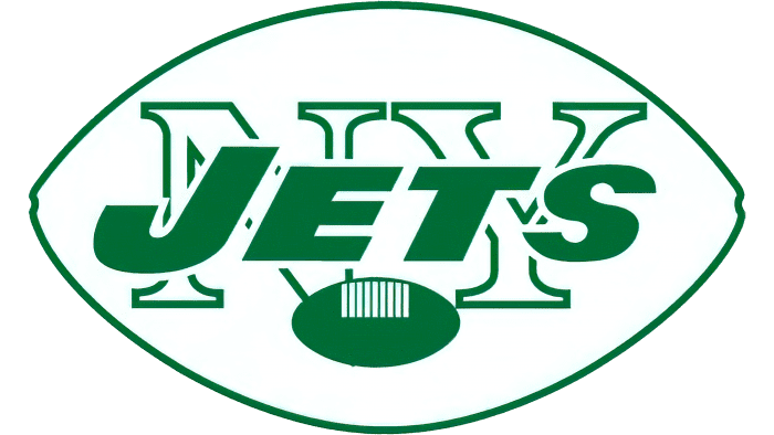
In 1964, the New York Jets logo was replaced with a white-green football with the inscription “JETS” in green inside the football. In the background of the logo is the outline of the letters “NY.” A small green football is located at the bottom of the logo.
1967 – 1969
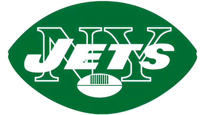
This version is almost an inversion of the previous one. In the new 1967 logo, the previous logo was flipped from white to green. The geometric shapes, arrangement of elements, and size of the Jets logo remained the same.
1970 – 1977
The next seven years were marked by the appearance of another New York Jets symbol, updated with a change in the color palette. The green became two to three shades darker. In the background of the “JETS” emblem is the outline of large “NY” letters in white.
1978 – 1997
Ten years later, in 1978, the team again changed the design of the logo. The only thing that remained untouched was the color. Now, the “Jets” logo is made in the form of a stylized combination of the team’s nickname with a jet airplane, one wing of which protrudes above the letters. It extends from the letter “J” and resonates with the other letters. The font is smooth, modern, and slightly inclined to the right.
1998 – 2018
Coach Bill Parcells, in 1998, aiming to form a new style for the team, changed the “New York Jets” logo, reverting to the 1965 logo, which was changed because the oval became more rounded at the ends and no longer resembled a football. The main color changed drastically to dark green.
2019 – today
The current New York Jets emblem almost entirely replicates the previous design: the same inscriptions and the same oval, rounded at the ends. There is a large word, “JETS,” highlighted in white italics. As before, it is inside a green oval in the shape of a football.
New York Jets: Interesting Facts
The New York Jets are a football team from the New York area with a lot of history, including big wins and famous players.
- Starting Off: They were first called the Titans of New York when they started in 1959 and were part of the American Football League (AFL). They changed their name to the New York Jets in 1963 to show they were moving.
- Big Win: Their most famous moment was winning Super Bowl III in 1969, beating the Baltimore Colts. Joe Namath, their quarterback, promised they’d win, and they did, which was a huge deal.
- Joe Namath: Known as “Broadway Joe,” Namath is one of the most well-known Jets players ever. He was famous for his great playing and his personality.
- The “New York Sack Exchange”: In the 1980s, their defense was so good at stopping the other team they were nicknamed the “New York Sack Exchange.”
- MetLife Stadium: The team shares MetLife Stadium with the New York Giants. It’s a big, modern stadium where they play their home games.
- Fans and Chants: The Jets fans, called “Gang Green,” are into their team. They do a chant, “J-E-T-S, Jets! Jets! Jets!” to cheer on their team.
- Mascot: Fireman Ed, a fan who led the Jets chant at games, became so famous he’s almost like a mascot. Even though he stopped in 2012, fans still do the chant.
- Monday Night Football: They played in the first Monday Night Football game in 1970 against the Cleveland Browns, starting a new tradition for fans.
- Training Center: In 2008, they moved their training to a new place in Florham Park, New Jersey, showing they’re serious about being the best.
- Helping Out: The Jets help a lot in their community, focusing on improving the lives of kids and families through their foundation.
The New York Jets’ story is full of big games, amazing players, and lots of support from their fans, making them an important team in football.
Font and Colors
The last six logos of the New York Jets are made in one style with minor details. They share a common symbol – a ball for playing American football. It has a characteristic oval shape and vertical seams in the middle or just below the center.
Many emblems feature two balls at once – a large one as a background and a small one as an addition. Designers didn’t forget about inscriptions containing the team’s name. It can be the phrase “NEW YORK JETS,” as it is now, its abbreviated version with the acronym “NY,” or the word “JETS.” The textual part allows for the identification of the football club and immediately determining who owns the logo.
Since 2019, one sans-serif italic font has been used for inscriptions. All letters are highlighted in bold font and capital letters. When the emblem had the acronym “NY,” it was written in an old-fashioned font.
The color palette has hardly changed throughout the team’s history. The exception is only the first logo adopted when the club was called “The Titans of New York”: it combined pale gold and blue shades. In subsequent versions, a combination of white and dark green was used. It remains relevant today.
New York Jets color codes
| Green | Hex color: | #003f2d |
|---|---|---|
| RGB: | 0 63 45 | |
| CMYK: | 90 46 80 55 | |
| Pantone: | PMS 3435 C* |
FAQ
Did the “New York Jets” change their logo?
Yes, the “New York Jets” have repeatedly experimented with the design of their logo, but in most cases, they remained within the chosen concept, using a green oval that repeats the shape of a football as the basis.
When did the “Jets” change their logo?
The last time the “New York Jets” changed their logo was in 2019. Before that, they updated their visual style in 1998, 1978, 1970, 1967, 1964, and 1963. The very first version was adopted in 1960.
Why are the “New York Jets” called “Jets”?
The franchise’s owner, David Abraham “Sonny” Werblin, gave it such a name. He chose the word “Jets” because it rhymed with the name of the team “New York Mets,” which also played at Shea Stadium. The name was also influenced by the fact that their home field was located near LaGuardia Airport.
What is the motto of the New York Jets team?
The fans of the “New York Jets” chant the battle cry: “J-E-T-S JETS! JETS! JETS!” It’s considered the most famous song of football fans.

