Exposure, a blogging platform from 2013 for photography enthusiasts and true professionals in this field, announced the formation of a new identity. Created by Luke Beard of Atlanta, it opens up opportunities for artists and businesses, schools and sports teams, non-profit organizations, and professional photographers. Modern offers, popular platforms do not meet the requirements for submitting information of this kind. It is rather indecent to use such platforms to showcase high-level photo stories with an abundance of low-quality insta-photos today. Exposure is an offer for real amateur photographers and professional photographers or organizations who want to do more than tell their stories. They will be able to introduce their masterpieces to serious or truly passionate people.
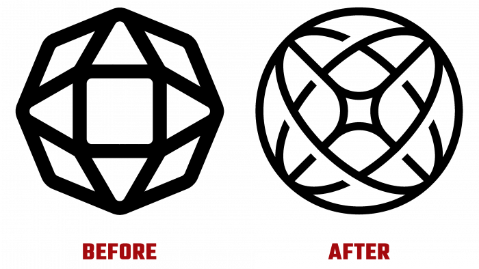
Smith & Diction from Philadelphia, a creative agency for developing advertising strategies and visual identity, was hired to develop a new image for the platform. The main change was the transformation of the old emblem sign into a circle. Its content created a visual dimension, which made it possible to see a multi-level sphere in it, symbolizing a frozen globe at the moment of movement. The presence of two elements in the sphere, in symbolic golden sections or intersecting transparent circles, added a semantic load to the sign. The shape of the ball symbolizes precisely the Earth, from the various corners of which users post their blogs. At the same time, this approach means that information about travel or events from all over the world is presented here, making Exposure a real window to the most beautiful places, focusing on this as an important element of the site’s identity.
The central and very important element is the “X” sign, which is formed due to the suppression of internal sections. Its endings combine all the graphic elements into a single composition, forming a unifying visual perspective. You can also see a commonality with the stars or a stylized image of a flash, which correlates it with the peculiarities of the creation of the photos posted.
An interesting point is the formation of the visual shape of the heart in the upper central part, obtained by crossing the sections. This demonstrates that everyone who uses Exposure leaves a piece of their heart here and puts their whole soul into creating a blog. At the same time, such a symbol is also a sign of the site’s gratitude to its users, without whom its existence would not have been possible. Geometry with humanity is the hidden symbolism of the new Exposure logo.


