The thematic logo of Nextdoor visually corresponds to the name of the social network it represents. It accurately conveys the concept of the web resource and testifies to openness to the local community. Although the emblem is friendly, it is also strictly business-like.
Nextdoor: Brand overview
Meaning and History
The purpose of this web platform is to provide news and events occurring within the administrative boundaries of a specific region. Local residents can also write comments, ask questions, express opinions, or leave recommendations about local service providers. The boundaries of the neighborhood (the coverage of a specific area) are initially established using Maponics. Users whose addresses are outside the neighborhood boundaries can open their own communities. According to Nextdoor’s rules, each separate “neighborhood” must consist of at least ten private homes. Therefore, a house is the key image of the logo and the basis of the web project’s concept. Over time, the image of a typical house has evolved into an unusual structure.
What is Nextdoor?
Nextdoor is an American company, and its social network was initially developed by Nirav Tolia, David Wiesen, Prakash Janakiraman, and Sarah Leary for local use. Since 2011, it has spread to eleven countries, including the USA, the UK, Canada, Australia, and Europe. The company was founded in 2008, with its headquarters in San Francisco, California. There is also a namesake application for Android and iOS.
2008 – 2011
In its early years, Nextdoor did not use a logo because it did not yet have a website for which it was opened. Only with the launch of the social network did it acquire its own emblem, gaining widespread recognition alongside the expansion of web resources.
2011 – 2020
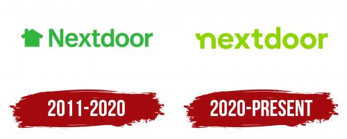
The logo features a house – the key unit in forming the so-called “neighborhoods,” defining the individual communication zone of internet users living nearby. It represents unification not so much by interests but by practical considerations, as people living on the same street or in the same neighborhood face similar problems. They are serviced by the same companies and surrounded by the same conditions. The silhouette of the building is schematic: walls, roof, and chimney. To its right is the project’s name, set in a chopped font in lowercase. The first letter is an exception – it is uppercase. All glyphs are strict, bold, and straight in a geometric style. Both the text and the icon are colored green.
2020 – today
In the fall of 2020, the web resource received a new logo. In it, the two main elements – the inscription and the icon – creatively merged. The designers artistically played with the lowercase “n,” turning it into a stylized house. They flipped the upper left element of the letter (the tail), making it an improvised chimney. The remaining part of the glyph has a rounded shape, resembling an igloo – an Eskimo house. In any case, the silhouette in the form of an inverted horseshoe indeed looks like a dwelling. The color of the emblem also changed: it became neon green. Thanks to the increased boldness of the letter, it gained smooth outlines.
Font and Colors
The inscriptions in Nextdoor’s logos are made with a bold, grotesque font with softly rounded letters. In the early version, a font identical to Rutan DemiBold from The Northern Block was used. In the later version, the glyphs became bolder, making them even more rounded, as seen in the Corporative Sans Bold font by Latinotype.
The corporate palette of the social network is associated with various shades of green. Initially, it was calm and neutral, then transitioned to the spectrum of spring green, which, according to the concept, represents an invitation to a renewed world.
